
Karl Frazier
UX Designer
Timeline: June 29 - July 24, 2021
This project was done with the collaboration of Isaac Saul - founder of Tangle.
UX Designer
Timeline: June 29 - July 24, 2021
This project was done with the collaboration of Isaac Saul - founder of Tangle.
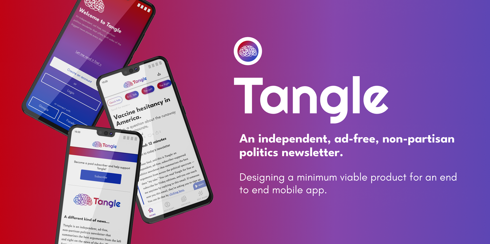
Project Background
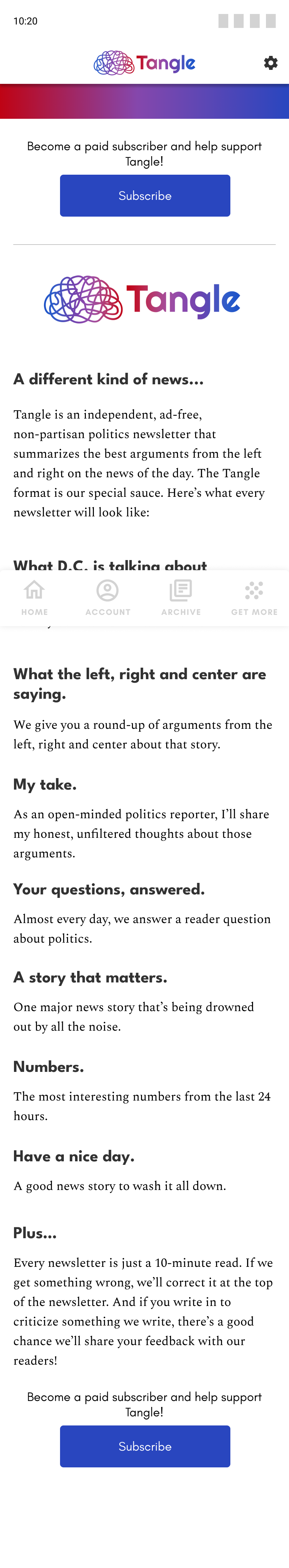
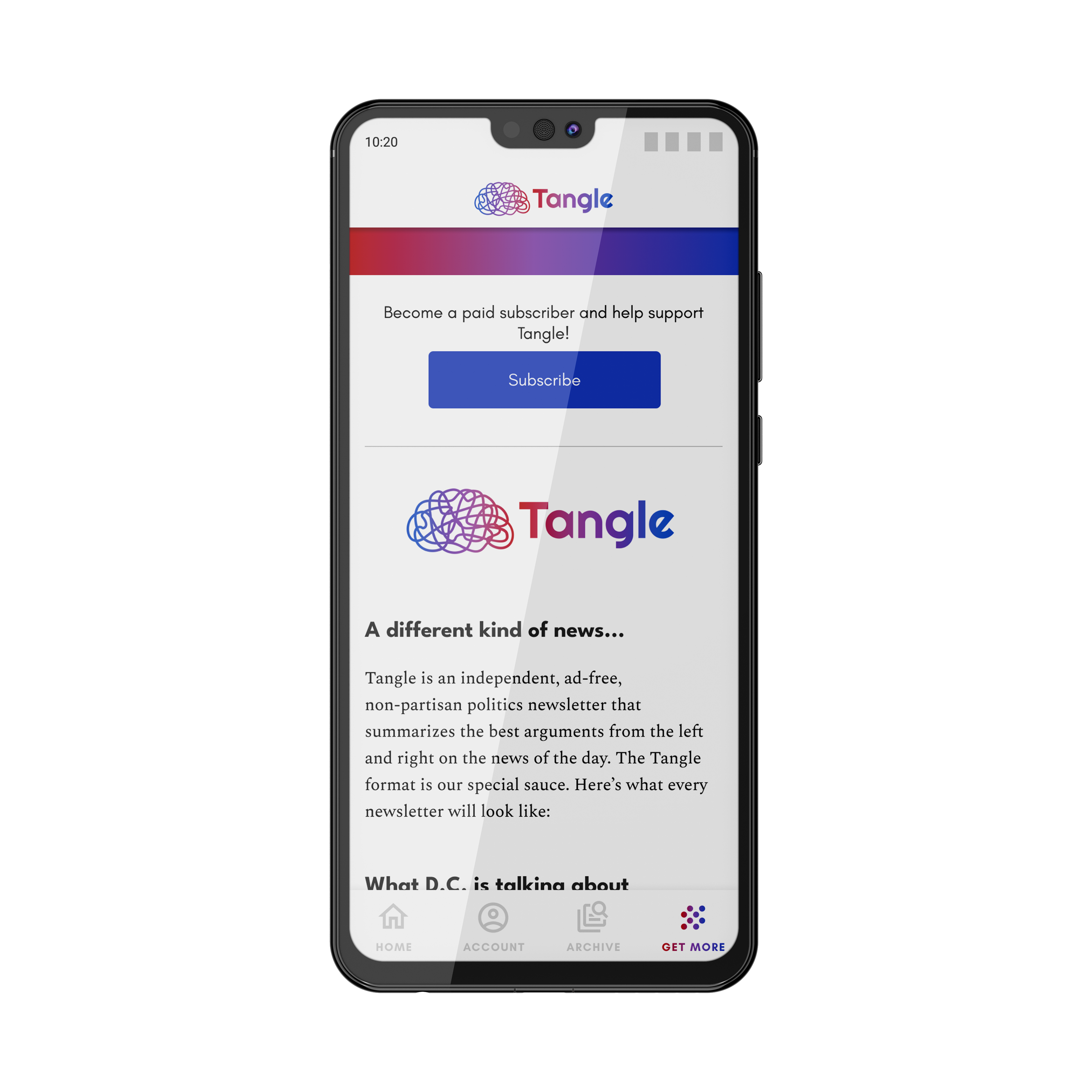
Tangle is an independent, ad-free, non-partisan politics newsletter that summarizes the best arguments from the left and right on the news of the day. Every week, Mon-Thurs, Tangle sends out a free newsletter. They also offer expanded content for paid monthly subscribers. All of the money for Tangle comes from donations and subscribers so it’s important to keep growing the platform in order to gain users, making it a prime candidate to expand into the app space.
Goals
1 - Create a research-backed user asset. Understand what motivates users to upgrade from a free to a paid membership and develop a user persona that reflects that behavior. This will also be a chance to discover other opportunities for growth.
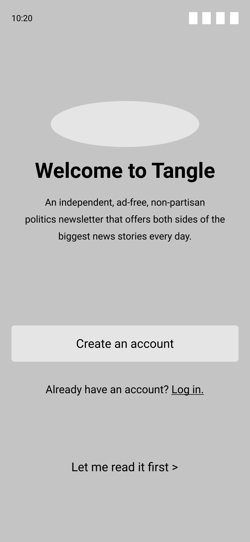
2 - Define parameters for an end to end app that is able to host all of Tangle’s content as well as leave room for growth. This will include onboarding/sign up screens, a place to host their free content, as well as a separate section for paid members.
3 - Deliver high-fidelity mockups to developers. Develop a prototype of a fully functional app.
Process
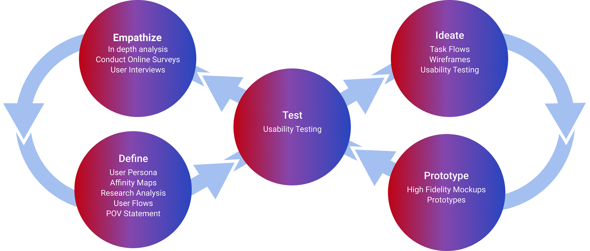
Research
The primary goal of my research was to learn how users typically consume their news and what they value in a news service. Understand what motivates users to upgrade from a free to a paid membership and develop a user persona that reflects that behavior. This will also be a chance to discover other opportunities for growth. There were three different methods used in the research phase; surveys, secondary research, and user interviews.
Online surveys were used to answer a broad set of questions focusing on how people consume their news. I’d like to know who some of Tangle’s major competitors are based on what sites, apps, blogs, etc. that people use. On top of that it would be great to find out how many, if any, use apps for their news at all. It will also be a good chance to ask people if they have any paid news subscriptions and why they made that choice. Lastly, it will be a chance to recruit participants for follow up interviews.
Some key takeaways from the survey can be seen below.
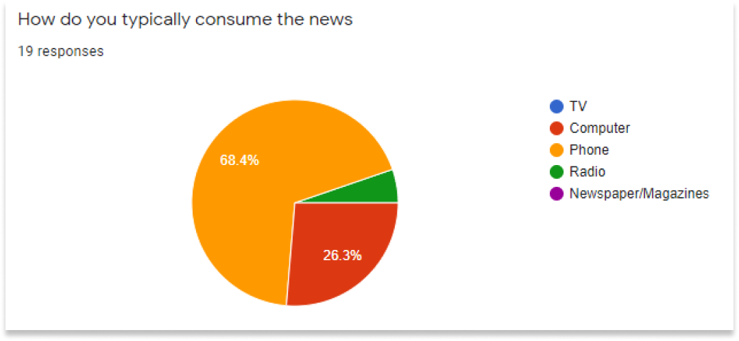
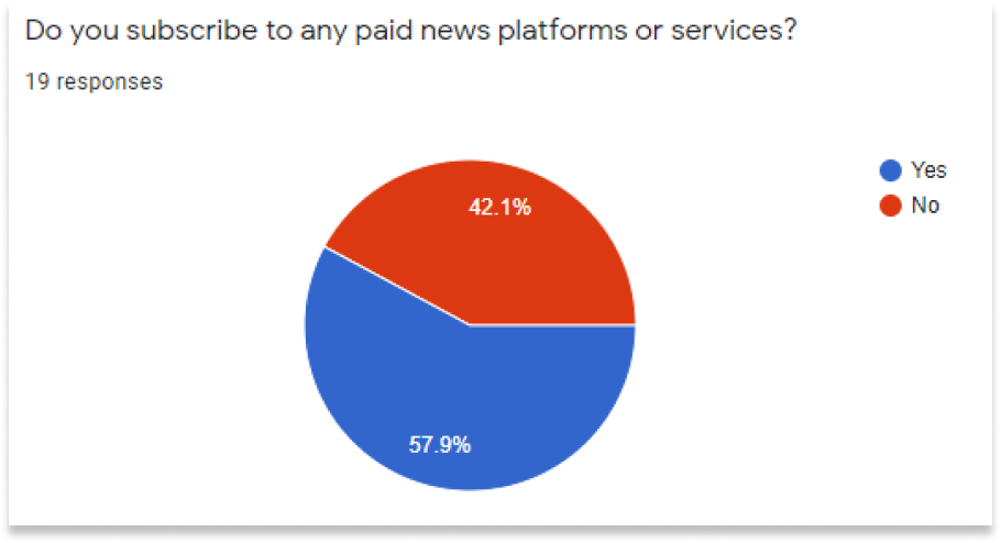
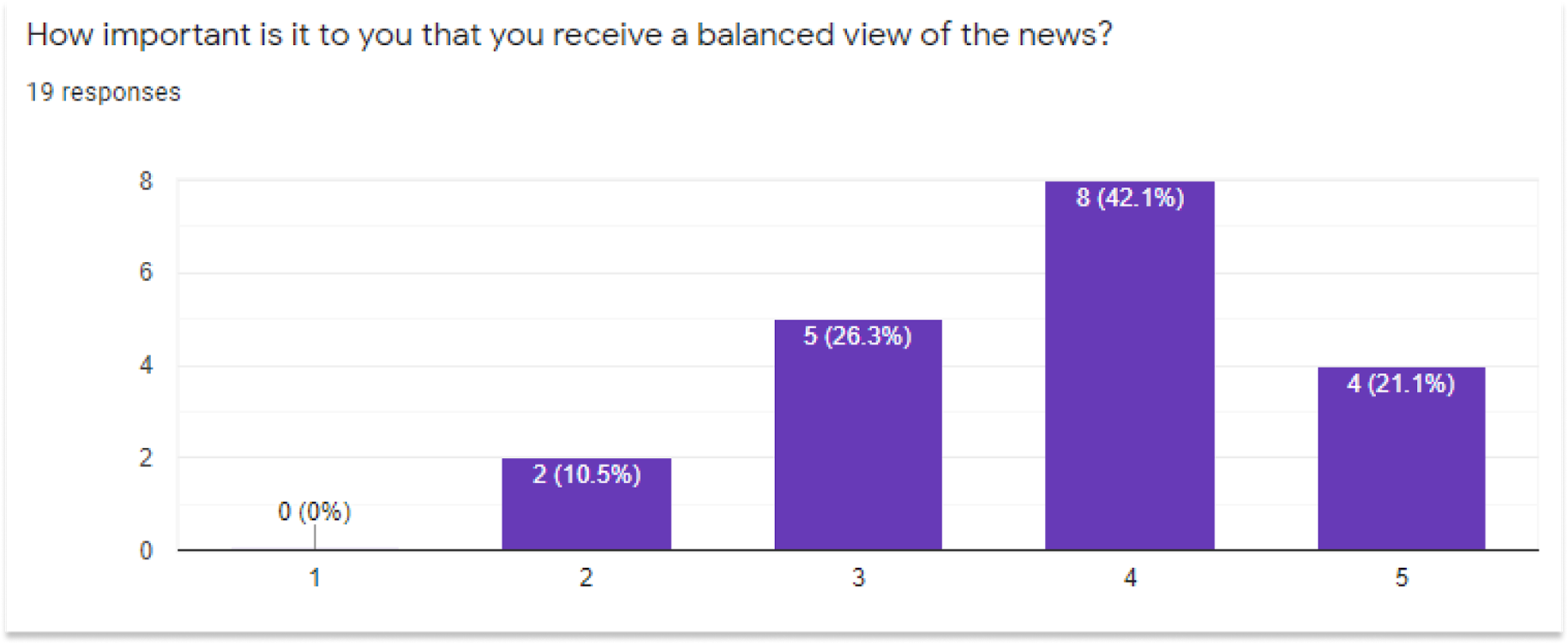
Seeing the above responses was a very strong proof of concept for a Tangle app. The majority of participants primarily use their phones to stay up to date with the news, are willing to pay for quality journalism, and believe that a balanced perspective is important to have.
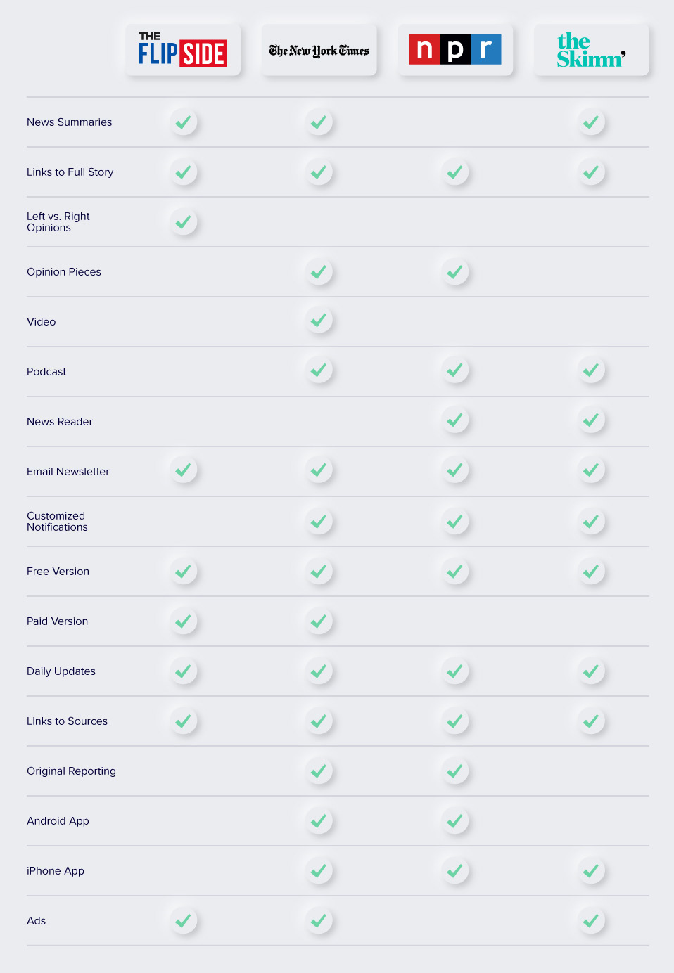
From the write in answers of the survey I was able to get a good list of news apps to research, both paid and free subscriptions. The most common publication mentioned was The New York Times but users also brought up Apple News, NPR, The Seattle Times, The Skimm, and others. Furthermore, Isaac from Tangle, views The Flip Side as one of his primary competitors so I included them in my in depth analysis.
The New York Times is an incredibly successful newspaper/app/website and is packed full of useful features. They were the primary focus of my research and provided a lot of ideas to build off of.
By seeing what some of Tangle’s biggest competitors created I could gain insight into what works and doesn’t work. A large focus of my attention was on the layout and navigation off the apps that were available to me. This would all come in very handy later on when we get to wireframes and prototypes.
Synthesizing Research
User interviews were conducted with 4 participants, all of whom had taken the earlier survey and were deemed quality candidates for follow up. Participants were asked a series of questions pertaining to their experience, what worked for them and what didn’t, how they chose to use who they did in the past, what challenges they were met with along the way, and other items that came up within the flow of conversation
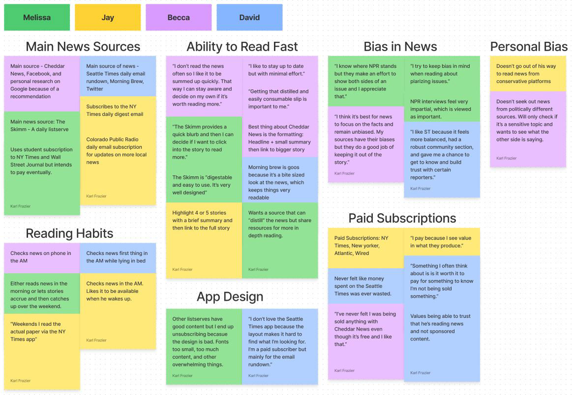
I created an affinity map of my interviews to group together any important patterns or insights.
I created an affinity map of my interviews to group together any important patterns or insights.
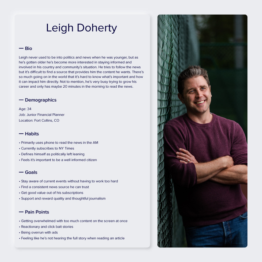
From this affinity map I was able to construct a user persona built around common behavior and feelings of multiple people. This is the target market for the app design. As long as I can make Mr. Doherty below happy with the app then I should be looking at a success!
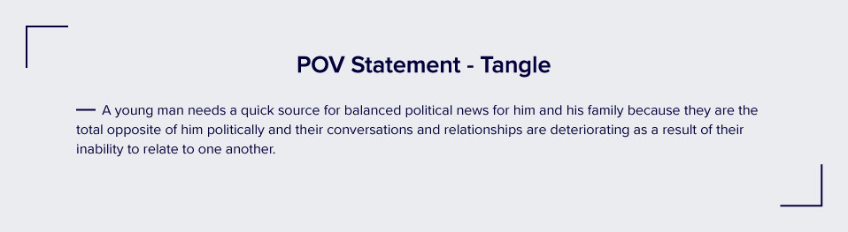
On top of the interviews, Isaac connected me with a survey he sent out to all of his users. With thousands of responses I had a lot of information to consume. This was very useful when writing a POV statement. This was very important because it gave me a chance to connect with the users of Tangle and what it is they find important about the newsletter.
Ideate
The task flows for Tangle are actually very straightforward. One of the seling points of Tangle is its simplicity. A no nonsense approach to the days news. For our purposes there simply needed to be a place to login/create an account (in order to allow users to comment/interact via their account or enable additional paid features and articles) and a place to host the current story. With that in mind I was able to jump straight into wireframing.
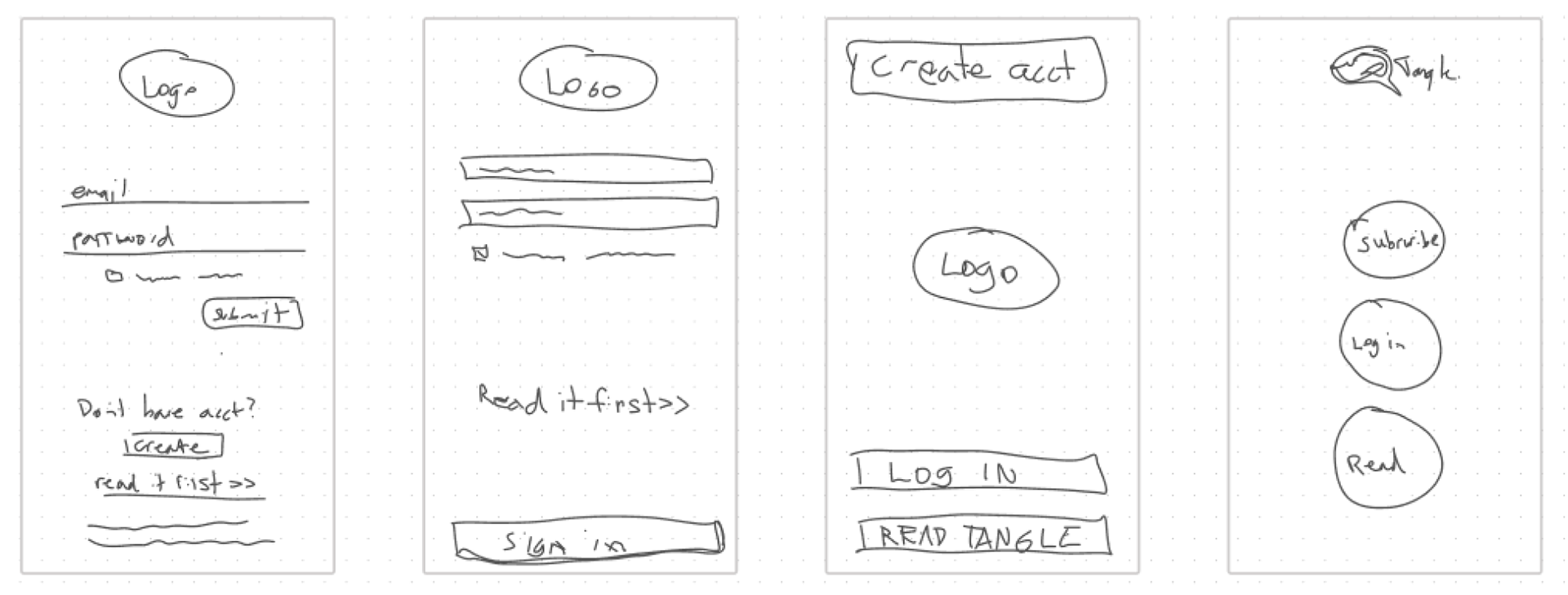
Some of my earliest, rapid fire sketches can be seen below. The top row contains ideas for the login screens and below are ideas for how to display the news. From the earlier research I had made the goal to keep the news broken into short and easy to access sectinos as opposed to one long vertical scroll. This would prove to be the biggest challenge of the design so that’s where most of my focus went,
Some of my earliest, rapid fire sketches can be seen below. The top row contains ideas for the login screens and below are ideas for how to display the news. From the earlier research I had made the goal to keep the news broken into short and easy to access sectinos as opposed to one long vertical scroll. This would prove to be the biggest challenge of the design so that’s where most of my focus went,
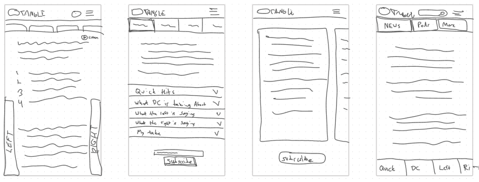
After sketching out a lot of ideas I started to build out more well defined wireframes in Figma. Below is the first iteration. I went with tabs that could scroll horizontally as a way to scroll sideways through the newsletter. For the in app navigation I created a hamburger menu icon that initiated a fly out menu from the left side.
Through ‘hallway tests’ and brief discussions with friends and my advisor for DesignLab I came up with some changes. The navigation wasn’t as intuitive as I had hoped. Both for the newsletter itself as well as the in app navigation. The in app navigation’s main problem was that it was too reminiscent of desktop navigation and not mobile.
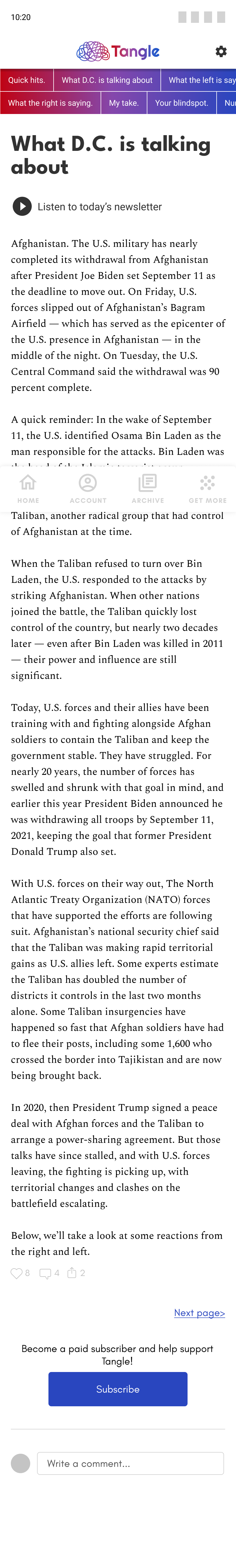
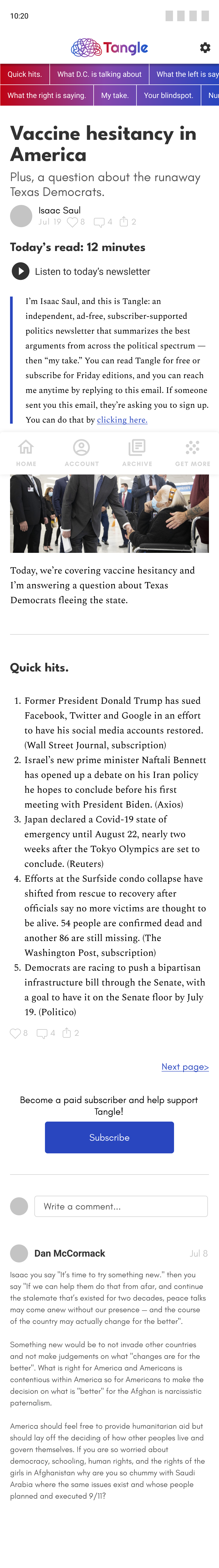
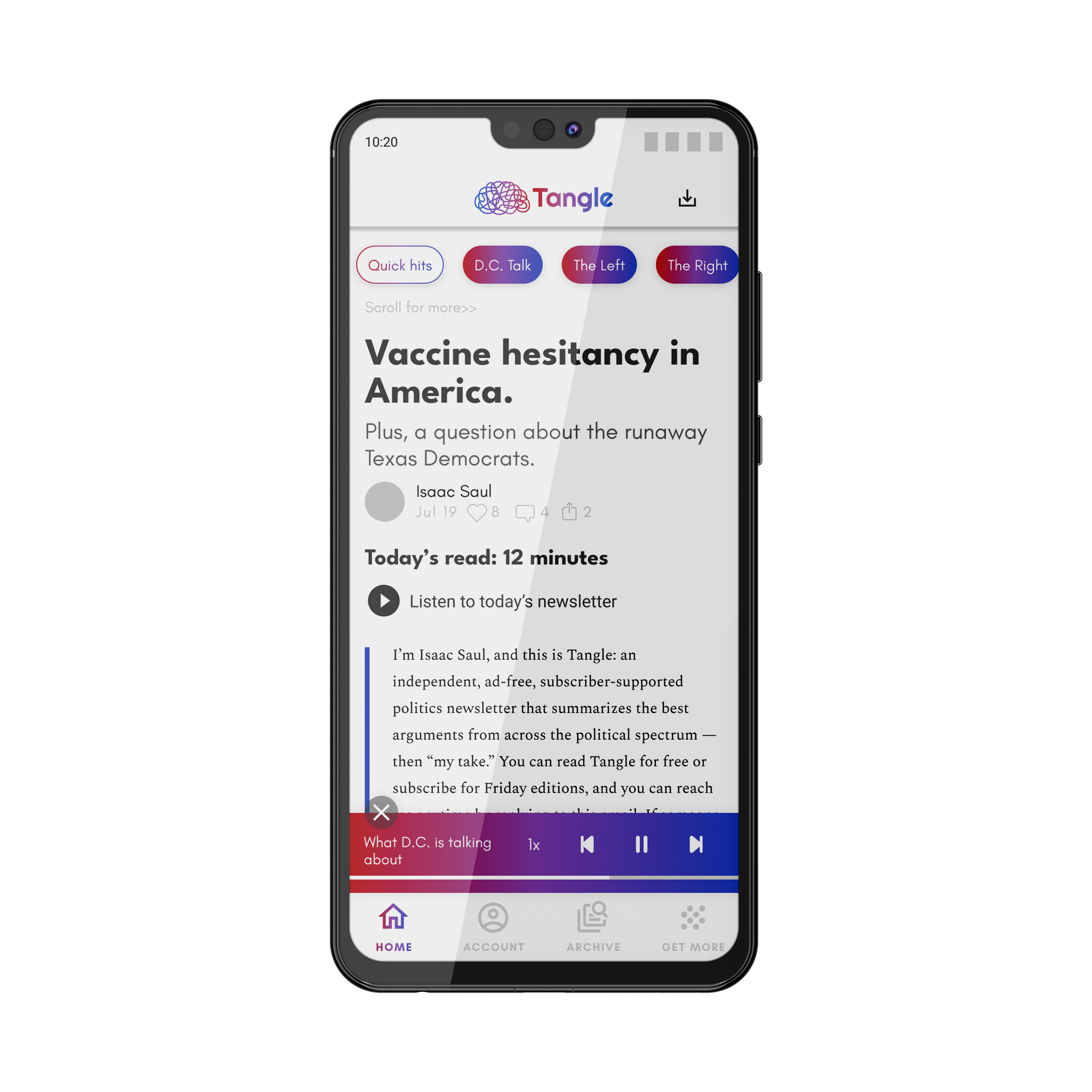
My next iteration moved to a lower navigation bar for in app navigation and the newsletter navigation was expanded to show more of the categories users could select to encourage them to scroll and choose whichever sections they felt were most important to them.
My next iteration moved to a lower navigation bar for in app navigation and the newsletter navigation was expanded to show more of the categories users could select to encourage them to scroll and choose whichever sections they felt were most important to them.
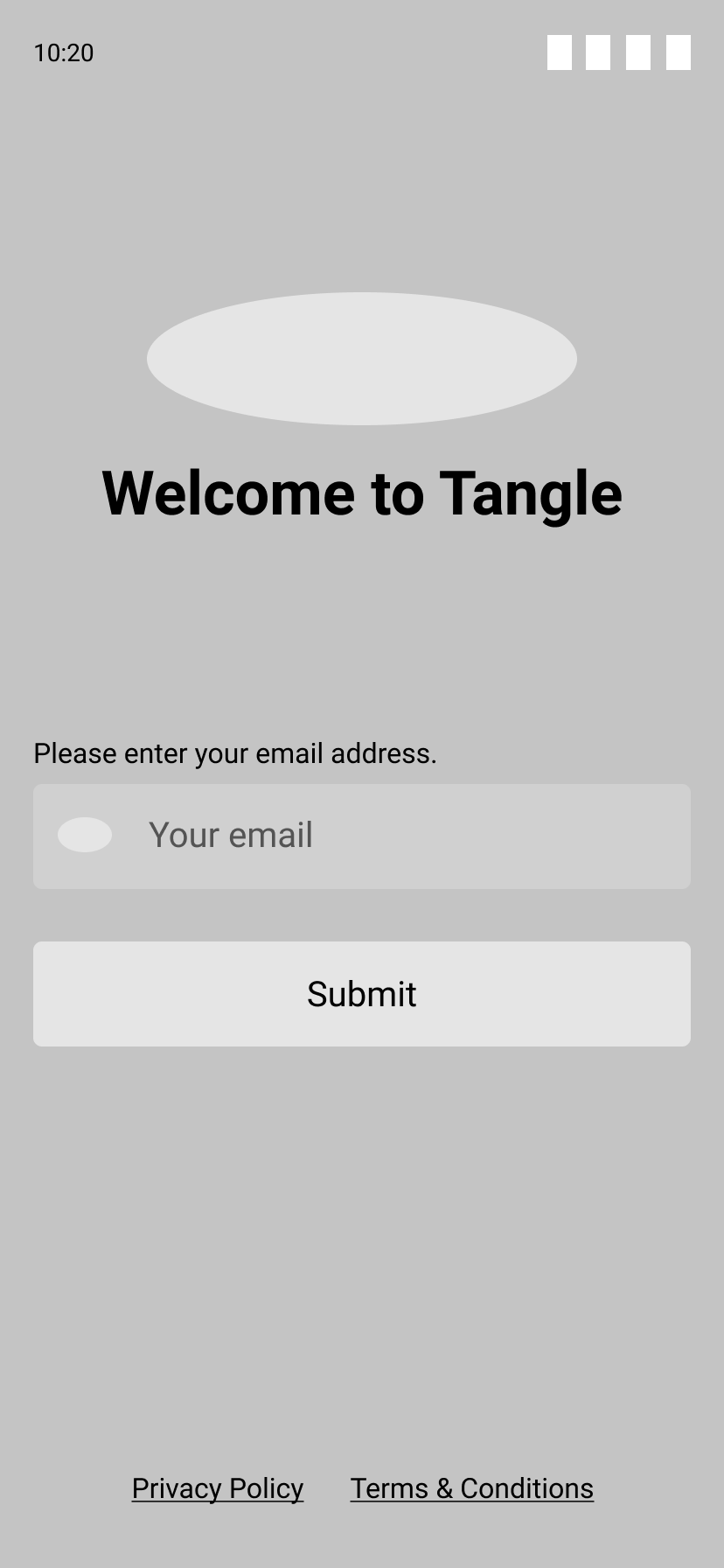
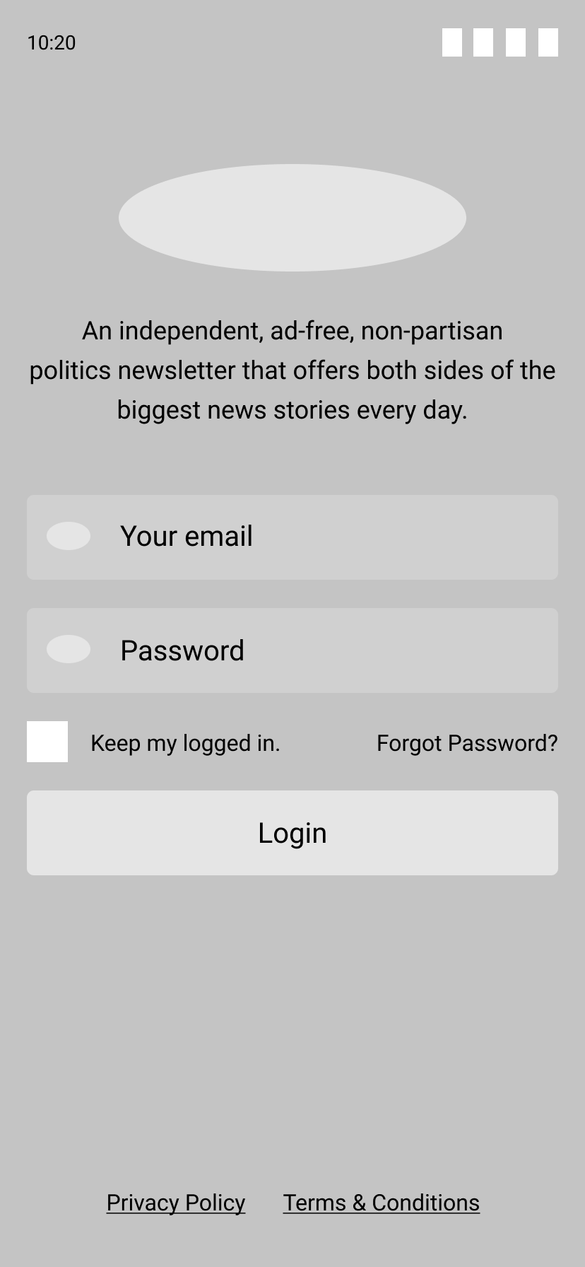
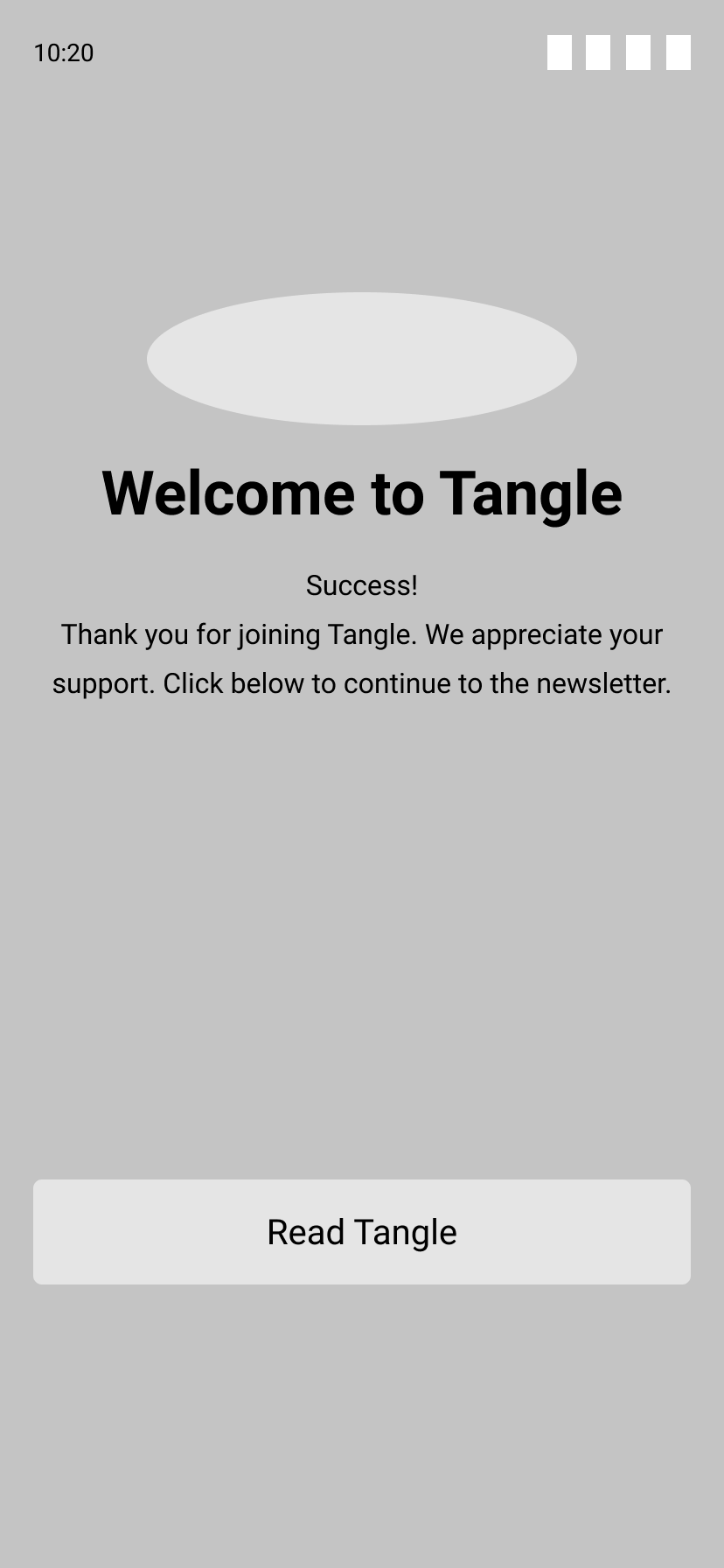
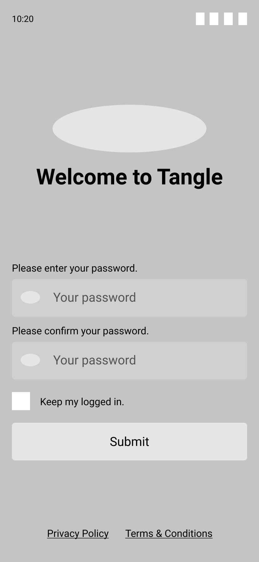
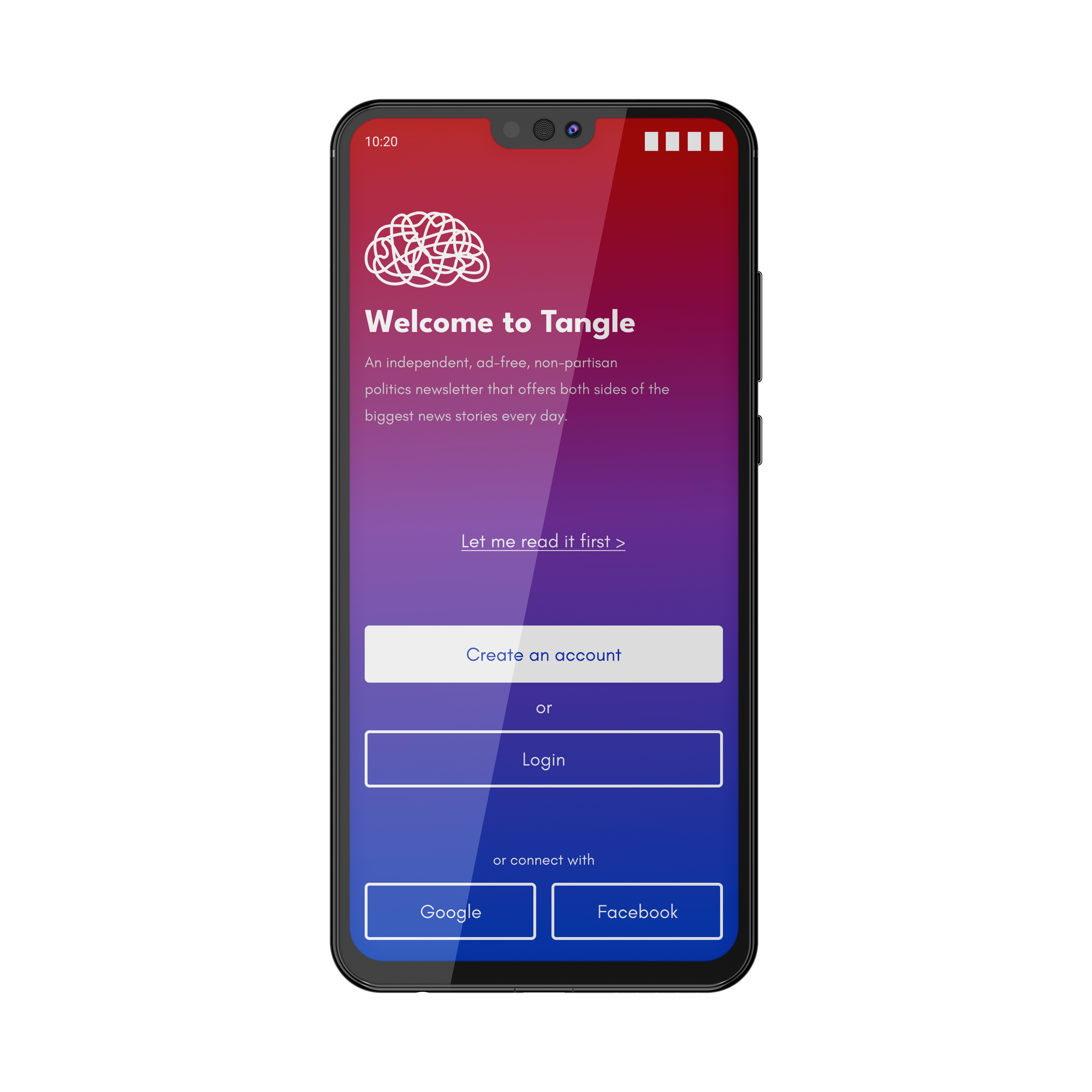
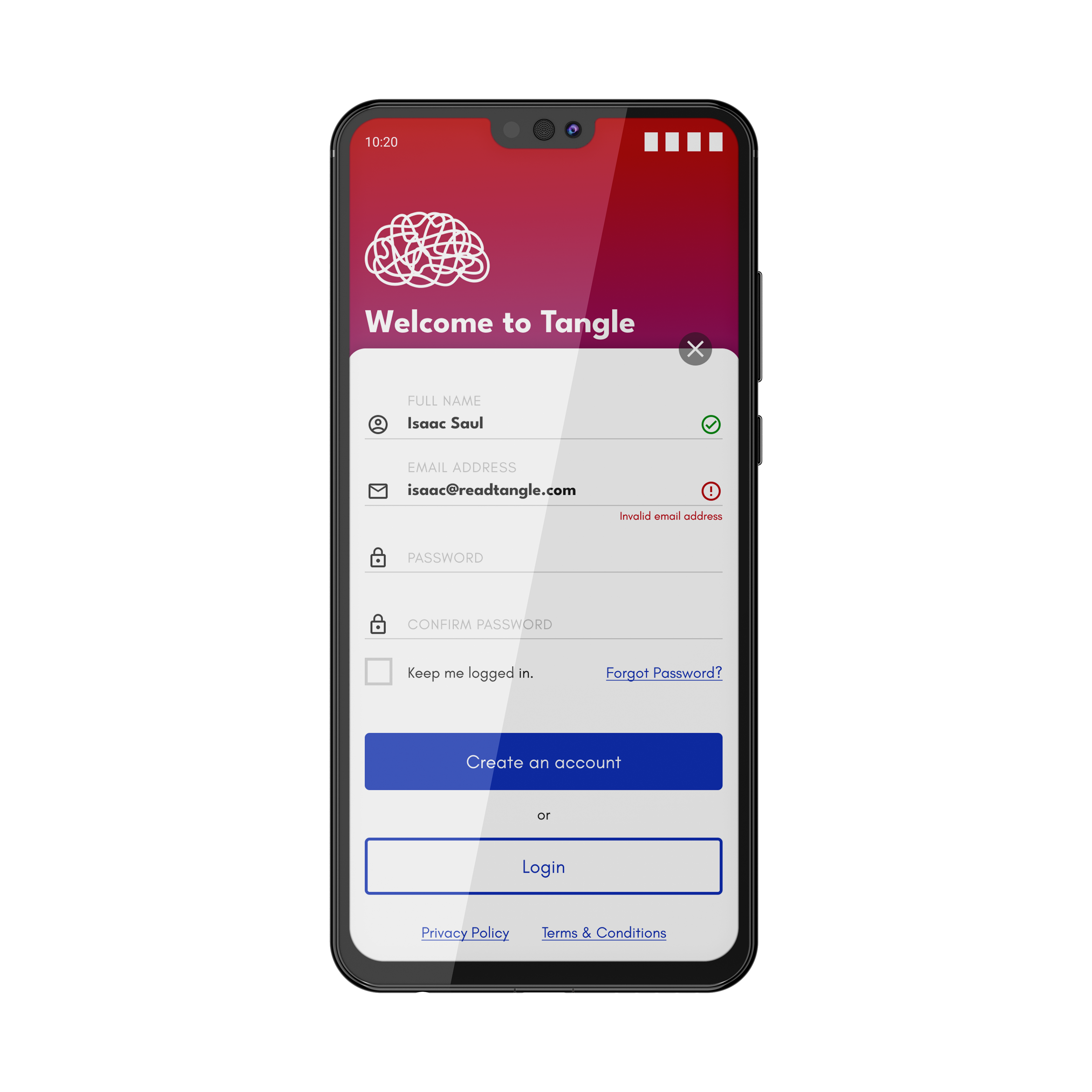
You can see there is also a much more robust login procedure. The was split across multiple screens to not overwhelm the user as well as being an attempt to encourage account creation. Once again I turned to rapid testing by showing my wireframes to anyone that would listen to get multiple opinions as quickly as possible. Feedback was moving in the right direction but some changes were still to be made.
Skipping ahead to the high fidelity prototypes you’ll see what I’m talking about.
Skipping ahead to the high fidelity prototypes you’ll see what I’m talking about.
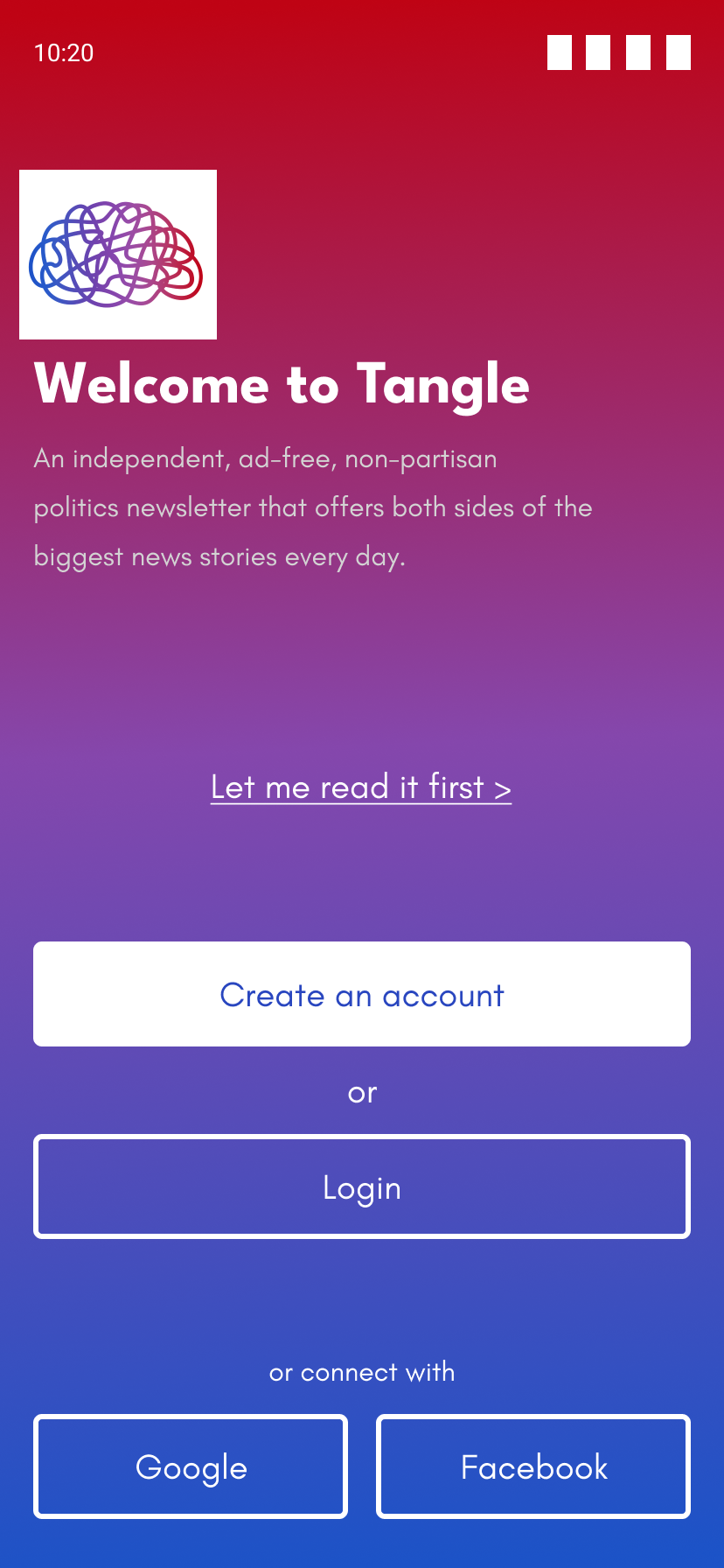
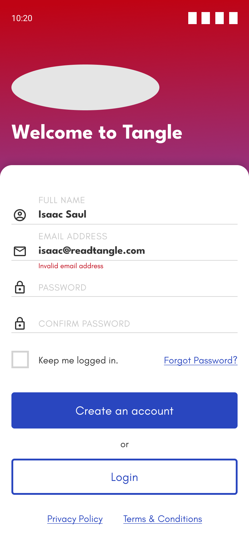
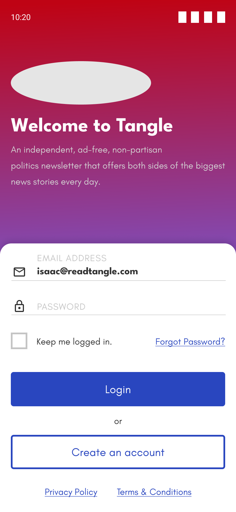
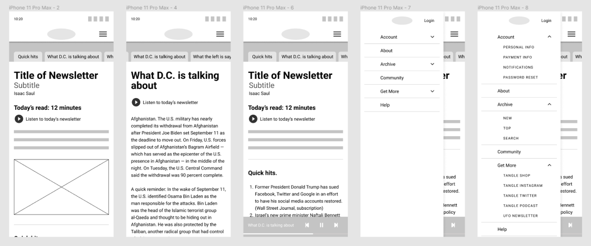
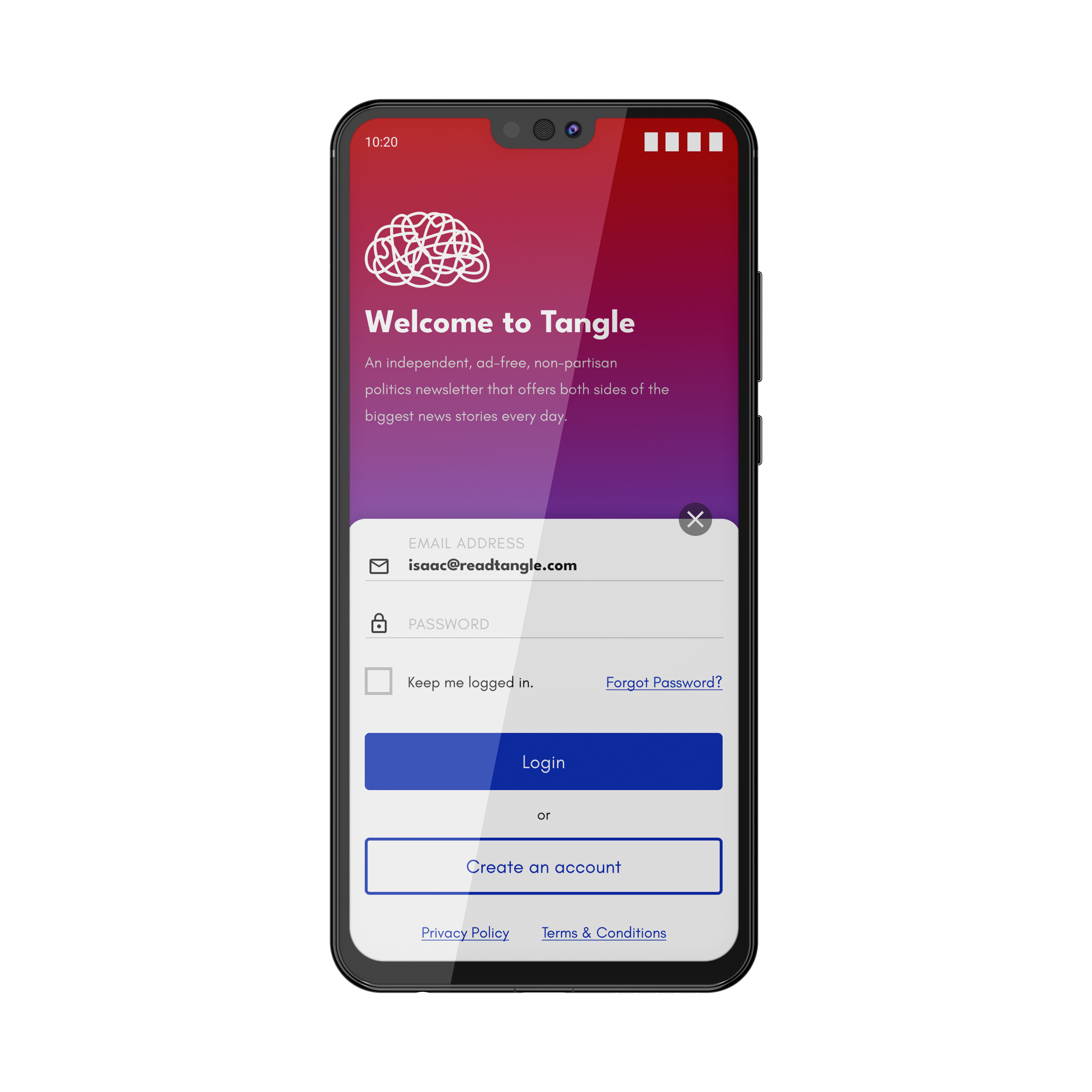
The login screen includes the addition of the ability to login via social channels, which has become more of a standard practice. It was also simplified so that the user doesn’t leave the page. They simply interact with a pop up menu that always offers them the chance to move backwards if they made a mistake.
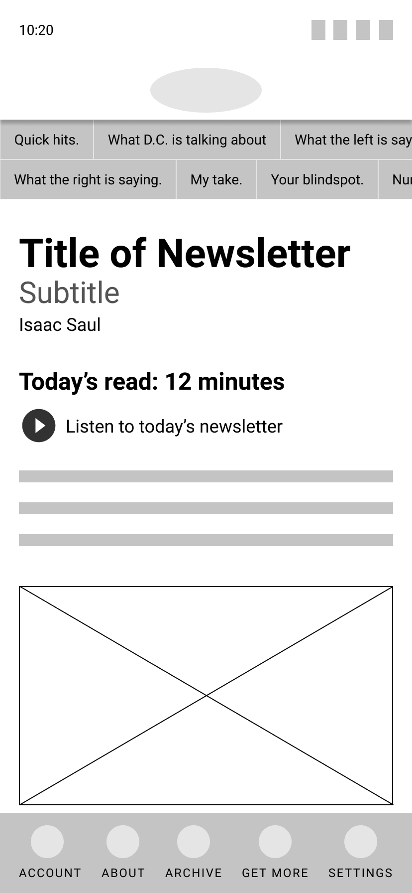
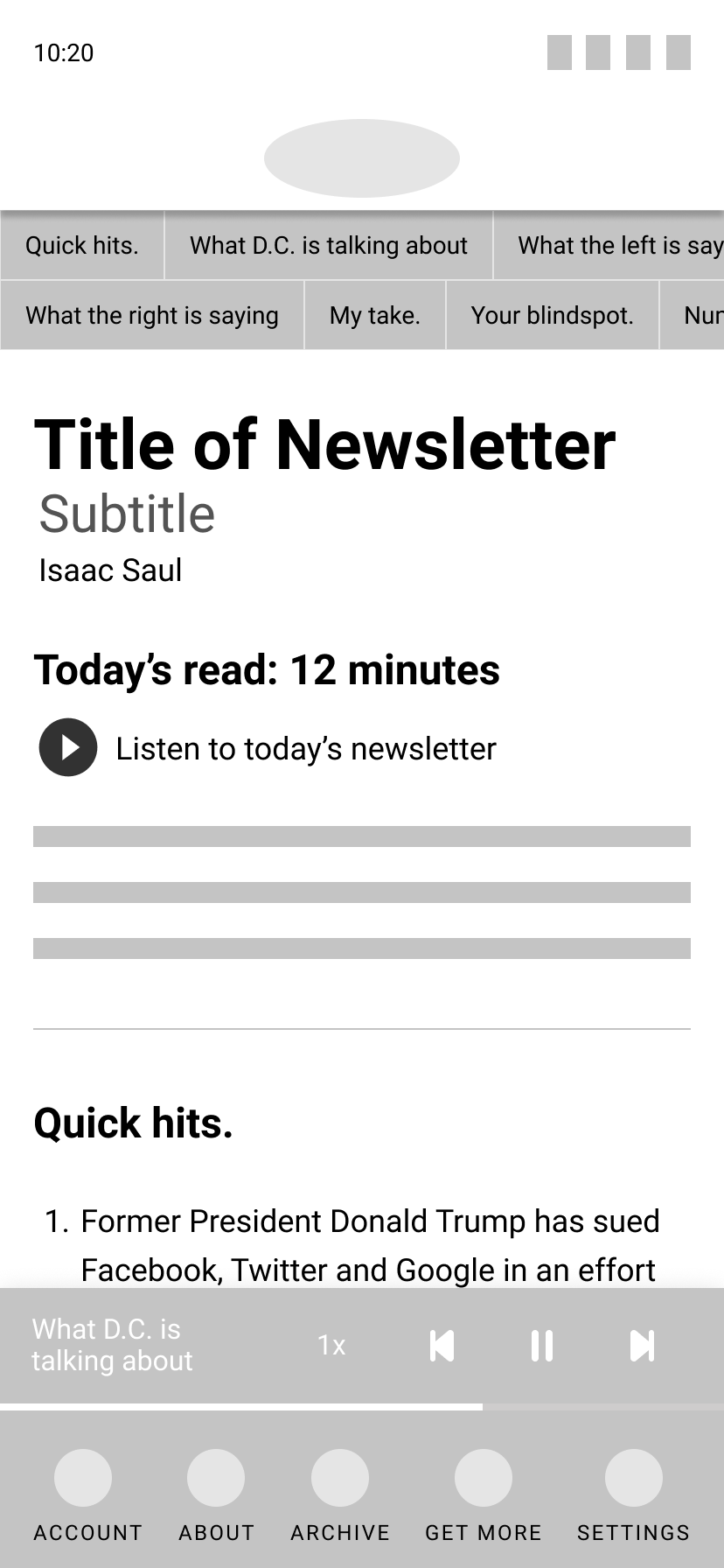
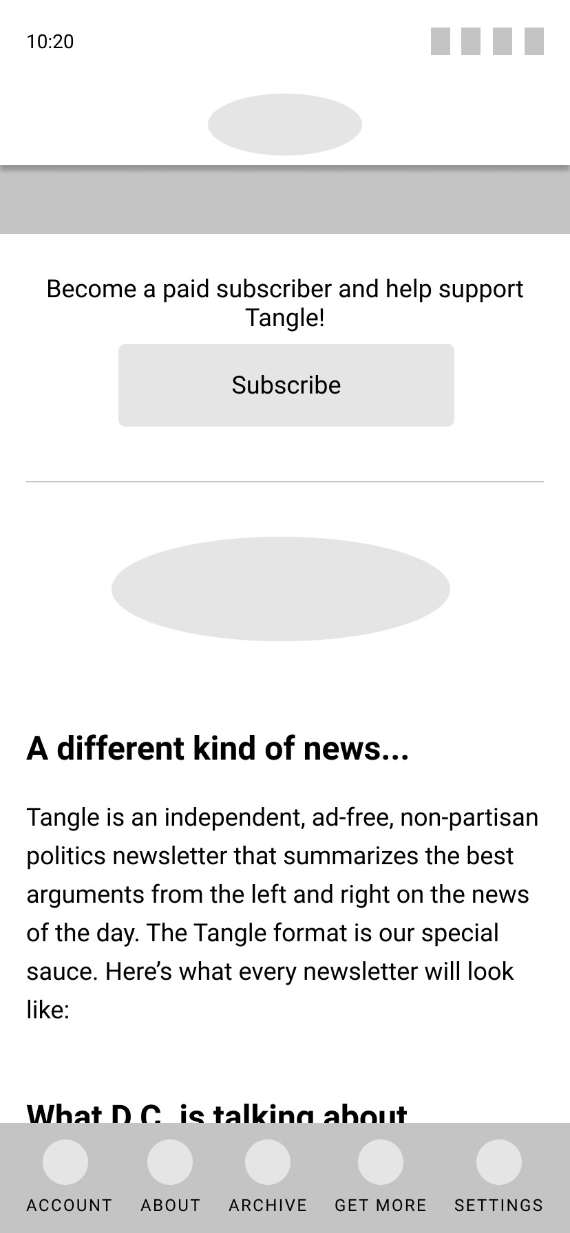
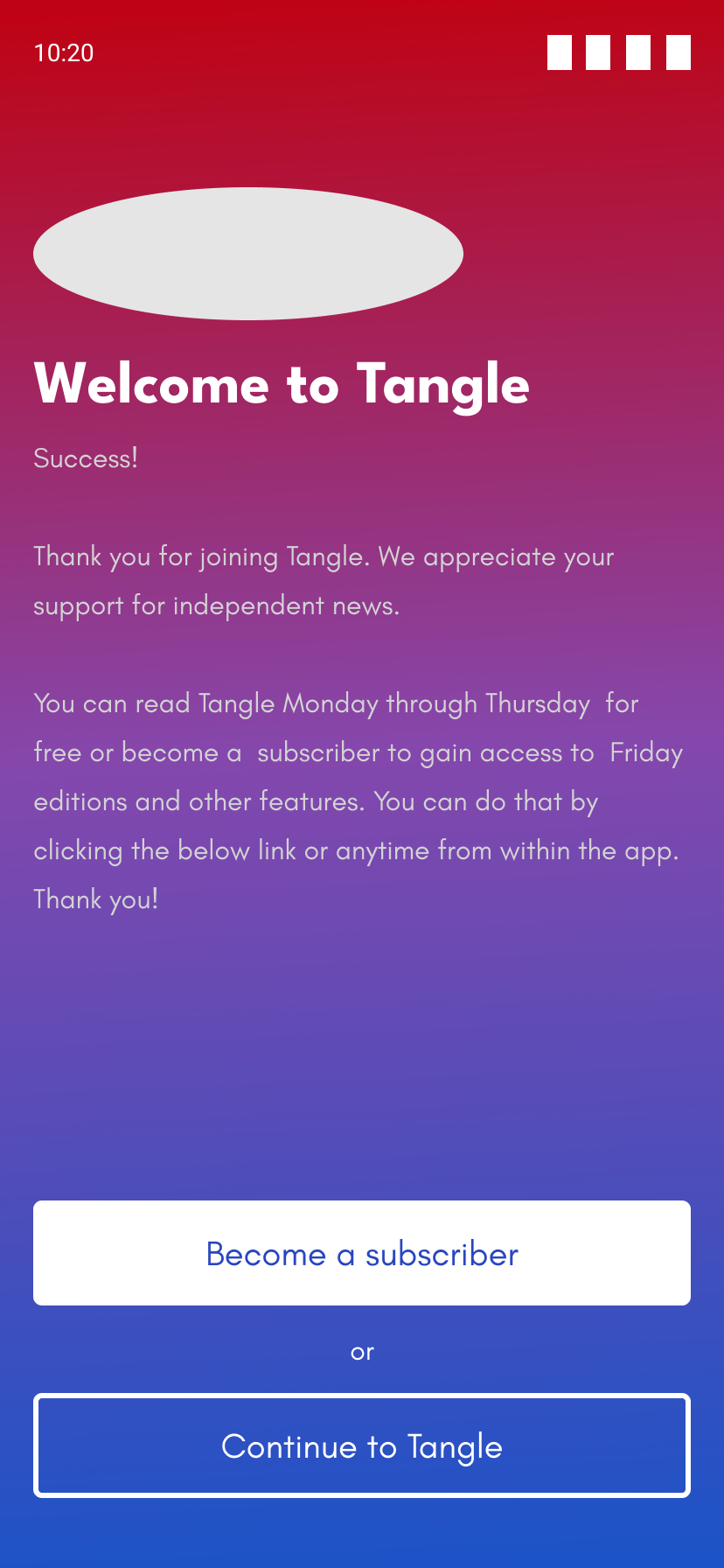
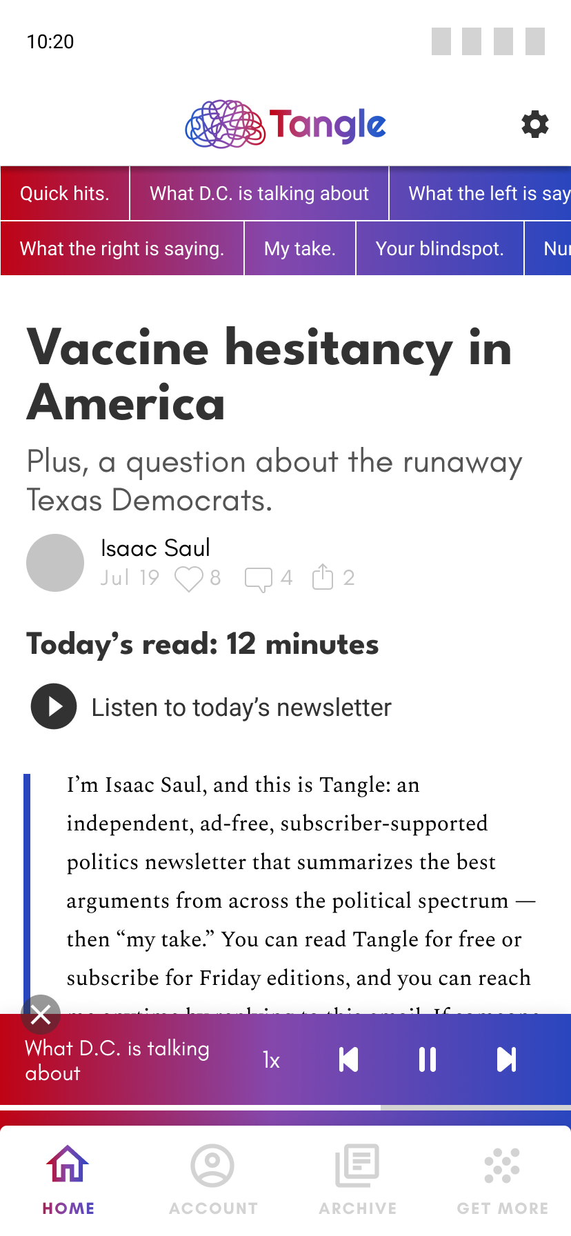
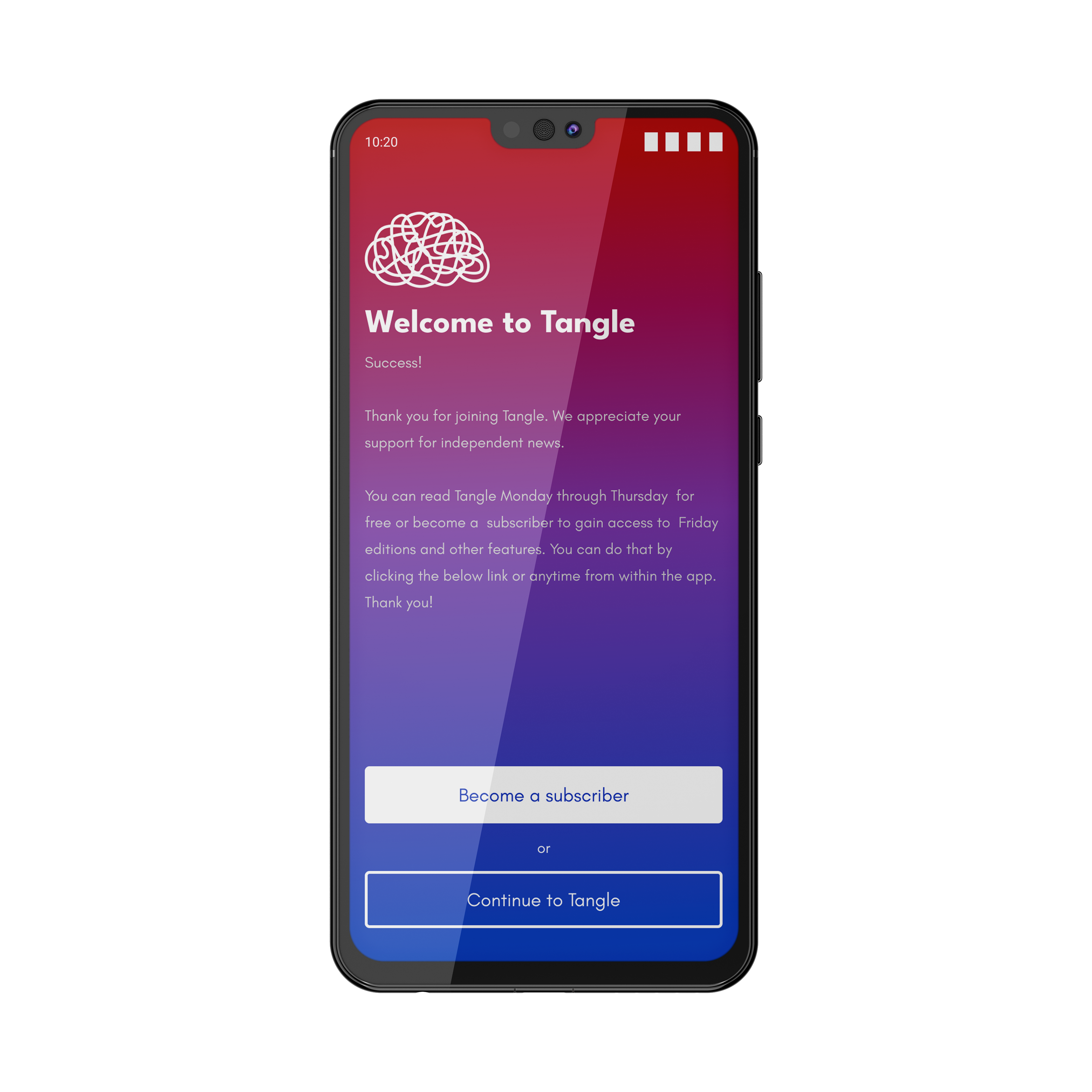
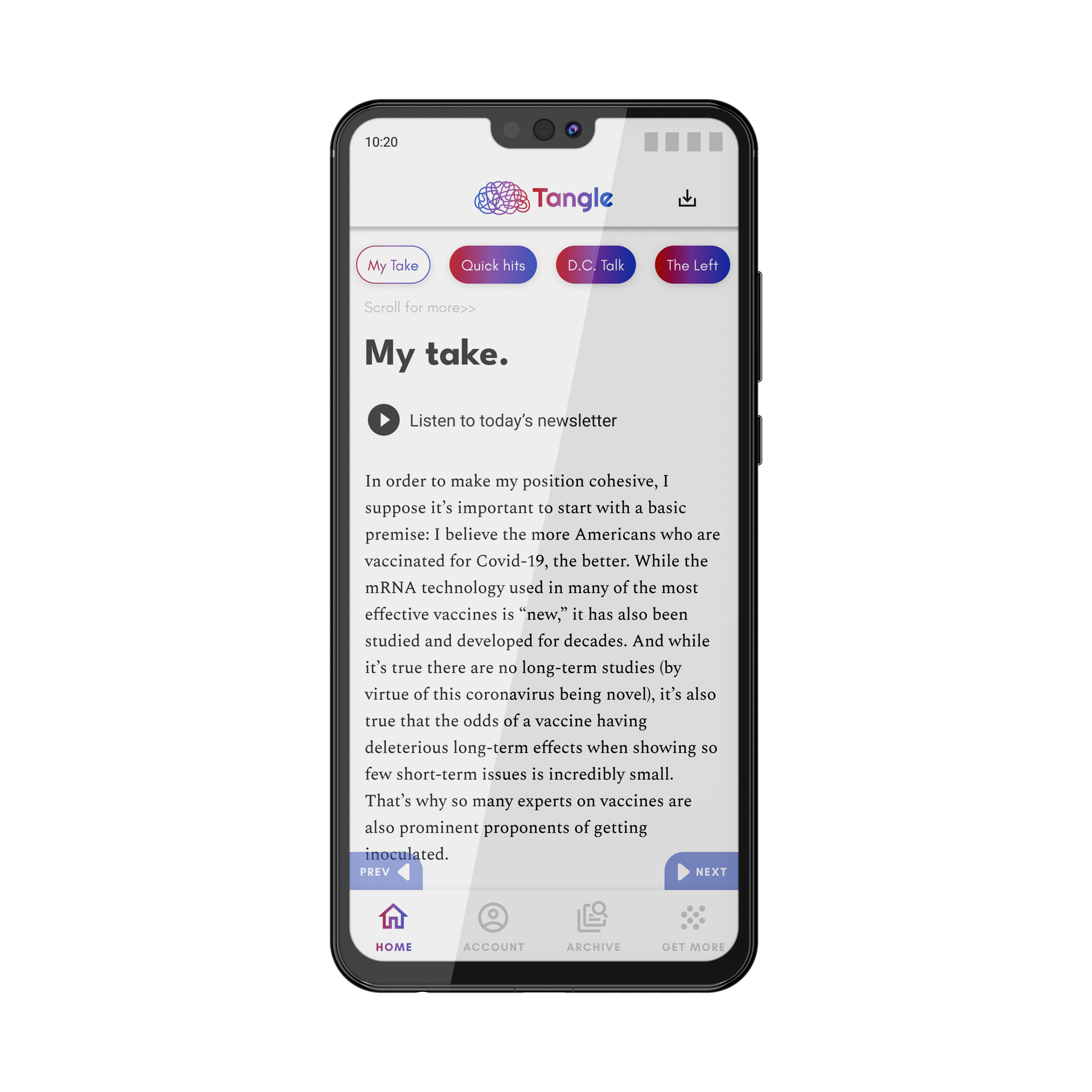
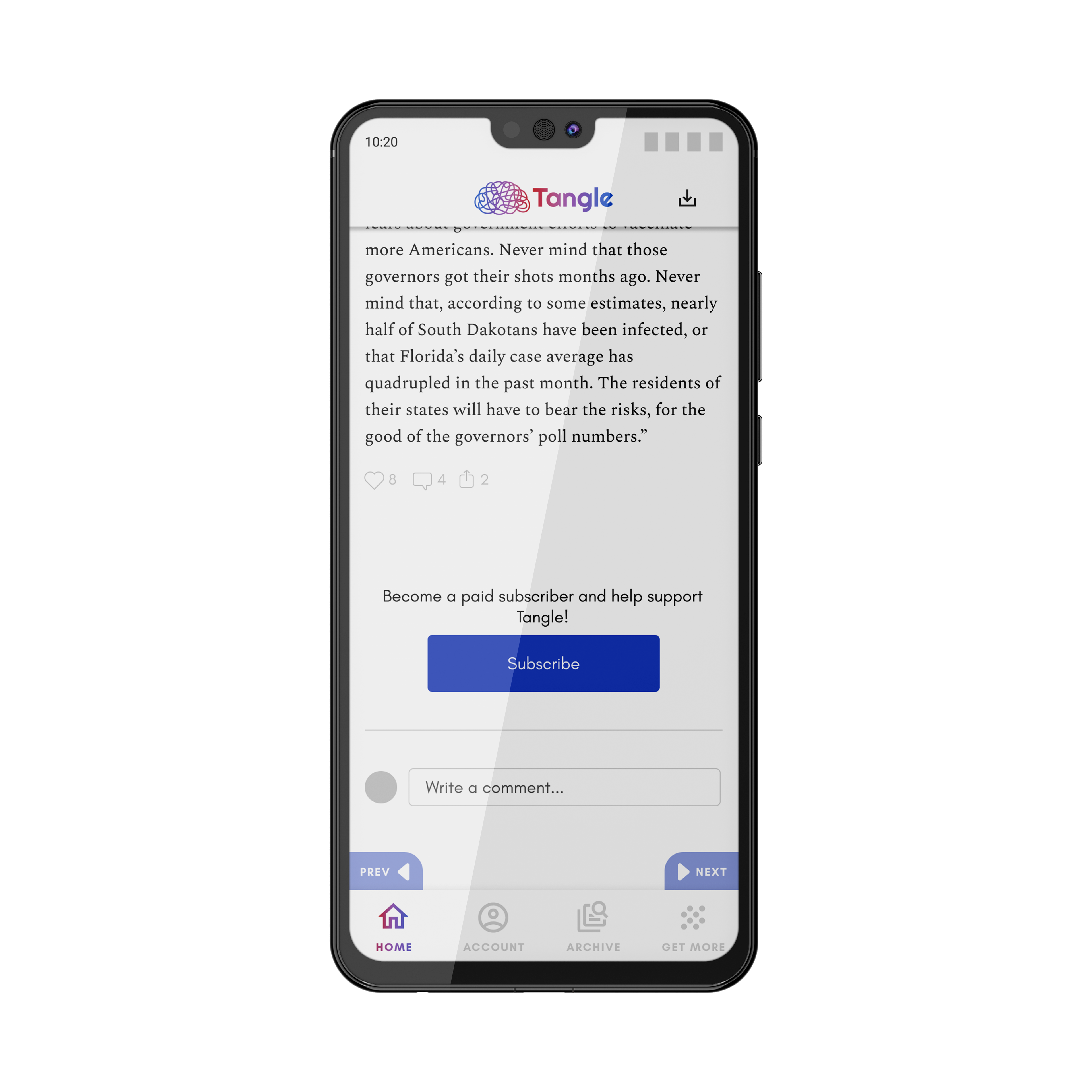
These high fidelity mockups are very close to the final product but had some small changes to be made. Namely, a way to signal which page the user is on in the lower and upper navigation menus. Still they provide a sense of what to expect out of the final product. Something that is simple and easy to follow with a clear flow through the newsletter. Our user persona is all about reducing effort and that was the primary goal. Also included is the added feature of being able to listen to the newsletter, which is something only available for paid members as added incentive to become a subscriber.
These high fidelity mockups are very close to the final product but had some small changes to be made. Namely, a way to signal which page the user is on in the lower and upper navigation menus. Still they provide a sense of what to expect out of the final product. Something that is simple and easy to follow with a clear flow through the newsletter. Our user persona is all about reducing effort and that was the primary goal. Also included is the added feature of being able to listen to the newsletter, which is something only available for paid members as added incentive to become a subscriber.
Usability Testing
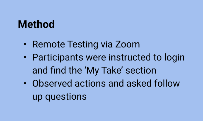
At this point it was time to put the prototype into the hands of other people to get their feedback as first time users. I was able to arrange 4 separate usability tests. I asked all participants to go through the process of creating an account, view the newsletter, and navigate to the author’s take on the issue. I also had plenty of follow up questions about the experience.
The prototype was shared over video chat and participants were asked to share their screen so I could watch how they interacted with the prototype.
The prototype was shared over video chat and participants were asked to share their screen so I could watch how they interacted with the prototype.
In the first test it became clear I was missing a couple key items. That is, how to return to the login screen in order to login or logout, where they expect to find information about Tangle itself, and how to find a previous article in case they missed an issue. This was a great opportunity to ask each participant where they would click first to find any of these items.
Below in another affinity map of the results of my usability tests. You can see the common responses and behaviors grouped together. This information was used to further the prototype into the final version.
Below in another affinity map of the results of my usability tests. You can see the common responses and behaviors grouped together. This information was used to further the prototype into the final version.
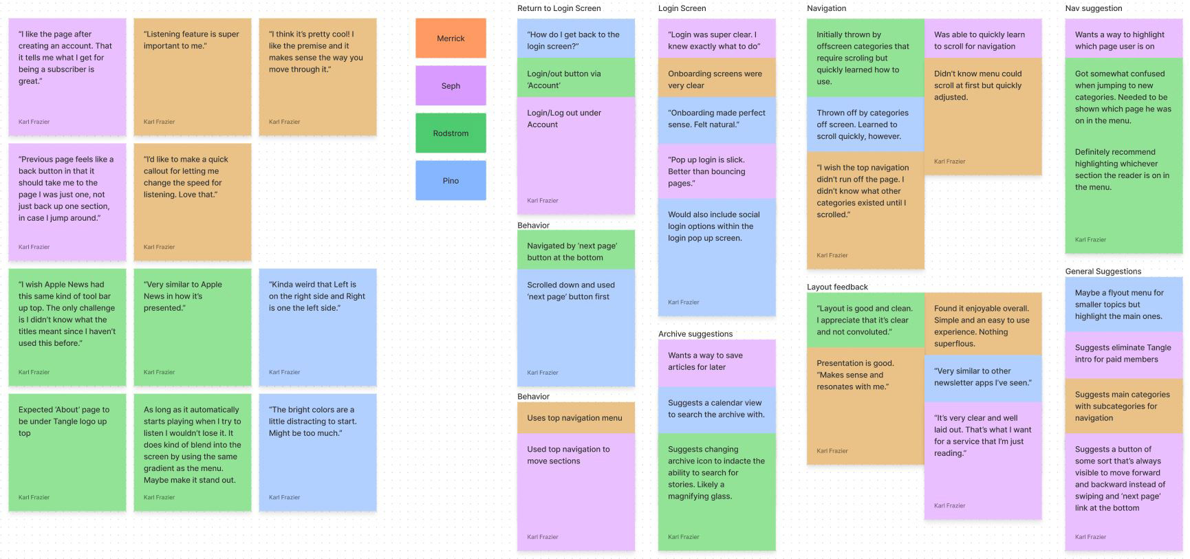
Usability testing gave me a lot of positive feedback. Users were very happy with the layout and appearance of the app. The onboarding process was smooth and familiar. I even received specific mentions commending things like the pop up login screens and the inclusion of an explanation of what users could expect with a paid subscription.
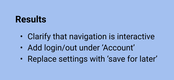
I made one final change to the upper navigation. Making pill shaped buttons on one level made more clear that the navigation was interactive. While testers had some initial hesitation with the navigation they were able to quickly figure it out and learn how to use the features. It may not be the perfect solution but user learnability was very high so I’m confident going forward that there would be minimal trouble.
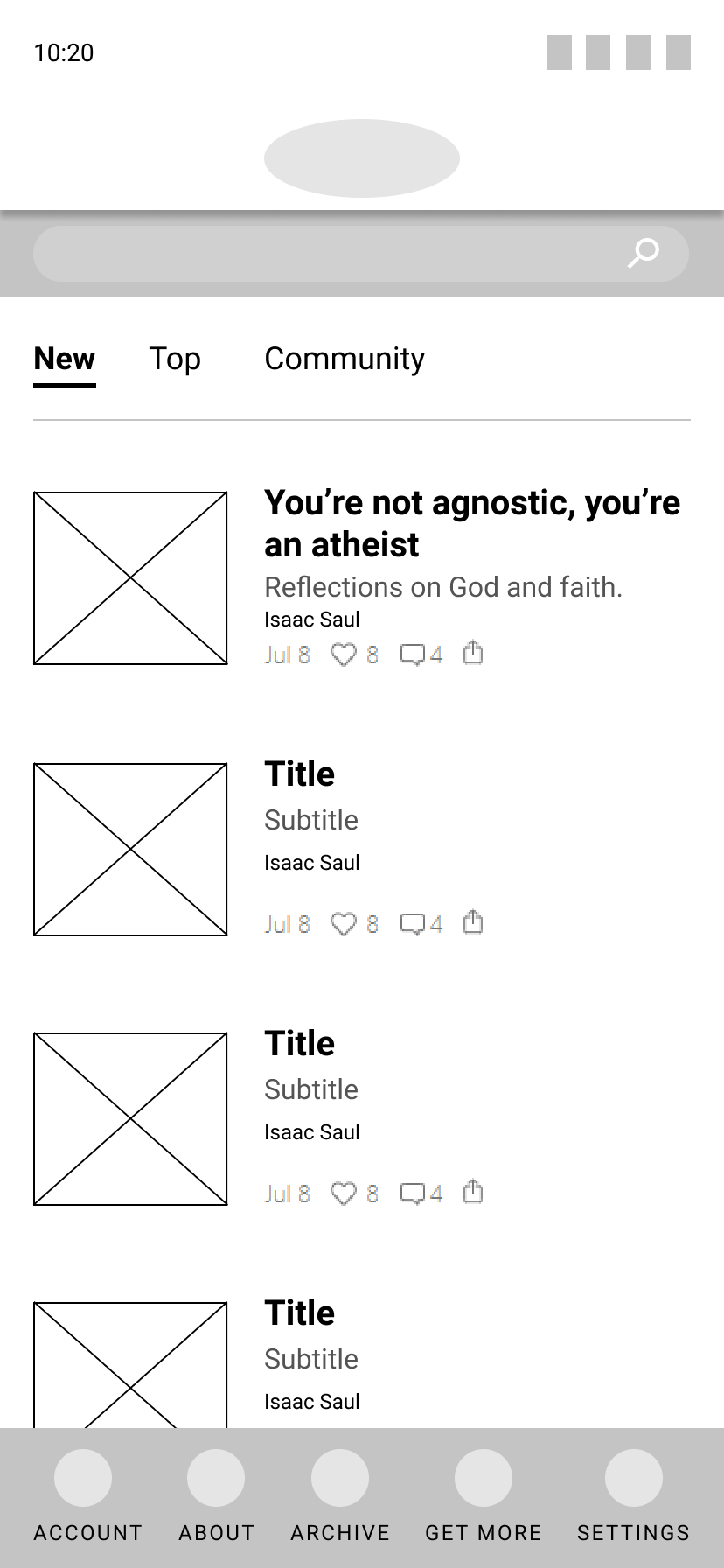
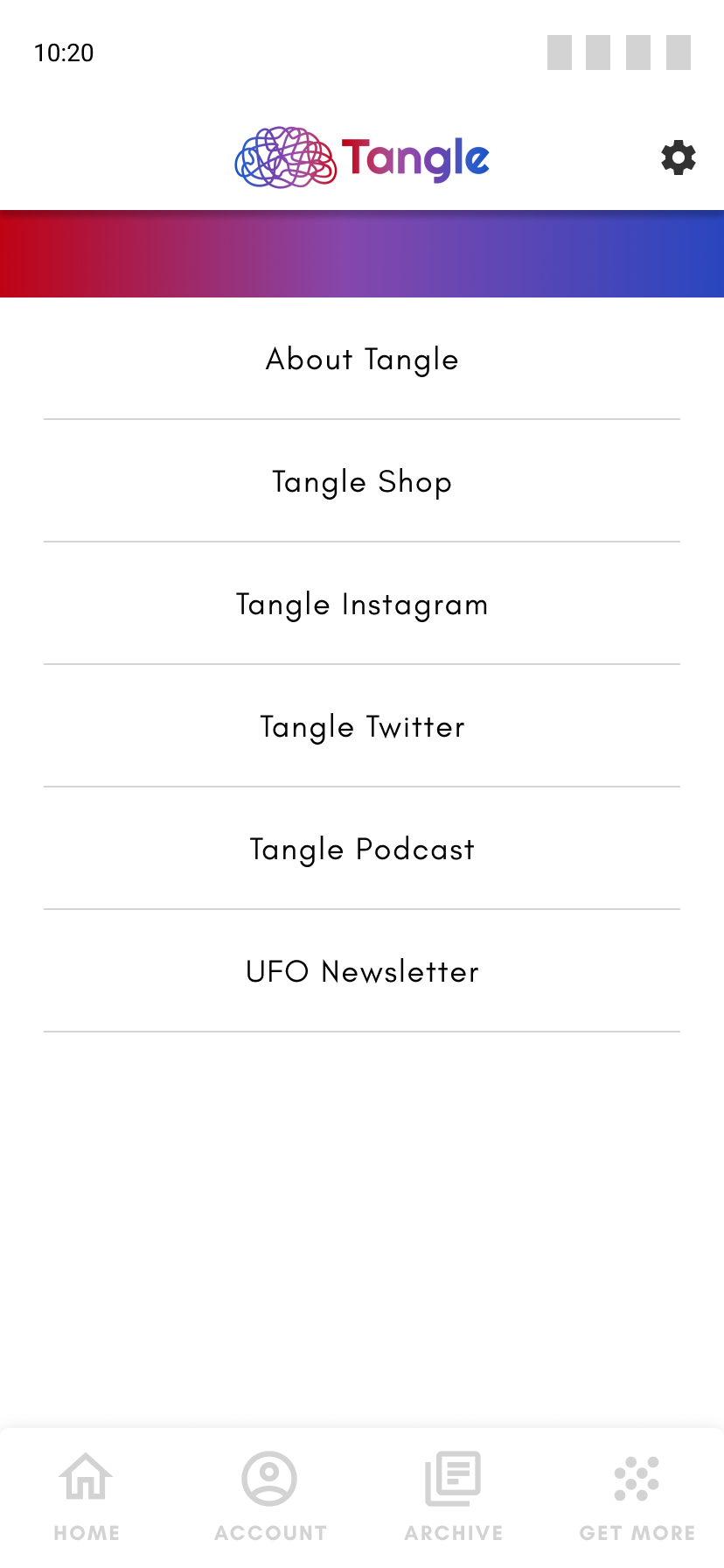
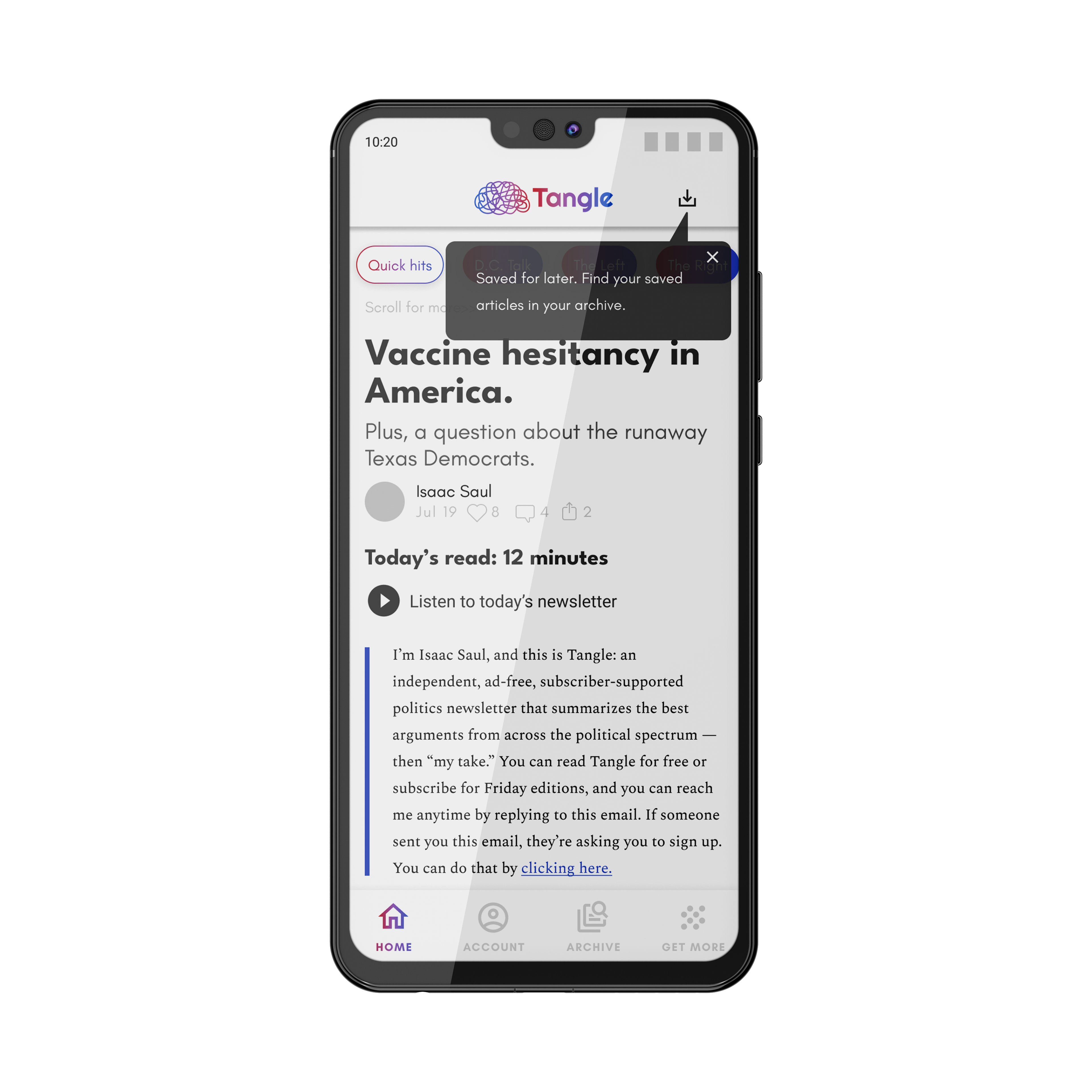
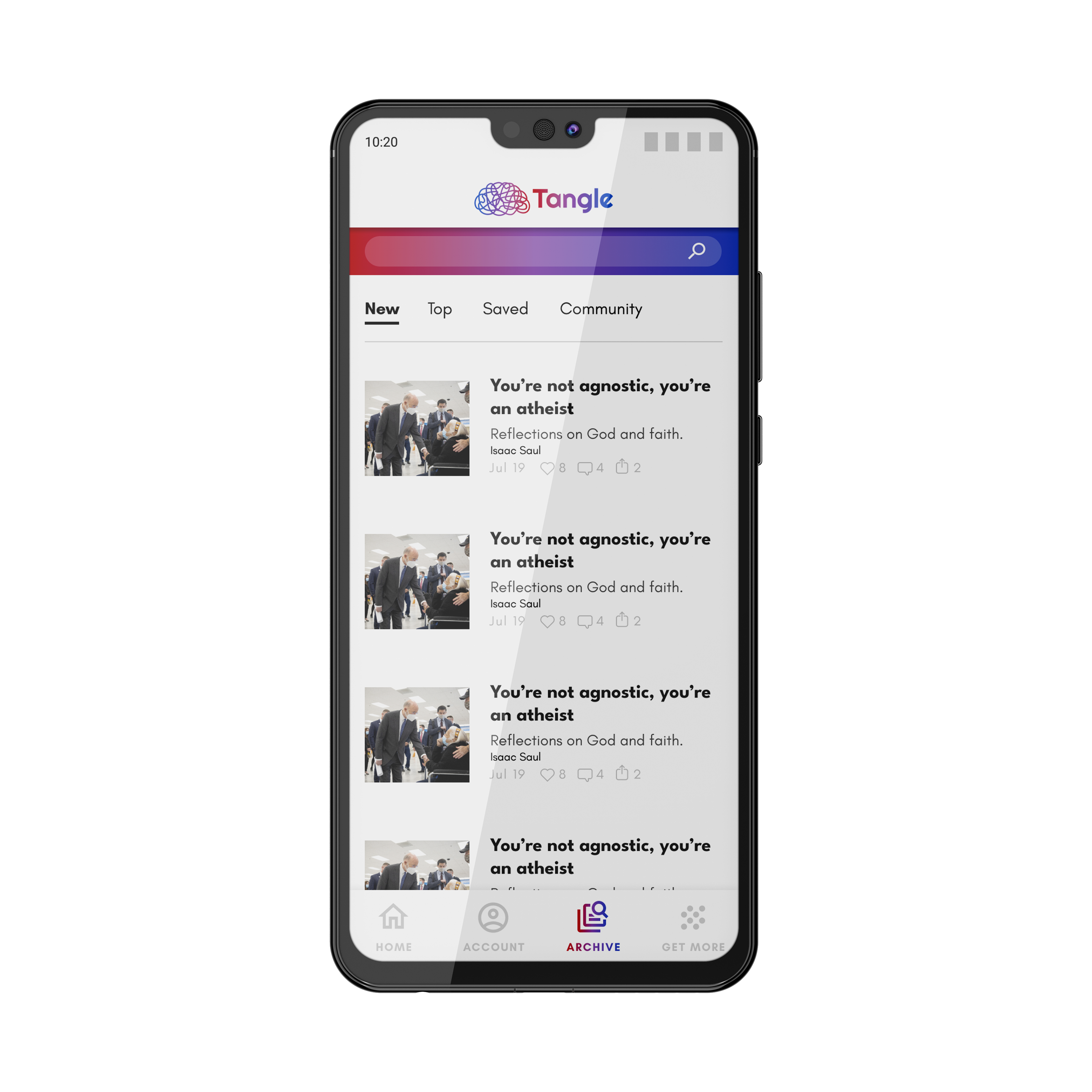
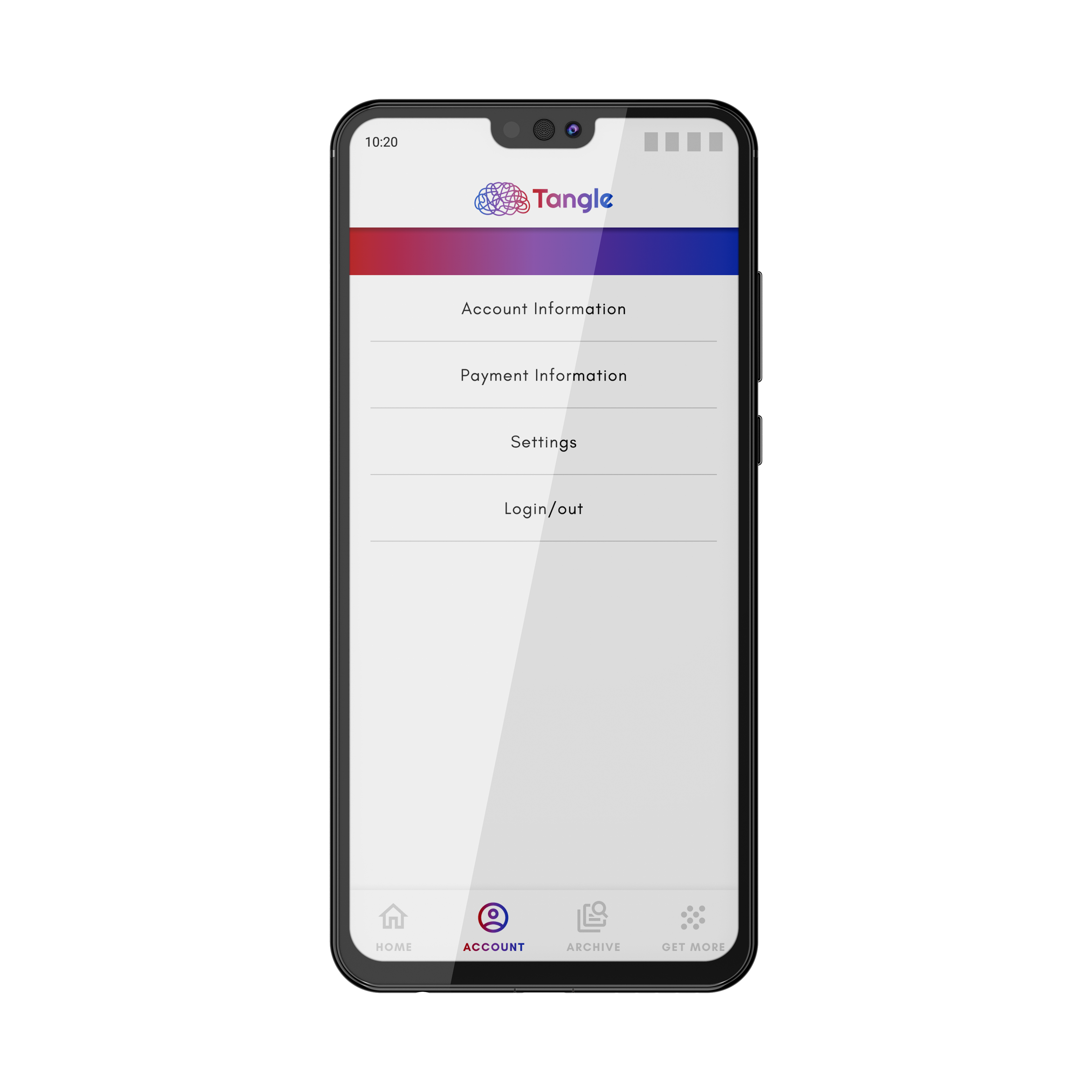
I replaced the settings icon in the top right with the option to save an article for later in case users don’t have time to read that day. This would be stored in their archive. The settings was moved into the Account tab as it was deemed less important and therefor did not need to reside in the main screen.
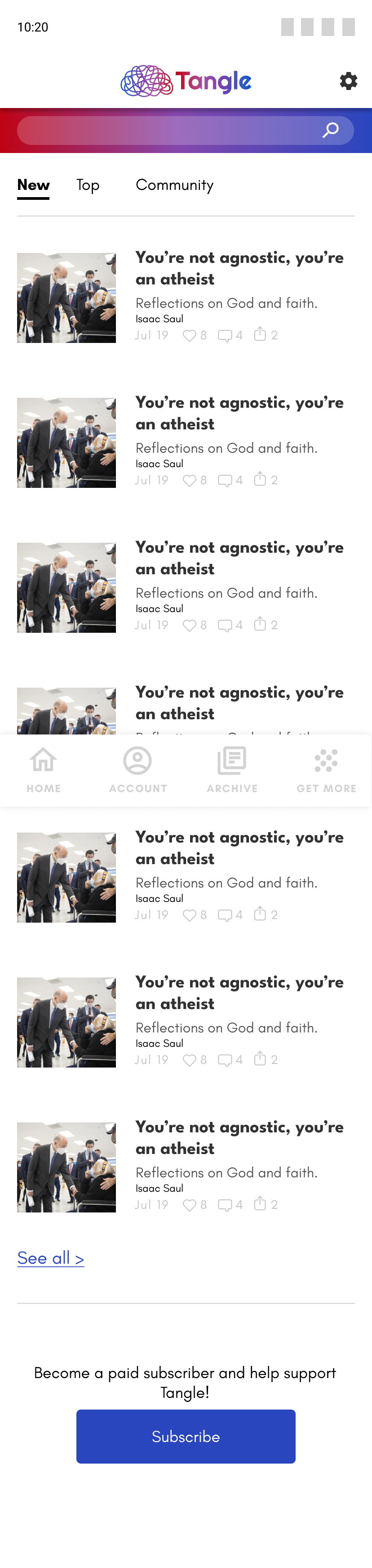
The other big change from usability testing was the inclusion of previous and next buttons that remained in place while scrolling. This way users don’t need to scroll all the way to the bottom of a page to move forwards or backwards. They can make that choice at any point.
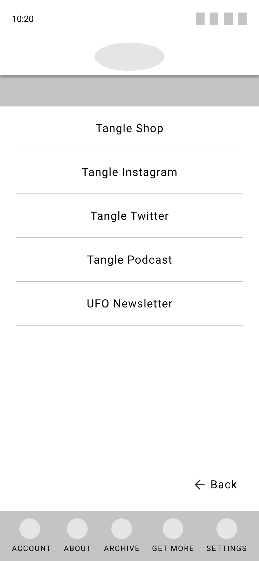
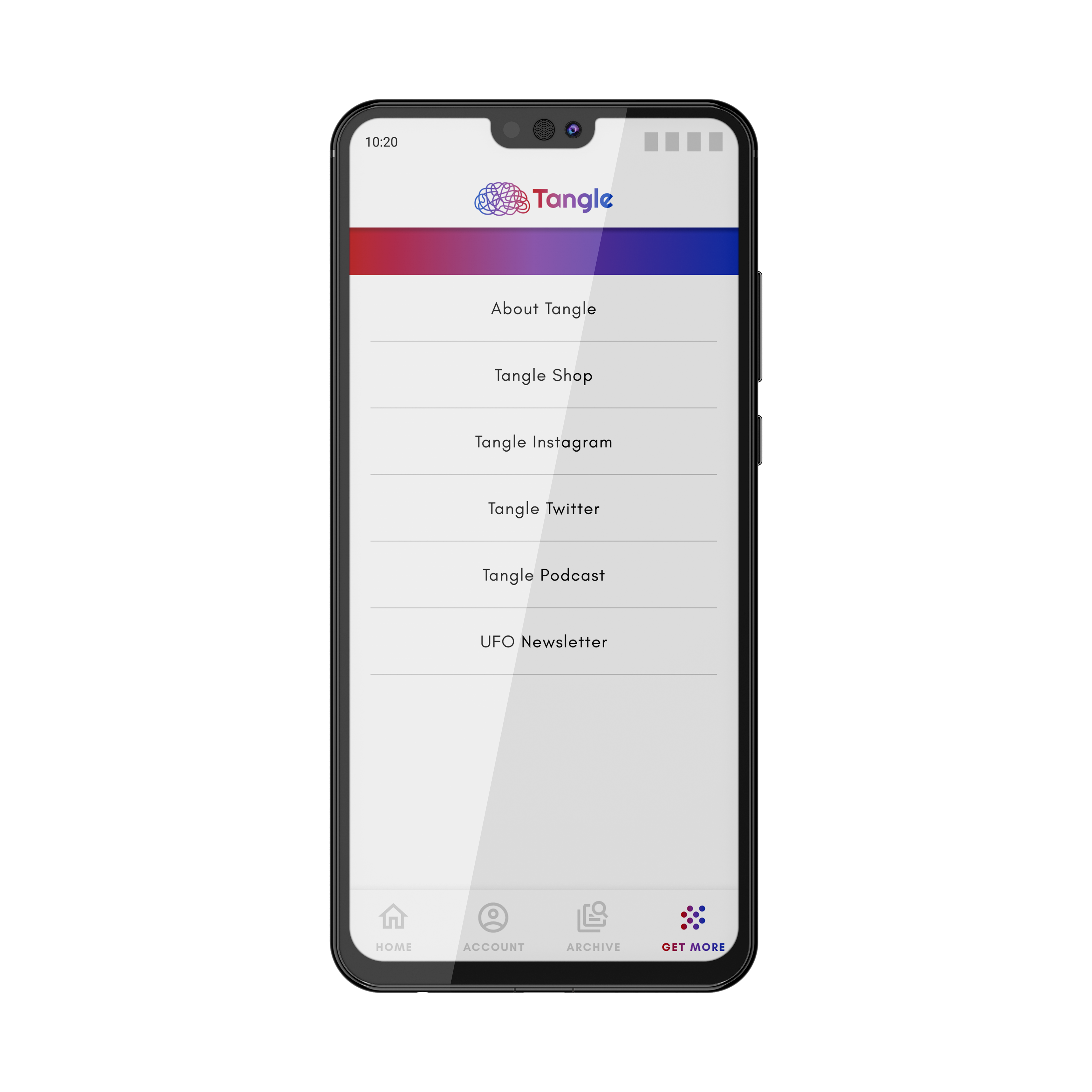
At this point the app is at the point of an MVP. More work can still be done, like how to link to the Tangle shop and other social accounts or the inclusion of a subscribing platform as opposed to being bounced out of the app to Sub Stack, where Tangle currently manages its subscribers.
I made one final change to the upper navigation. Making pill shaped buttons on one level made more clear that the navigation was interactive. While testers had some initial hesitation with the navigation they were able to quickly figure it out and learn how to use the features. It may not be the perfect solution but user learnability was very high so I’m confident going forward that there would be minimal trouble.
I replaced the settings icon in the top right with the option to save an article for later in case users don’t have time to read that day. This would be stored in their archive. The settings was moved into the Account tab as it was deemed less important and therefor did not need to reside in the main screen.
The other big change from usability testing was the inclusion of previous and next buttons that remained in place while scrolling. This way users don’t need to scroll all the way to the bottom of a page to move forwards or backwards. They can make that choice at any point.
At this point the app is at the point of an MVP. More work can still be done, like how to link to the Tangle shop and other social accounts or the inclusion of a subscribing platform as opposed to being bounced out of the app to Sub Stack, where Tangle currently manages its subscribers.
A short disclaimer is that Figma is unable to fully handle a couple features I would include in the final product. This will be explained in the final documentation. For the sake of using the prototype I will say that the Listen feature is meant to fix its position while scrolling but that cannot work with open overlays.
For a full interactive prototype see below.
For a full interactive prototype see below.