
Karl Frazier
UX Designer
Timeline: 2.5 weeks, approximately 80 hours
This was an independent project created for DesignLab. The work is entirely my own and has no connection to Google.
UX Designer
Timeline: 2.5 weeks, approximately 80 hours
This was an independent project created for DesignLab. The work is entirely my own and has no connection to Google.
Project Background
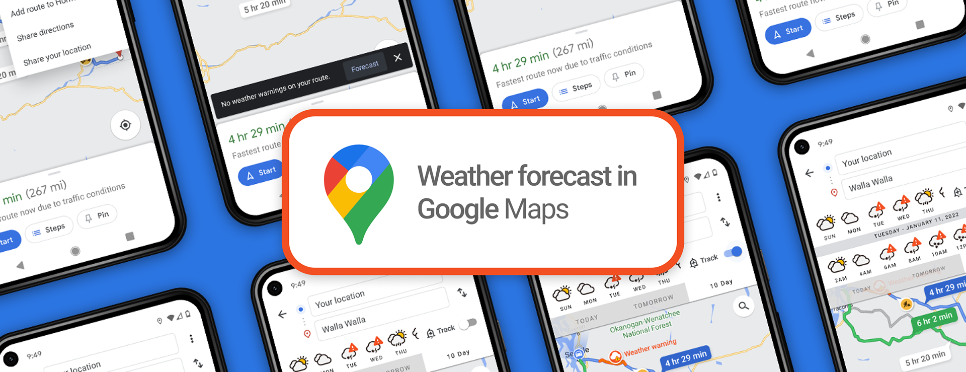
The goal of this project will be to design a system in which users can harness the power of Google Maps to ensure the safest possible trip during times of hazardous conditions. Much like how Maps can show users areas of high traffic, this feature would show you high risk times and areas along your selected route. On many occasions it’s important to know when your route may intersect freezing rain, heavy snowstorm, or similarly dangerous weather events in order to properly plan out the best time/day to leave to ensure the safest possible trip. Furthermore, I hope to be able to back up this goal with research that shows this is a concern worth solving.
The Challenge
Google Maps is an incredibly powerful and complex tool that is harnessed by millions of users ever single day. Because of that complexity the main challenge is going to be figuring out how best to integrate my feature/solution into the existing program without cluttering everything up. At it’s best, design should be simple to understand and easy to use.
We will know success when the feature is seamlessly integrated without disturbing typical user behavior. Google can monitor customer satisfaction as well as expect an uptick in usage. Furthermore, I expect that if this feature were to be implemented Google could track and expect to see a decrease in weather related incidents for drivers using their app.
We will know success when the feature is seamlessly integrated without disturbing typical user behavior. Google can monitor customer satisfaction as well as expect an uptick in usage. Furthermore, I expect that if this feature were to be implemented Google could track and expect to see a decrease in weather related incidents for drivers using their app.
Process
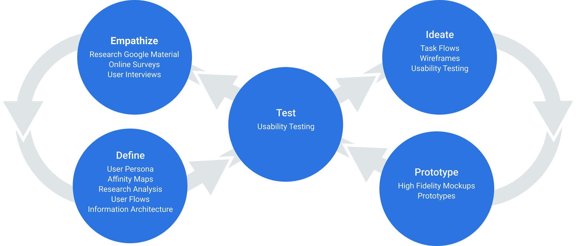
Research
The primary goal of my research was to learn what type of concerns travelers have when planning a long distance drive and how we may be able to design a feature to ease those concerns. There were three different methods used in the research phase; surveys, secondary research, and user interviews.
Online surveys were used to answer a broad set of questions focusing on long distance drives (2+ hours). What is their approach to planning their trips? Have participants altered travel plans in the past due to predictable events? What sort of things might make them change their plans? It was also be used as a way to screen interview participants as the focus will be on “planner” user types.
Some key takeaways from the survey can be seen below.
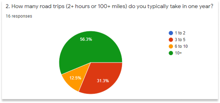
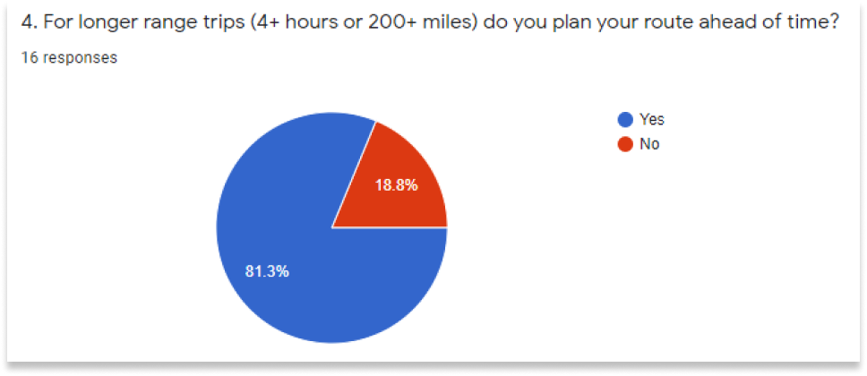
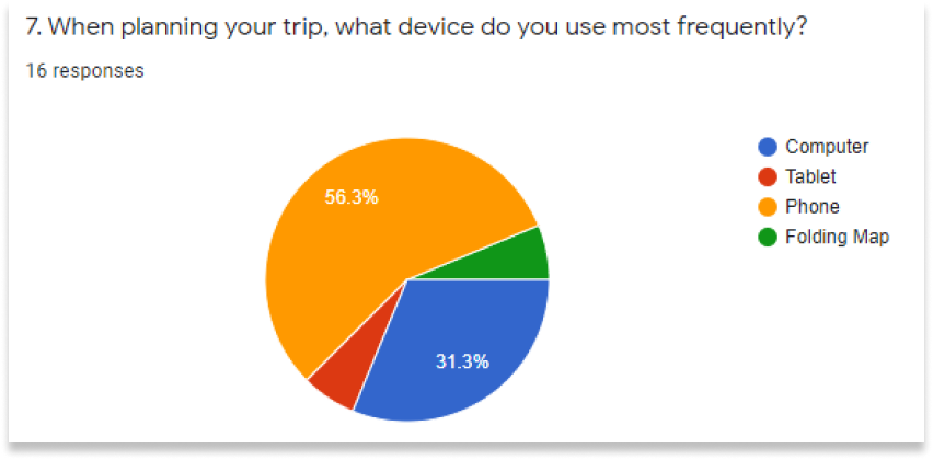
I learned that people are frequently taking long range road trips every single year so already the idea is sounding like it could be useful. They tend to do most of their planning via mobile so the design should be focused in that space. Also, people have to make last minute changes to their plans not infrequently so there is an argument to be made for the validity of this design.
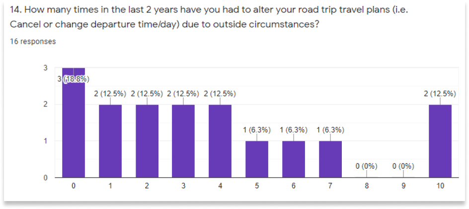
Aside from the more quantitative results, participants were asked to elaborate on a lot of their answers. Through this I noticed a lot of patterns in what sort of situations cause people to postpone or cancel their travel. Common answers included heavy traffic and inclement weather. Google already wans users of heavy traffic so with this added feature for hazardous weather conditions we should be able to expect more and more satisfied users.
Aside from the more quantitative results, participants were asked to elaborate on a lot of their answers. Through this I noticed a lot of patterns in what sort of situations cause people to postpone or cancel their travel. Common answers included heavy traffic and inclement weather. Google already wans users of heavy traffic so with this added feature for hazardous weather conditions we should be able to expect more and more satisfied users.
Synthesizing Research
User interviews were conducted with 4 participants, all of whom had taken the earlier survey and were deemed quality candidates for follow up. Participants were asked a series of questions pertaining to their experience, what worked for them and what didn’t, how they chose to use who they did in the past, what challenges they were met with along the way, and other items that came up within the flow of conversation
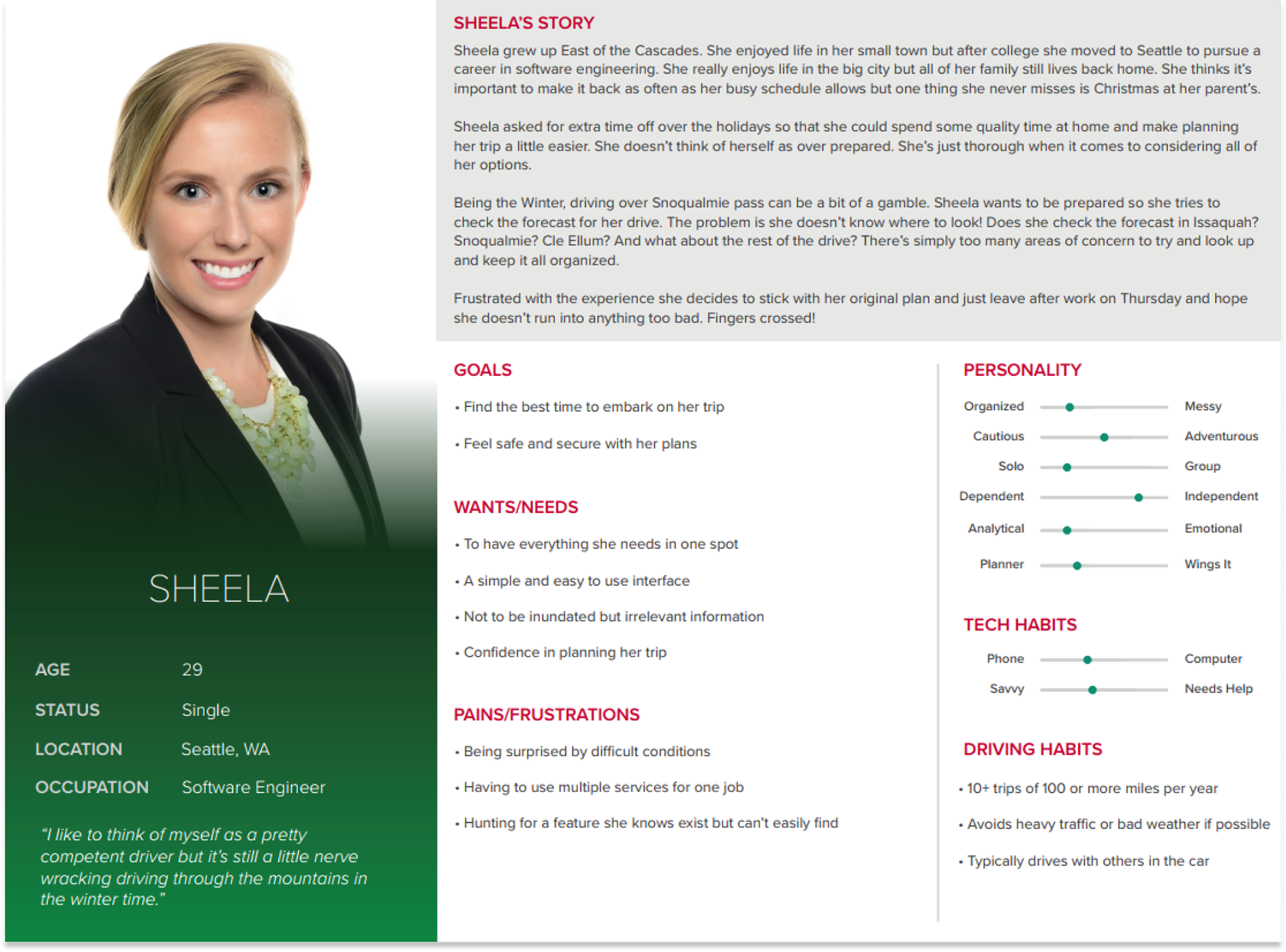
Using those interviews I was able to create a user persona to help guide our decisions with the website design. For the purposes of this feature, our primary user type would be a planner. Our user is someone who is in search for efficiency and safety. She does not want to be overrun with irrelevant information and wants to have confidence is the plans she makes.
Using those interviews I was able to create a user persona to help guide our decisions with the website design. For the purposes of this feature, our primary user type would be a planner. Our user is someone who is in search for efficiency and safety. She does not want to be overrun with irrelevant information and wants to have confidence is the plans she makes.
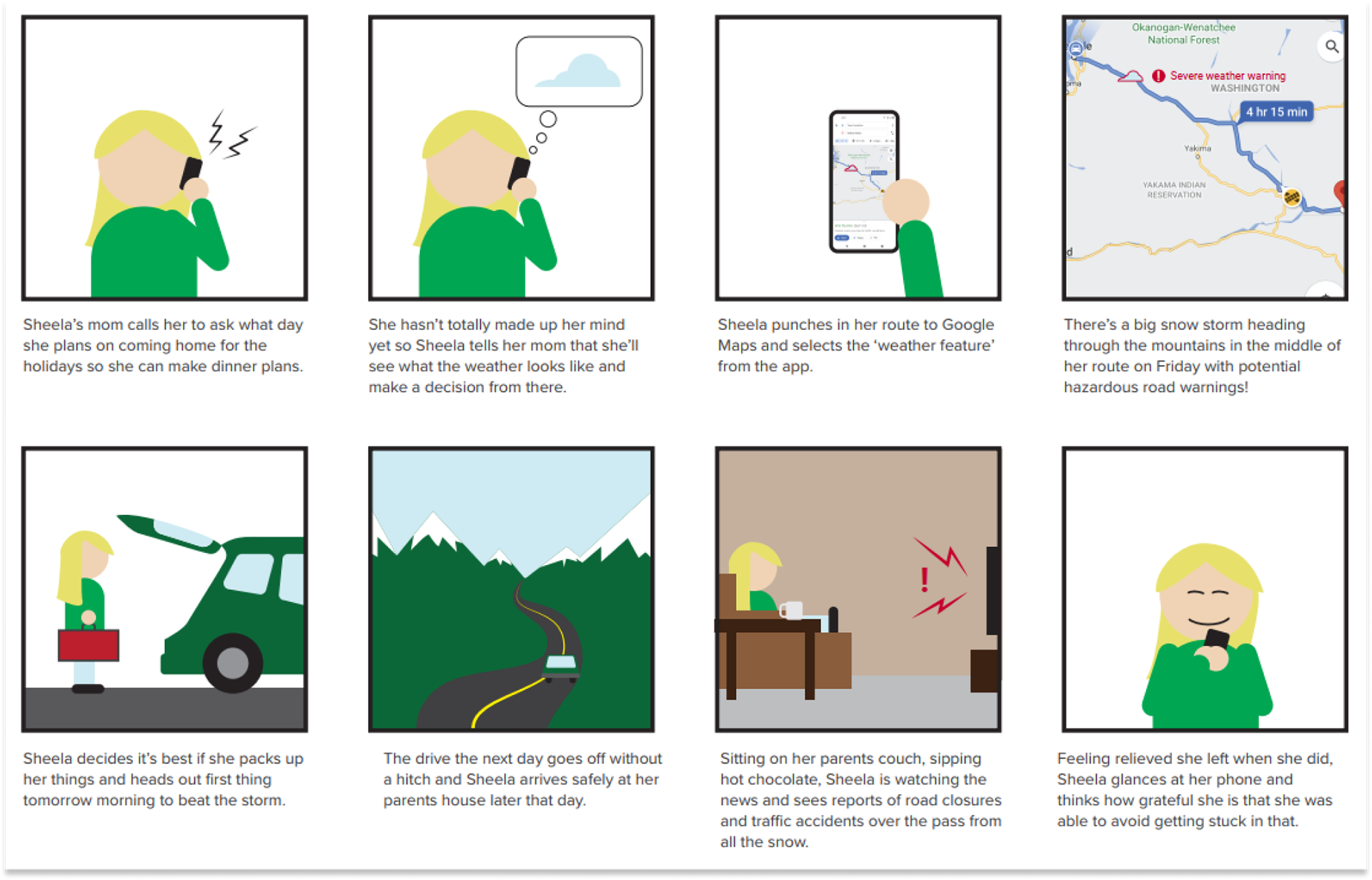
With the persona in mind and the research interviews fresh in my mind I also put together a brief storyboard. The following storyboard shows a day in the life of our user persona, Sheela, in which she is able to successfully use this new weather feature within Google Maps. The story also highlights her emotional state when able to harness the power of this addition.
Ideate
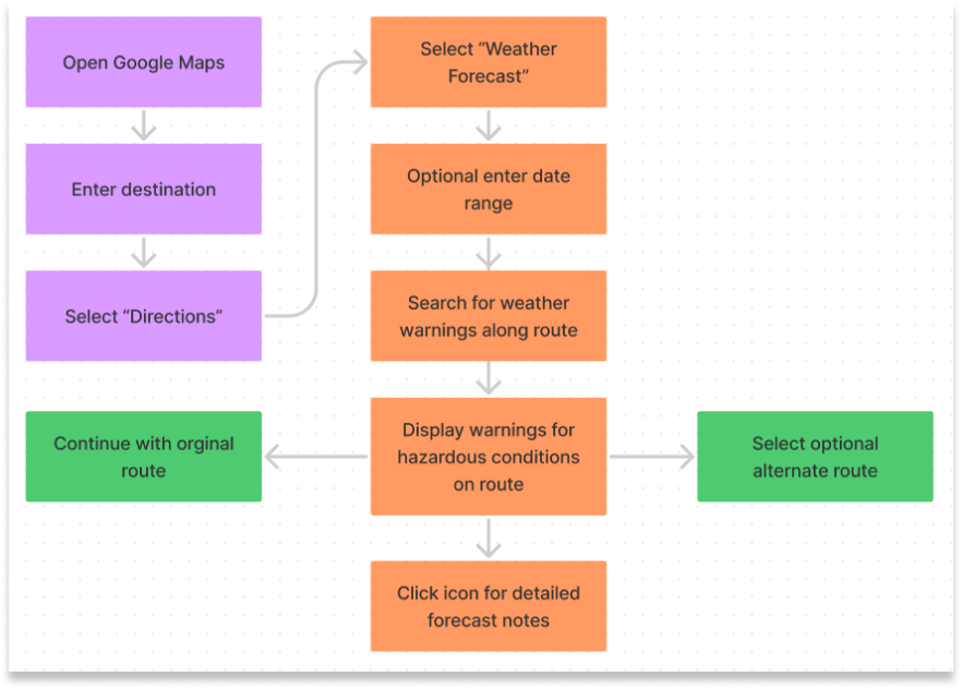
The first step in the ideate phase was to map out the task flow. Part of the beauty of this feature is in its simplicity. You can see to the right that the actual system should be handled in a few simple steps. The purple boxes represent the current flow of Google Maps and then the sections in orange are the plans for this new feature.
Using this feature you should be presented with two options. One option is to remain on your current course but you’re warned of potentially hazardous conditions. The other option is to be shown a safer route that is able to move around the projected storm or whatever is deemed a concern. From there the user can decide to stay the course or take the alternate route.
Using this feature you should be presented with two options. One option is to remain on your current course but you’re warned of potentially hazardous conditions. The other option is to be shown a safer route that is able to move around the projected storm or whatever is deemed a concern. From there the user can decide to stay the course or take the alternate route.
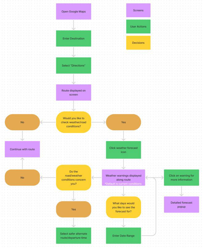
An expanded user flow was also created to give a better idea of where the user decision points and actions come into play. This can be seen in the image below.
Wireframes
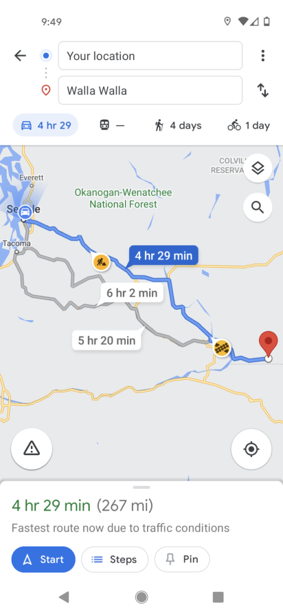
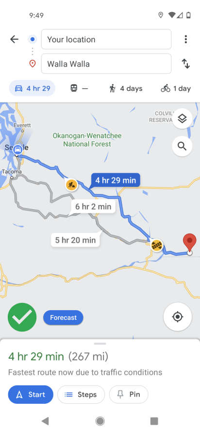
In the early round of wireframes I used a screenshot from my own phone from Google Maps and then tried to fit my ideas within the existing design. The idea here was not to reinvent the wheel but to work within the confines to the system I was provided. My focus was on deciding the best way to initiate the feature and then how to display that there was a weather warning. Below you can see some of my early ideas for both of those situations.
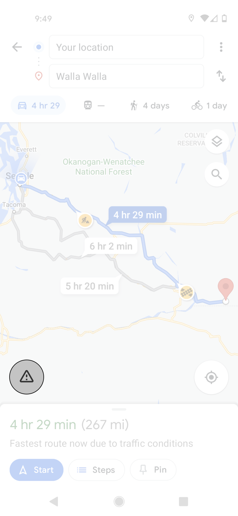
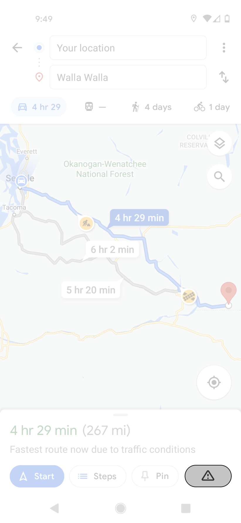
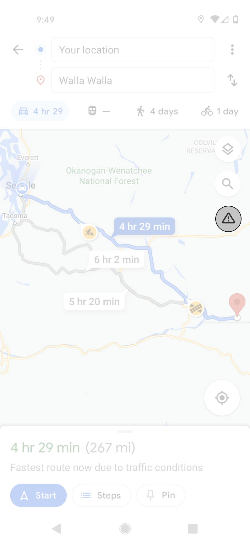
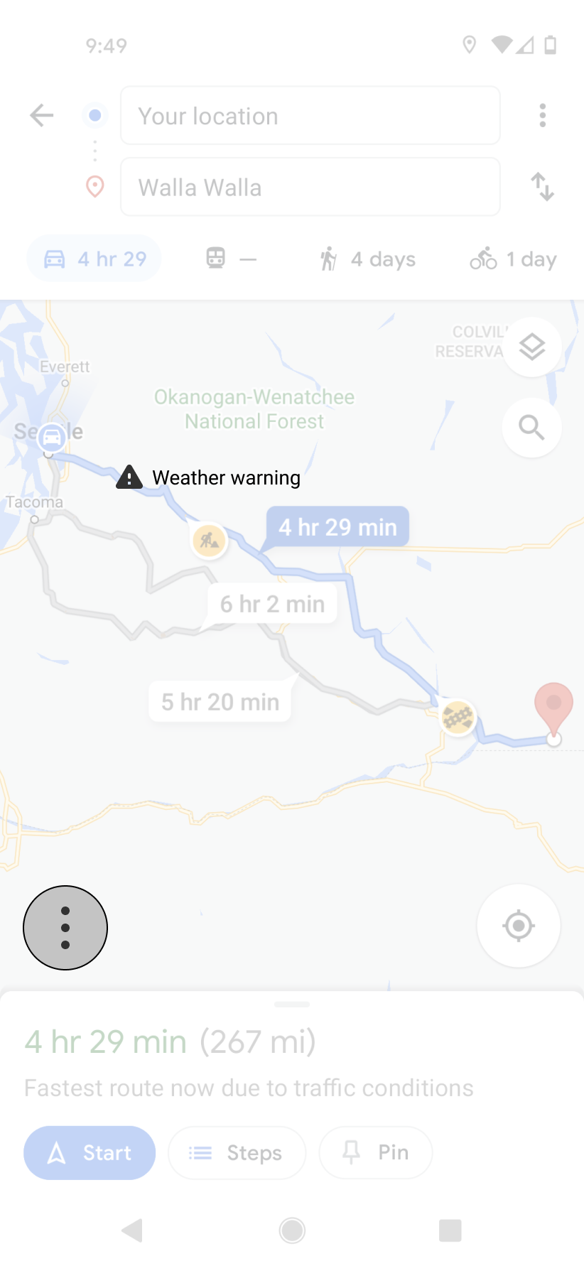

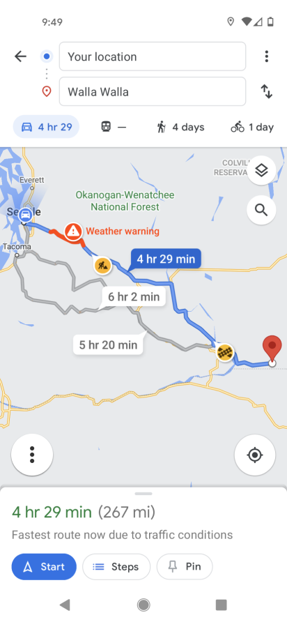
Option 3 for the initiate screen was deemed the most successful after some brief hallway/usability tests. I decided to move ahead with that design and the weather warning displays were all used in an ascending style. The warning would display on screen, you could click for more information, and then get to the forecast from there.
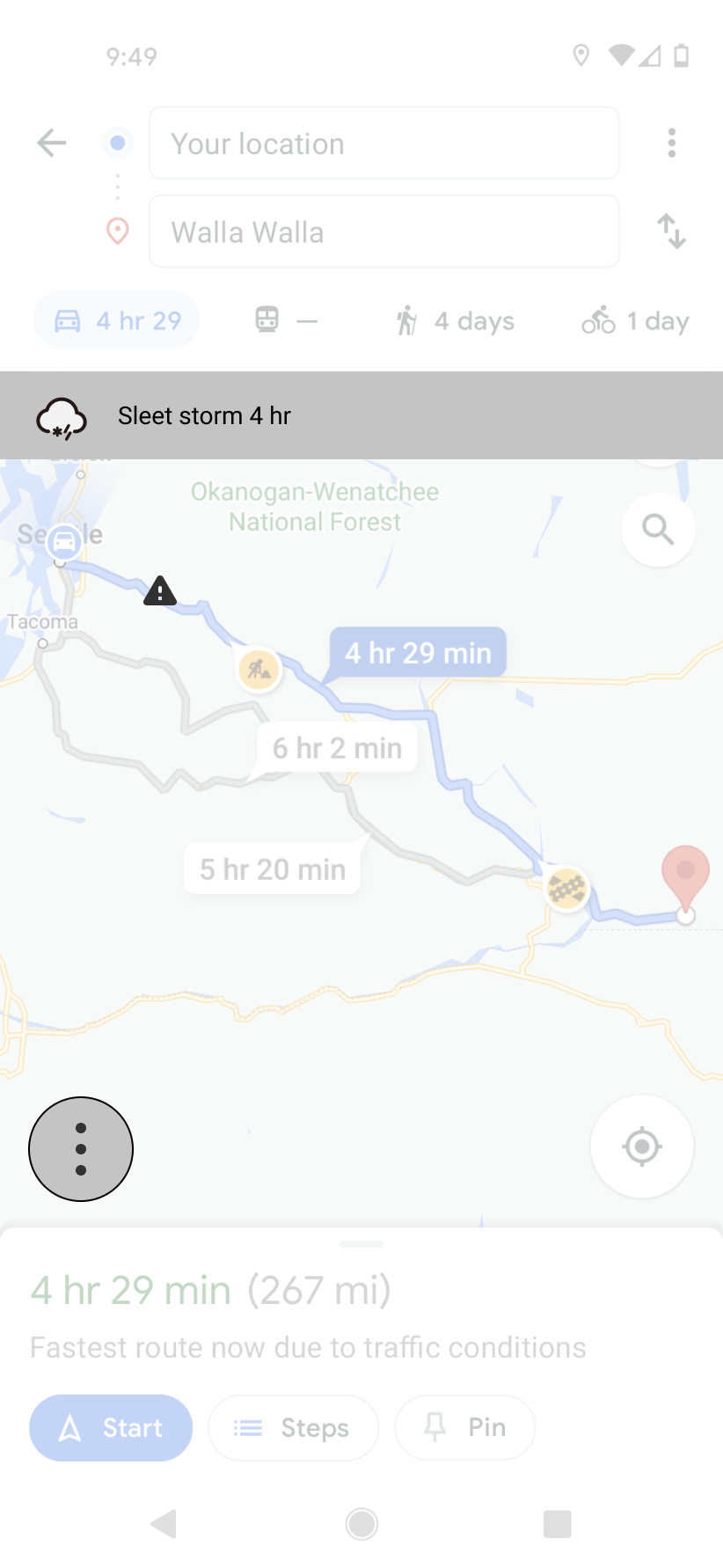
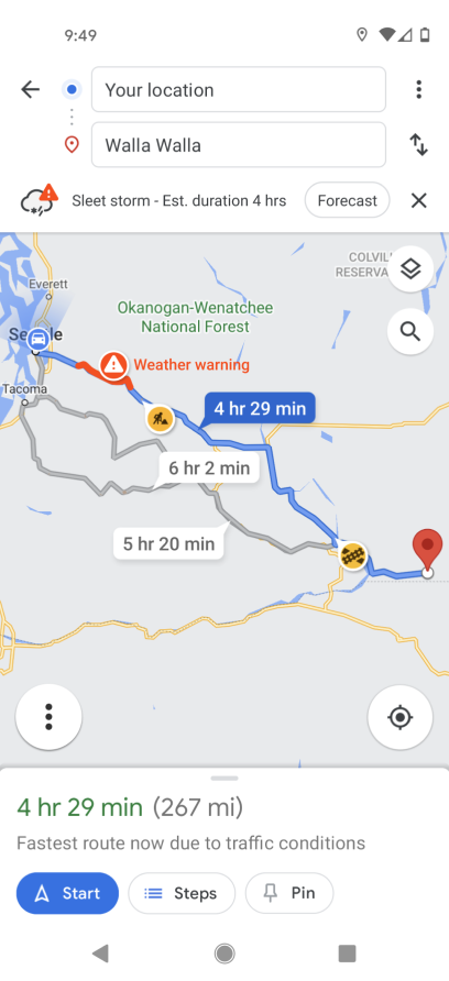
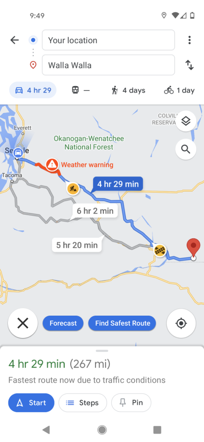
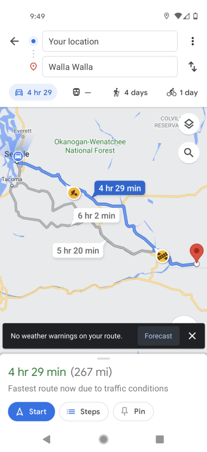
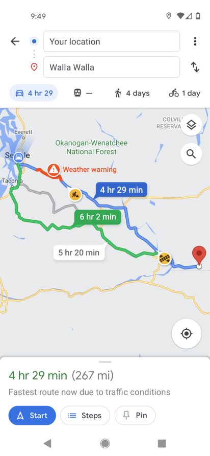
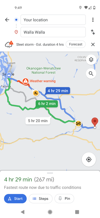
After some further discussions/tests with my advisor and within group critiques I discovered that these were not without their own issues. The concerns people had were in the warning display and the forecast screen. Hazardous weather situations are not localized to a small point so I needed some way to display how much of the route was contained within the storm system. Imagine a weather radar screen overlayed on top of your route (as seen below).
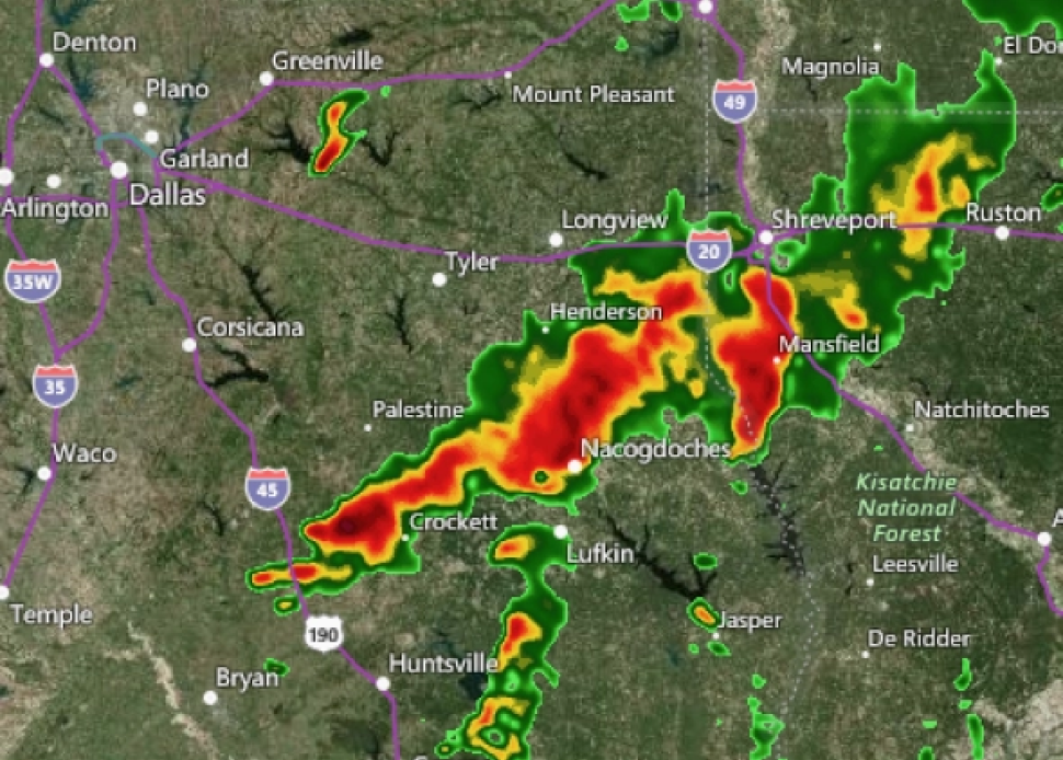
My system should be able to take that overlay and show the portion of the route that is set below the concerning area. Essentially, if the route is underneath anything from yellow to red, it should be seen on your screen. In order to not overwhelm the screen with all this data I decided to use Google’s current system for high traffic areas but in a different color.
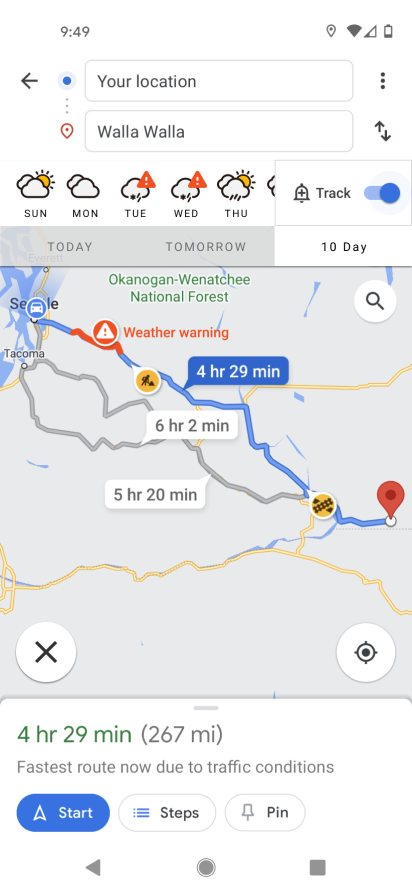
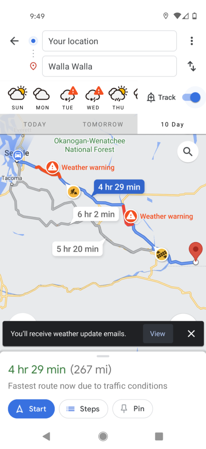
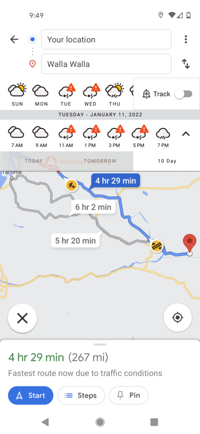
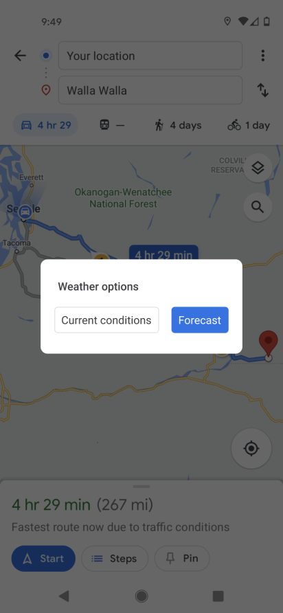
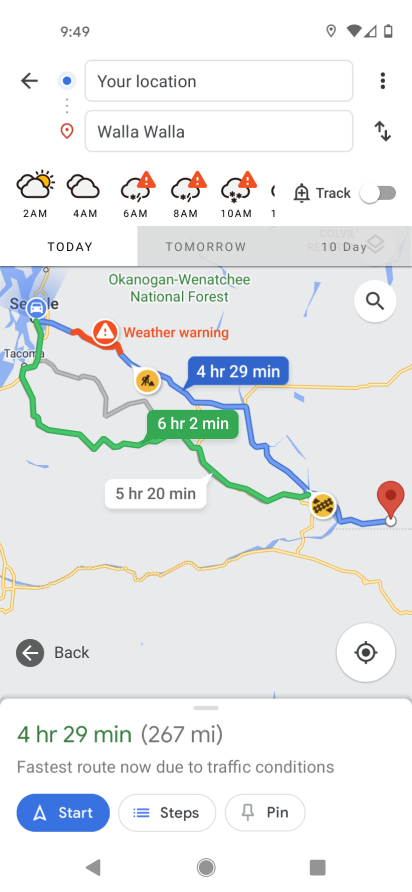
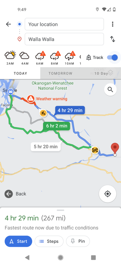
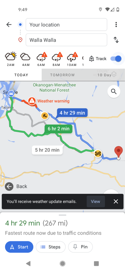
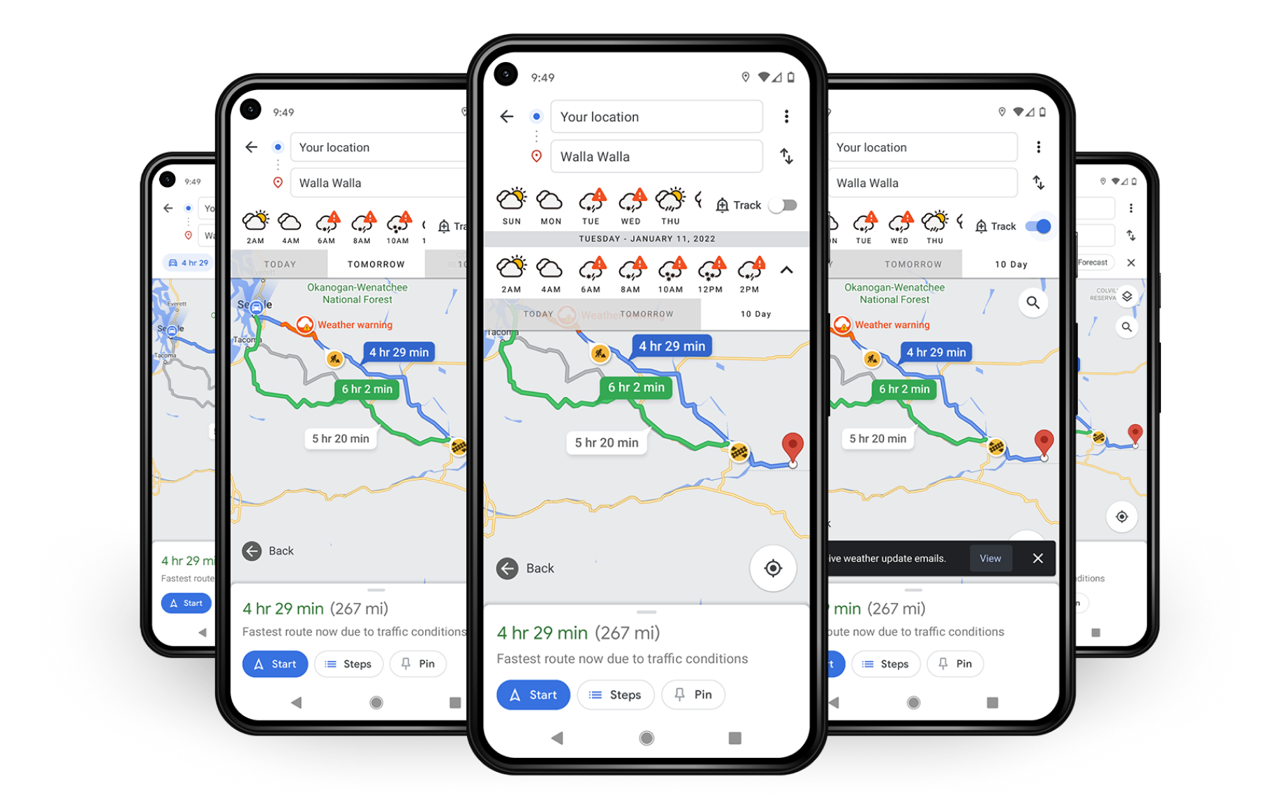
The primary change made to the forecast screen was to expand the size of the clickable area to account for touch. I adjusted the buttons to cycle between Today, Tomorrow, and 10 day to 40px tall, making them much easier to operate with the users fingers. Example screens of high fidelity mockups can be seen below.

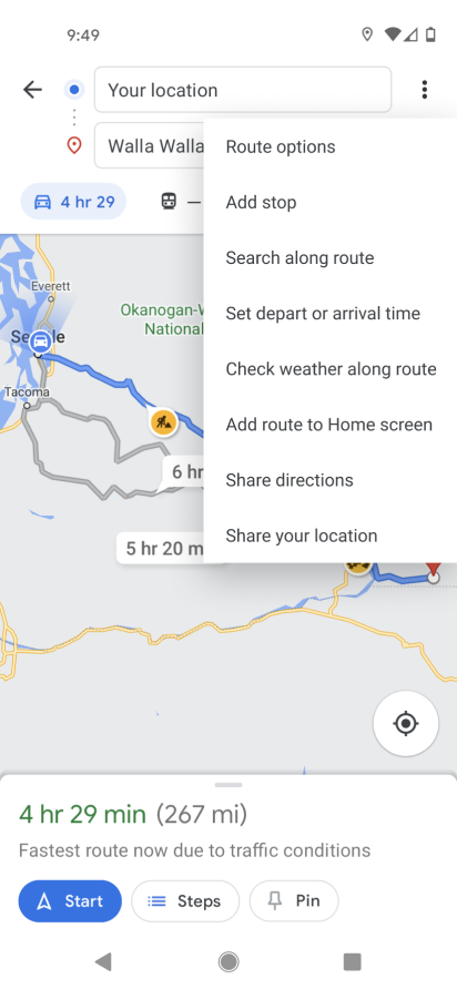
UX design being the iterative process that it is, I think took my newest prototype to testing. In this round I learned that my feature was being too much the focal point within the Google Maps system. The goal was to integrate my feature, not lay it over the top. So after studying the current way Maps handles most of their features I decided to place my design within the options kebab menu with a follow up screen to ask the user if they’d like to see a long term forecast or the current road conditions.
Prototyping
I created a usable prototype for further testing. Users were tasked with using my feature to check for hazardous conditions along their route and then decide which day would be safest to take their trip. You may have also noticed that the previous screens indicated a longer route in green. This was at the request from group critique to include a safer route option. When applicable, the feature will show a safer route that avoids the worst part of the storm and the user can then decide to take the safer route or continue on their original one, albeit more prepared for what’s to come.
The test was conducted with 4 participants, also pulled from my earlier survey. Participants have a lot of experience driving long distances multiple times throughout the year and had expressed interest in viewing my prototype. I shared the prototype online and observed while the participants shared their screens with me as they operated the prototype.
Key talking points and quotes from the usability tests were written down and used to create an affinity map. Overall feedback was very positive and the test went very smoothly in all cases. Participants were finding everything without any trouble, harnessed things like my included back button without being prompted, and were quickly able to locate the dropdown kebab menu in the event that no warnings were displayed but they still wanted to forecast.
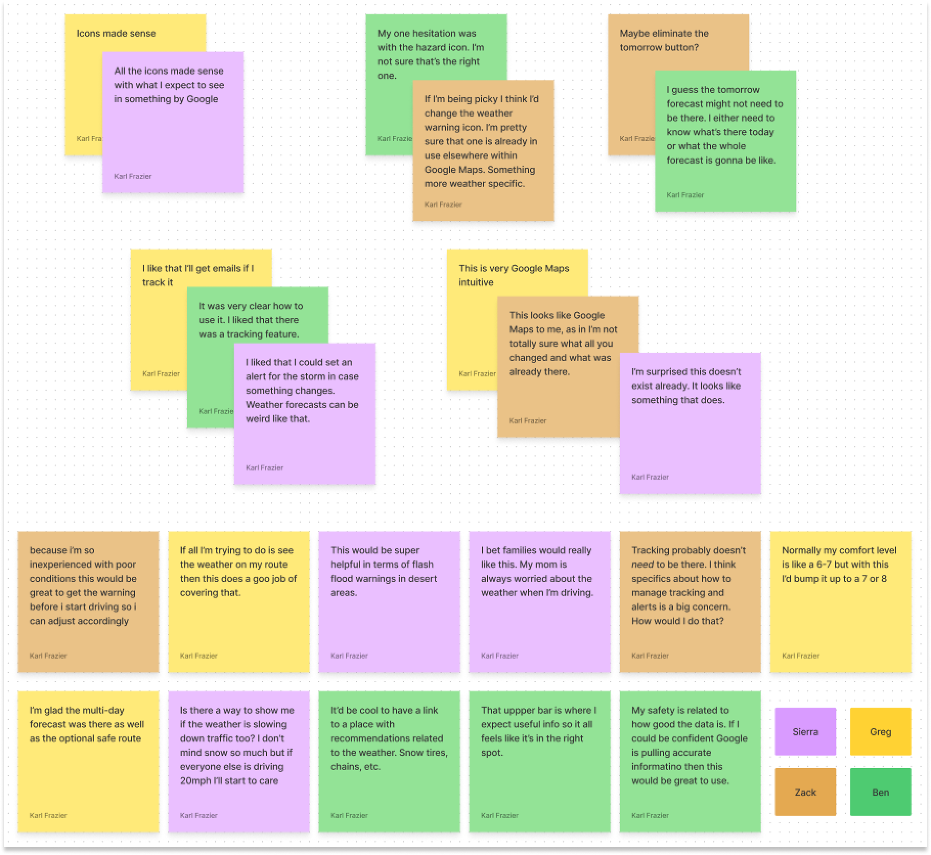
Some minor suggestions to come from the usability test were to change the weather warning icon to something more weather specific and also that the addition of the Tomorrow button may not be needed. I decided that the icon switch made sense but I would leave the Tomorrow forecast button. The later idea was because users only suggested that after they were prompted to think of something they could eliminate without ruining the experience and this is also a familiar enough design pattern that it makes perfect sense for all users to have it be there.
Final Product
After multiple iterations on the high fidelity mockups and prototypes paired with group critiques and user feedback/usability tests I put together a final prototype. This project has been stripped down to its bare essentials, making the user experience as quick and painless as possible. It fits smoothly within the existing Google Maps universe and is able to accomplish the user goals in as few steps as possible.
Find the prototype in Figma at this link: https://www.figma.com/proto/p3TcZY22LcUo7q3DUcLGrj/Google-Maps-Weather?page-id=134%3A19357&node-id=134%3A19413&viewport=636%2C278%2C0.14263339340686798&scaling=scale-down
Next Steps
The next steps for this project would be to dive into some more details on how to fully take advantage of the feature. While it has the ability to track storms there needs to be more work put into how the tracking functions. How the tracking operates, can users customize what they track, how they decide to turn off an alert later on. These are all questions that still need answers.
As mentioned in one of the usability tests, I would also like to have a way to link users to suggestions on how to properly prepare for the hazardous conditions. Whether Google contains their own recommendations or links to an outside source like the local department of transportation is yet to be determined.
As mentioned in one of the usability tests, I would also like to have a way to link users to suggestions on how to properly prepare for the hazardous conditions. Whether Google contains their own recommendations or links to an outside source like the local department of transportation is yet to be determined.