Karl Frazier
UX Designer
Timeline: 2.5 weeks - Approximately 80 hours
This an ongoing project. The case study below is presented as part of the UX Academy with DesignLab but the design of the website continues as I work with the client to gather final imagery and finish writing copy.
UX Designer
Timeline: 2.5 weeks - Approximately 80 hours
This an ongoing project. The case study below is presented as part of the UX Academy with DesignLab but the design of the website continues as I work with the client to gather final imagery and finish writing copy.
Project Background
Rush Team Apparel (RTA) creates custom athletic apparel for teams and events in Washington and Oregon. Customers can order their own custom gear for their specific team or event and RTA can handle the design, sourcing, production, and sales of all merchandise. RTA also creates merchandise for Washington and Oregon major sporting events, such as the High School State Championships, and will setup and sell on site or customers can visit their store to order away from the event.
The Challenge
RTA needs to host multiple online stores for event specific merchandise (i.e. WA High School State Championships for each sport) as well as inform customers that they make custom gear for individuals/teams/events and allow them to place custom orders. That means users are both individual customers as well as larger organizations looking for a merchandise supplier. Currently their site only shows the State event stores. Furthermore, RTA has separate sites for WA and OR as well as a sister company (Shirtworks West) that focuses on apparel for businesses and other non-team related entities so they would like to be able to redirect relevant customers there.
“We want people to get on our page and know what we do and that we offer more than just state stores.”
“We want people to get on our page and know what we do and that we offer more than just state stores.”
Process
Research
The primary goal of my research was to learn why people might want to order custom designed merchandise, how they expect to be able to create it, and how we can best cater our design to satisfy their needs. There were three different methods used in the research phase; surveys, competitor analysis, and user interviews.
Online surveys were used to get some broad strokes answers to questions like ‘What factors do users consider when shopping online?’ or ‘What companies have users worked with in the past to produce custom clothing?’ They were also utilized as a way to narrow down a field of potential interview participants.
Online surveys were used to get some broad strokes answers to questions like ‘What factors do users consider when shopping online?’ or ‘What companies have users worked with in the past to produce custom clothing?’ They were also utilized as a way to narrow down a field of potential interview participants.
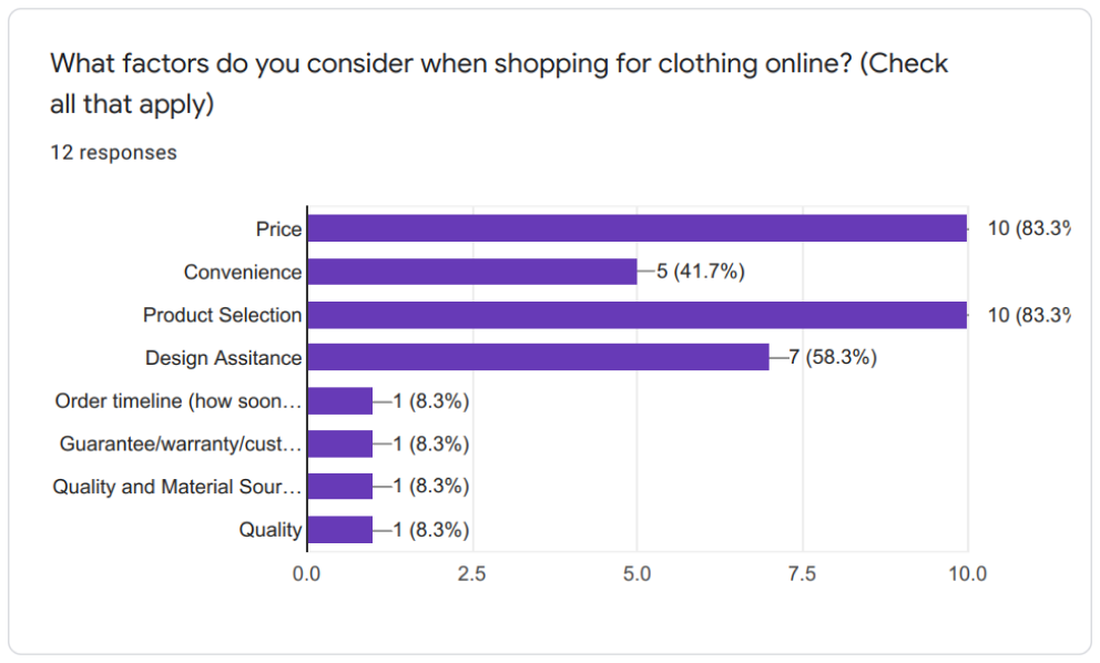
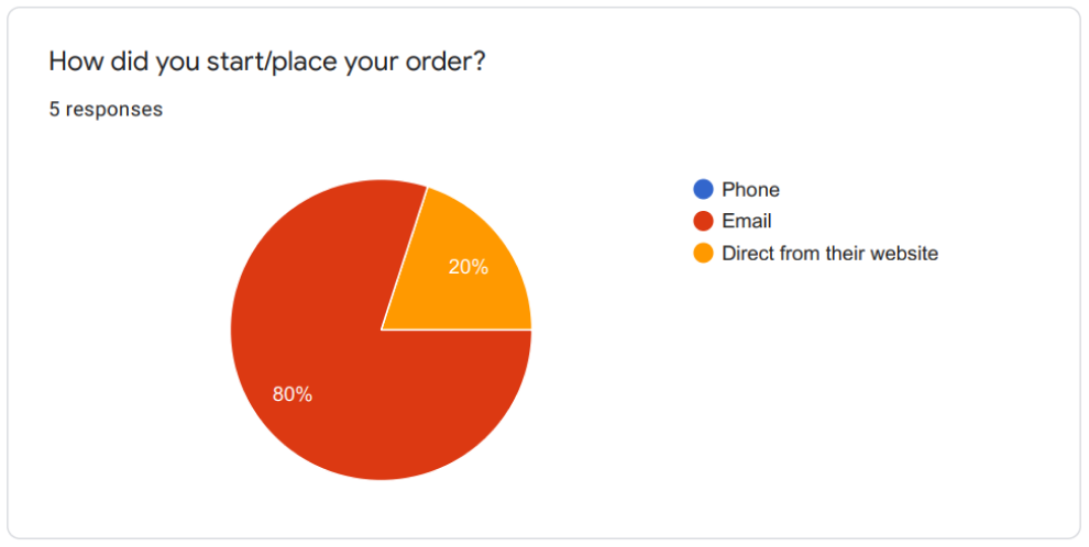
Some of the most telling results were factors considered and how users generally placed their orders. It appears that most users, when ordering in the past from other companies, used email to place their orders. They felt that developing a system to order online was unnecessary and actually preferred having a representative to speak to in order to insure their order was produced correctly.
We can also see that the majority of responses labeled price and product selection as the top reasons they choose one company over another. Going forward this will be very useful information on what areas to highlight for Rush Team Apparel.
After putting out the survey I did some research on some of the competitors in the same field. Fine Designs was specifically mentioned by the stakeholders as one of their main competitors. Custom Ink and Gameday Sportswear were the other biggest players that were revealed in a collection of Google searches. The results of the research can be seen below.
User interviews were conducted with 5 participants, all of whom have previous experience ordering custom apparel online. Participants were asked a series of questions pertaining to their experience, what worked for them and what didn’t, how they chose to use who they did in the past, what challenges they were met with along the way, and other items that came up within the flow of conversation. I also used it as a chance to do some brief usability testing on the current website to both see if there was anything on the currnet site worth keeping but also verify my reasons for changing certain aspects of the site to the stakeholders.
Using those interviews I was able to create a user persona to help guide our decisions with the website design. Rush Team Apparel has 3 different user types but for the purpose of this project we wanted to focus on the user looking to make a team order of custom items as that is the business area they are hoping to grow. Our user is someone who is motivated by a good deal and quality customer service. He appreciates high quality products with a diverse selection and values a company with strong communication. He doesn’t like being burdened with extra or confusing information and would like to be able to easily navigate the website in order to find what it is he needs.
Using those interviews I was able to create a user persona to help guide our decisions with the website design. Rush Team Apparel has 3 different user types but for the purpose of this project we wanted to focus on the user looking to make a team order of custom items as that is the business area they are hoping to grow. Our user is someone who is motivated by a good deal and quality customer service. He appreciates high quality products with a diverse selection and values a company with strong communication. He doesn’t like being burdened with extra or confusing information and would like to be able to easily navigate the website in order to find what it is he needs.
Information Architecture
Mapping out the user flows was a good way to get started with the information architecture. With three different types of users it was important to make sure all of their needs would be satisfied. I did this by making a simple flowchart for each user type arriving at the homepage and what they would need to do in order to accomplish their goals.
I spoke with the stakeholders about what needs to be included and how best to organize everything. The old site was haphazardly put together over time and as a result things got out of hand and disorganized. We thought it was best to have a clearly defined section for each user type (Team Orders, Event Directors, and Event Attendees) as well as places to learn more about RTA and get in touch. From the above flowchart you can see that for event directors and team orders they merely need to get directed to a page that prompts them to get in touch with RTA.
The major challenge is how to organize so many mini online stores. For every organization RTA works with (WIAA, OSAA, West Central District III, etc.) there is a potential for 10+ stores. This complexity is noted in the site map by the light purple rectangles that represent every individual store.
The major challenge is how to organize so many mini online stores. For every organization RTA works with (WIAA, OSAA, West Central District III, etc.) there is a potential for 10+ stores. This complexity is noted in the site map by the light purple rectangles that represent every individual store.
By following the flowchart from before I was able to narrow down the site navigation to the bare essentials to make life easier for the user. Every user type’s needs should be represented and easy to navigate to in a minimal number of steps.
Wireframing
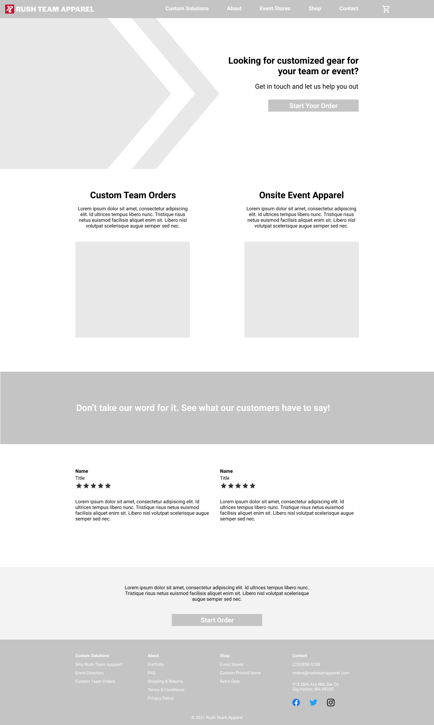
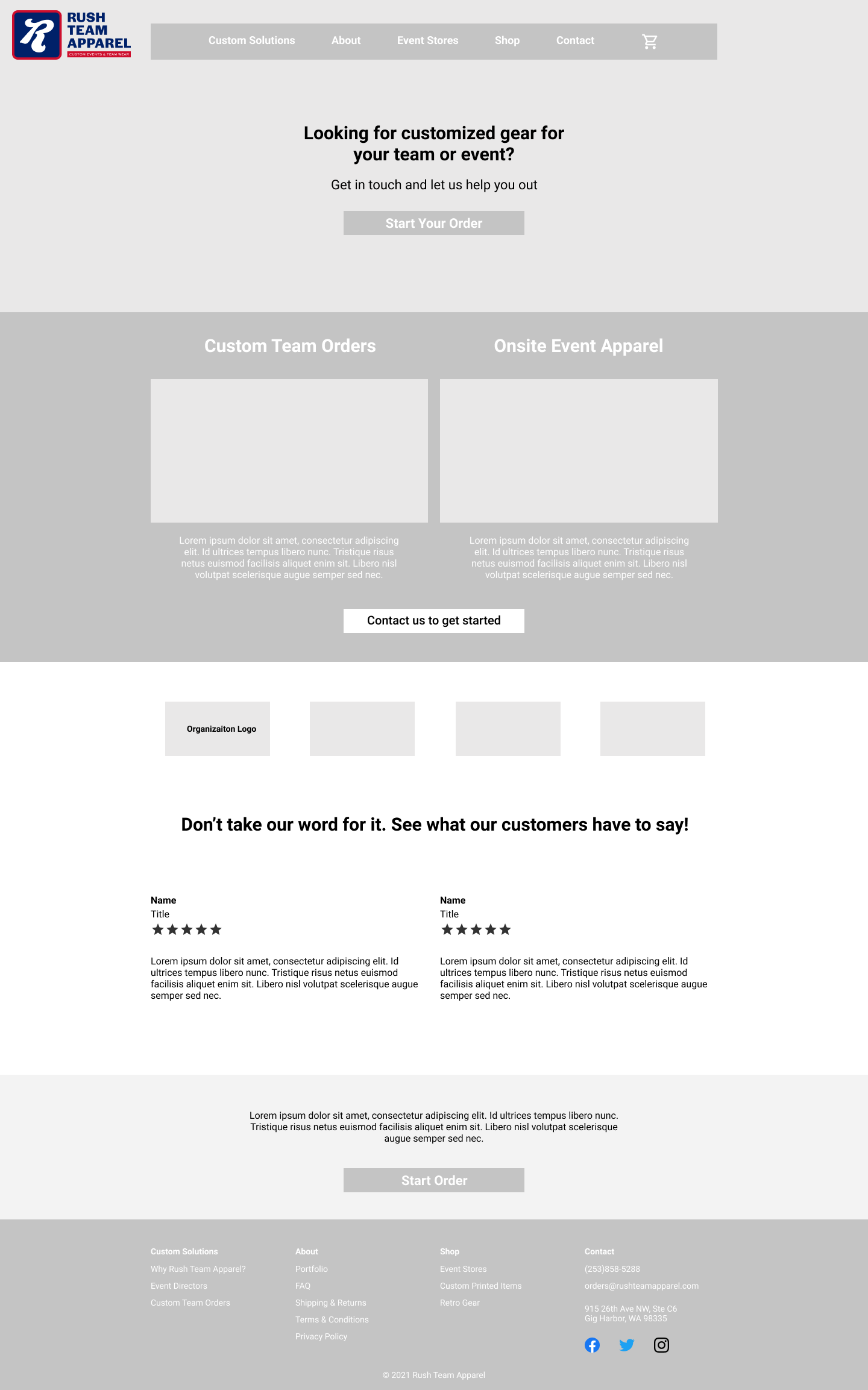
With a completed site map it was now time to begin sketching out the pages themselves. I started with the homepage as that would guide the rest of the design. The majority of the other pages would be simple collections of information if the user wanted to learn more but ideally users will land on the homepage, decide this company is what they were looking for, and then go directly to the contact page via the CTAs.
I took a rapid fire approach to knock out ideas as quickly as they came. The goal was to follow the “no idea is a bad idea” path and get as many things down as fast as possible. There’s good and bad in each one but afterwards I can take the best elements and combine them together.
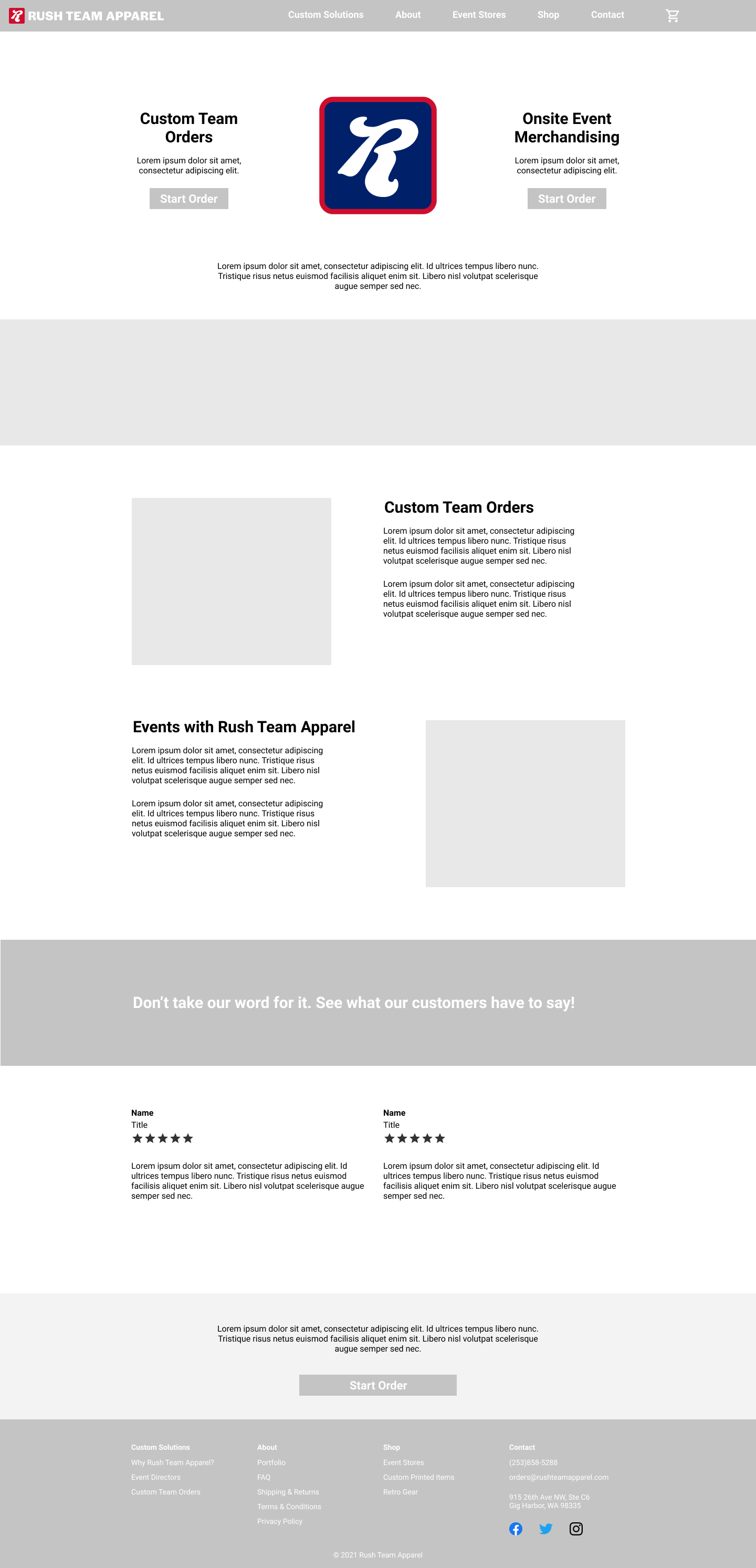
Below is the completed digitized wireframes made in Figma for the homepage based off my earlier sketches.
Logo and Branding
One addition to this project I took on was to update the company logo and branding. Their old design is out of date and disjointed so I wanted to add a fresh rebrand to this project. After working with this company for the last few months ass a freelance designer I had a good idea of the company values and goals and used those to inform my design.
They were hoping for something that represented classic American athletics and gave a strong sports vibe. I wanted a design that could be used all the way from favicons to giant billboards as I believe responsive logo design is very important. I also took into consideration how the logo might print as they intend to be printing the design on clothing as a sponsorship logo. Below you can see the old vs. new logo as well as some of the variations.
They were hoping for something that represented classic American athletics and gave a strong sports vibe. I wanted a design that could be used all the way from favicons to giant billboards as I believe responsive logo design is very important. I also took into consideration how the logo might print as they intend to be printing the design on clothing as a sponsorship logo. Below you can see the old vs. new logo as well as some of the variations.
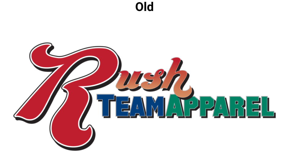
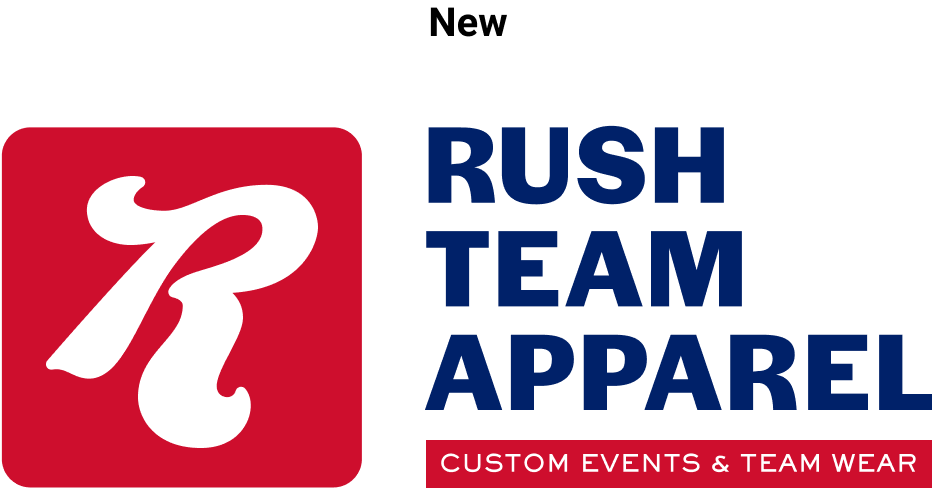
I thought the R from their original logo would make a strong logo mark and was something to build off of. The italicized look and the flowing script looks like a vintage sports logo. You can easily envision the mark used as a custom tag on their products. Using a bold sans serif font brought the design more into the modern era and kept things clean and simple. The colors are classic American and really connect with the values of the company.
High Fidelity Prototype
The next step was to turn the wireframes into a high fidelity prototype. Using the color scheme from the new logo I created a simple style tile to aide in some of the design decisions. The client also mentioned that part of their current problem was how bad their site is on mobile so I wanted to be sure this site would work for desktop, tablet, and mobile.
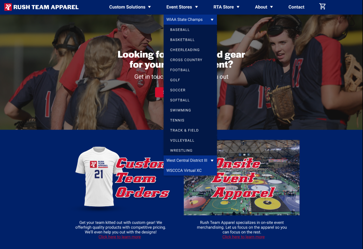
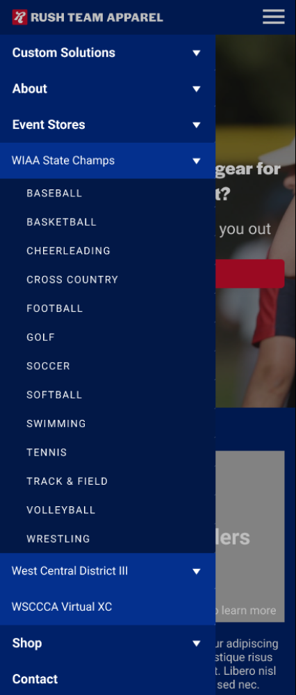
The biggest focus of my attention was on the in site navigation, specifically the navigation bar. I needed a way to allow users to navigate straight to the store of their choosing quickly and intuitively. I came up with this nested accordion menu as a way to provide users with the information they needed one step at a time and not confuse them with too much on the screen at once. You simply go to the Event Stores tab, find the organization you’re playing for (in this case WIAA), and then select the sport you’re shopping for.
Usability Testing
When the prototype was ready I moved onto usability testing. Participants were asked to perform a couple of primary tasks while sharing their screen so I could see how they interacted with the site. The first task was to purchase an item from the WIAA State Champs Soccer store. The next was to figure out how to order custom t-shirts as a captain of a league team. I created an affinity map based off the things participants said or did within the test/conversation and used that to iterate on my design.
Overall the feedback on the site was very positive. Participants thought it looked professional, was clearly a sports apparel company, and they believed they could trust Rush Team Apparel to handle their custom gear needs. Participants had no trouble figuring out how to order customized items for their team as their were many options to both get to the Custom Team Orders page or the Contact page to begin the ordering process.
During the first test, however, it became clear that the terms in the Navigation bar needed to be switched. Half of the participants went to the wrong store first because they instinctually went to the Shop tab without even seeing Event Stores. The easiest solution here was to use the same word for both with some extra clarifying language. That is why the navigation bar now says Event Store and RTA Store. Other than that, there were some minor changes to spacing and hierarchy. Also, there are plans to get stronger imagery in place for the hero image and other locations on the site. In order to do that, however, I’m waiting on the stakeholders to gather images from their own events or their clients.
During the first test, however, it became clear that the terms in the Navigation bar needed to be switched. Half of the participants went to the wrong store first because they instinctually went to the Shop tab without even seeing Event Stores. The easiest solution here was to use the same word for both with some extra clarifying language. That is why the navigation bar now says Event Store and RTA Store. Other than that, there were some minor changes to spacing and hierarchy. Also, there are plans to get stronger imagery in place for the hero image and other locations on the site. In order to do that, however, I’m waiting on the stakeholders to gather images from their own events or their clients.
