The Brief
Zeit is the first of its kind, a time travel tourism company. They sell travel packages to a total of 289 destinations all over the word - from prehistoric times to today. They are in need of a responsive e-commerce website to sell travel packages and tickets complete with a new logo and branding.
Design goals and objectives
• Design a logo that reflects the modern technology and historical connection to the past
• Responsive e-commerce site that allows users to browse trips, filter interests, and book their tour
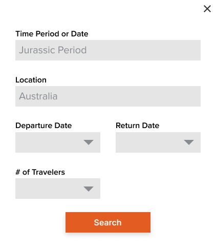
• Users should be able to select day of departure and duration of trip in the present and understand travel to Zeit is not included
• Responsive e-commerce site that allows users to browse trips, filter interests, and book their tour
• Users should be able to select day of departure and duration of trip in the present and understand travel to Zeit is not included
Research
User Interviews
Since I couldn't ask people about their experiences with time travel research was more focused on what motivates people to travel, how they typically find and book their vacations, and what kind of experiences they have had (positive or negative) finding and making reservations in the past.
From my conversations with interviewees I drew the following conclusions.
Price is the driving factor for most travel purchases. Participants focus on value.
Price is the driving factor for most travel purchases. Participants focus on value.
• 4 out of 4 participants said they want to be in charge of booking the trip themselves
• 4 out of 4 mentioned the importance of flexibility
• 3 out of 4 use 3rd party sites to compare price and then book directly from the service provider
Competitive Analysis
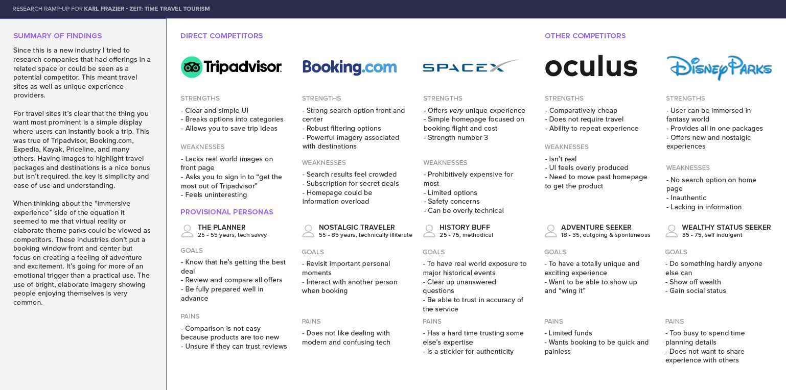
Research Findings
User Wants/Needs
• Simple and easy to use interface
• Ability to search for trip details themselves and set flexible parameters
• Save search results and set alerts to track prices
• In the event of changes it’s best if it can be handled online
• Confidence is knowing they’re getting the best value
• Ability to search for trip details themselves and set flexible parameters
• Save search results and set alerts to track prices
• In the event of changes it’s best if it can be handled online
• Confidence is knowing they’re getting the best value
User Pains/Frustrations
• 3rd party sites are clunky and difficult to use
• Long and difficult customer service related experiences
• Being overloaded with unimportant information like offers they’ll never use
• Being unable to make changes is a constant pain
• Long and difficult customer service related experiences
• Being overloaded with unimportant information like offers they’ll never use
• Being unable to make changes is a constant pain
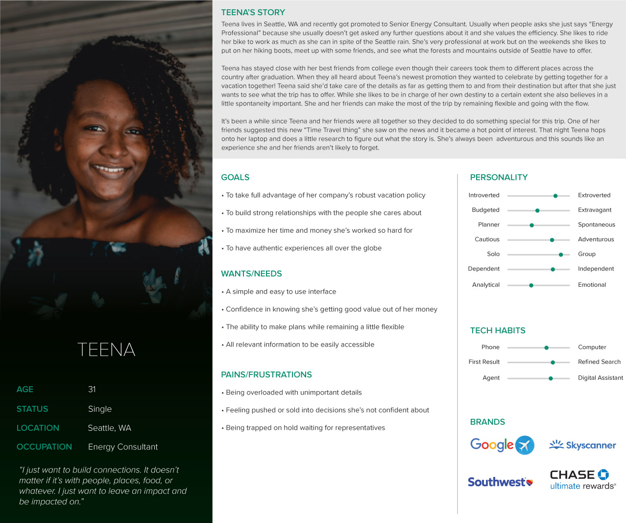
User Persona
By combining the data obtained from my research I developed a user persona, Teena, that contains many of the common factors between the participants. Teena is a young professional who works hard for her money but likes to maintain a healthy work/life balance. She values her friendships and connections and enjoys having authentic experiences across the globe.
This persona will guide the design moving forward as she is our target user. Simply put, if it won’t work for Teena then it won’t work for Zeit.
This persona will guide the design moving forward as she is our target user. Simply put, if it won’t work for Teena then it won’t work for Zeit.
Site Map & Sketches
Early in the process a card sorting exercise was used to decide how best to sort the categories for the tour offerings. A series of randomly historical events/periods were listed. Participants were then asked to group them in whatever way they thought made the most sense and then title the groups themselves. Commonalities were grouped together in a way to satisfy the most users' ideas.
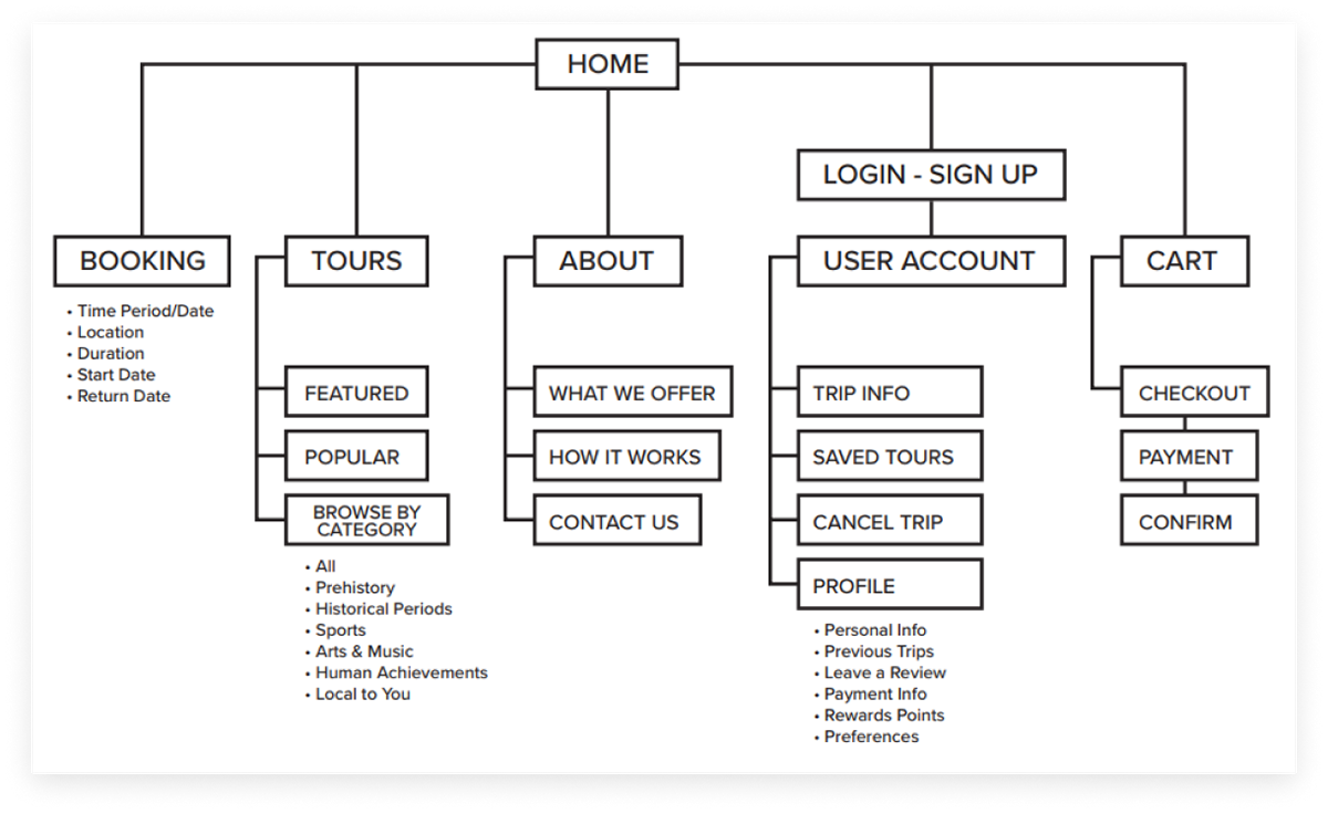
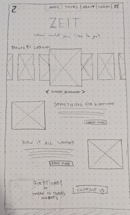
With a basic site map decided I could then begin sketching ideas for the homepage. This would dictate the rest of the site design so this page was done independently before moving onto the rest.
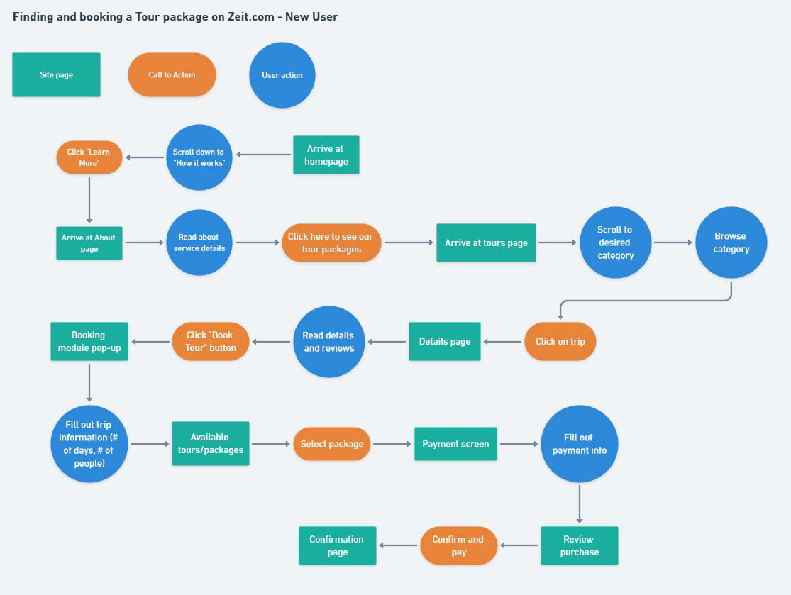
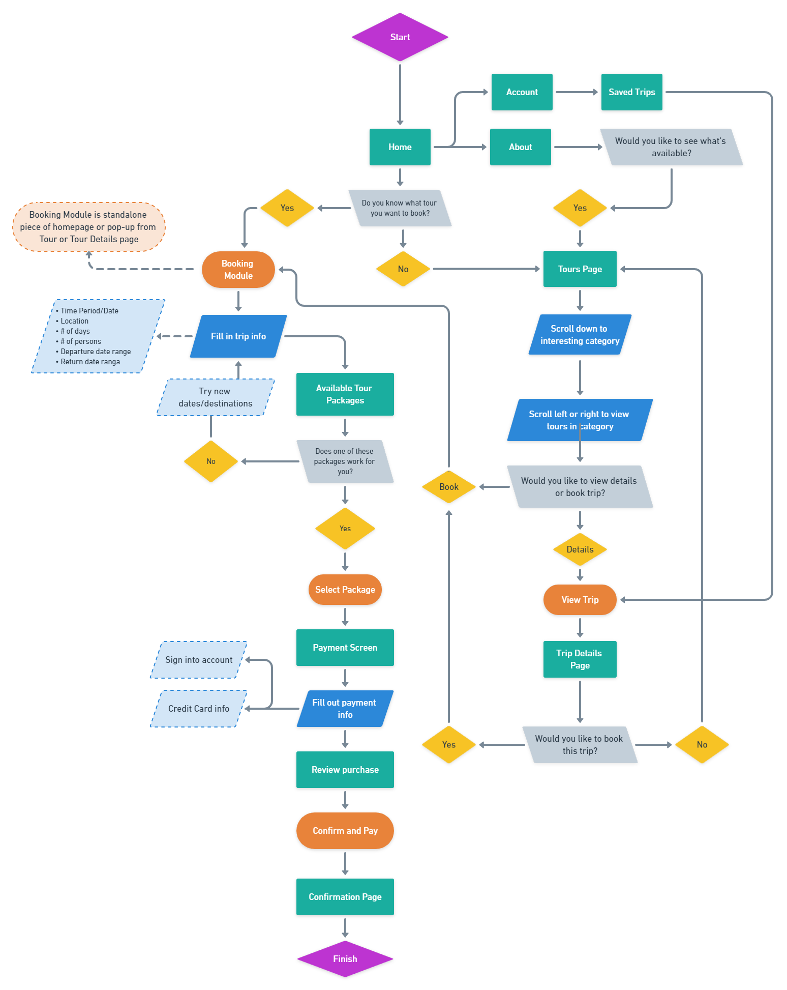
Task & User Flows
A more detailed map was then plotted out to consider the user flow for a specific task (finding and booking a tour) as well as the flow chart for any decisions made by users throughout the entire site. By doing this I was able to ensure that every step of the process was planned for. By building using these flows I could be certain the customer is able to accomplish their goals.
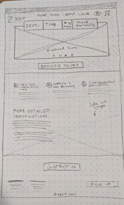
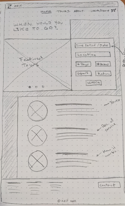
Wireframes
With the knowledge of how the site was going to function it was time to move onto creating wireframes.
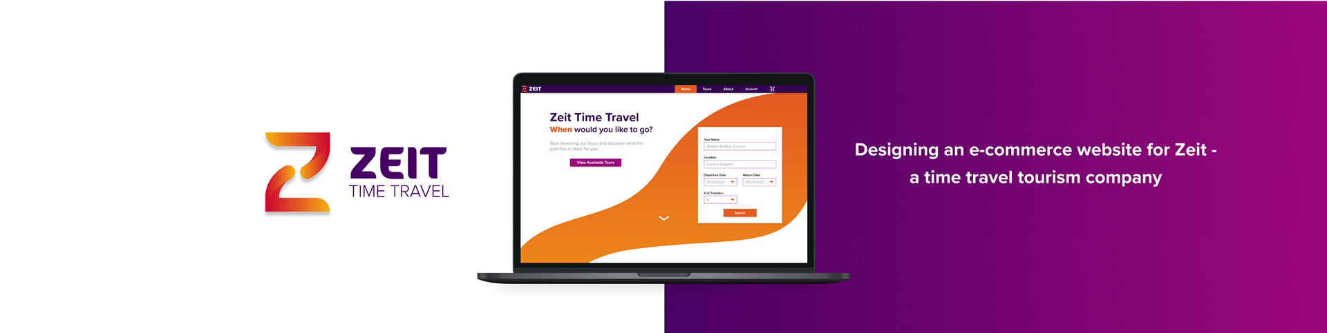
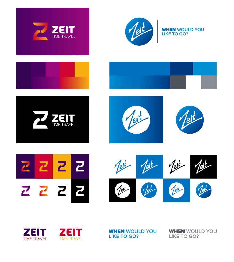
Logo & Branding Design
Zeit’s logo and branding was a challenge because of the competing concepts of modern tech but also a connection to history. The goal was to create a mark that was fresh and modern looking with a nod to time travel and the past, something clean a simple with warm and inviting colors.
Below are the top two options I created. Option 1 ended up being the final choice. The oranges and yellows give that warm and inviting feeling we’re looking for. The sleek lines create a sense of movement and the hourglass in the negative space is a good nod to the time travel aspect. Subtlety is a key factor with this design but the colors give you a chance for more expression. The ‘Z’ mark also works very well from a scalability standpoint, which is important when being presented smaller mobile devices.
Below are the top two options I created. Option 1 ended up being the final choice. The oranges and yellows give that warm and inviting feeling we’re looking for. The sleek lines create a sense of movement and the hourglass in the negative space is a good nod to the time travel aspect. Subtlety is a key factor with this design but the colors give you a chance for more expression. The ‘Z’ mark also works very well from a scalability standpoint, which is important when being presented smaller mobile devices.
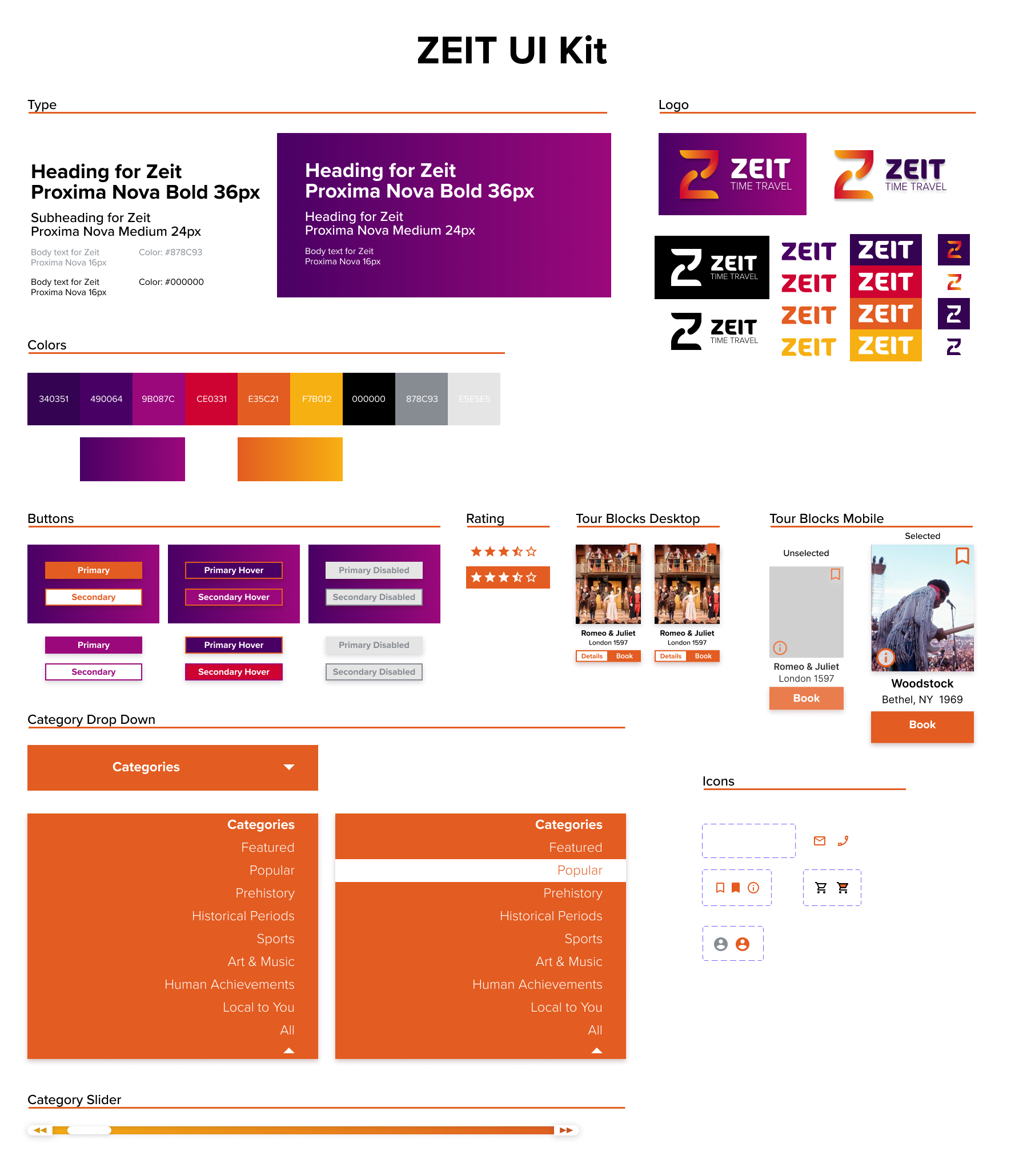
Mid Fidelity Mock Ups
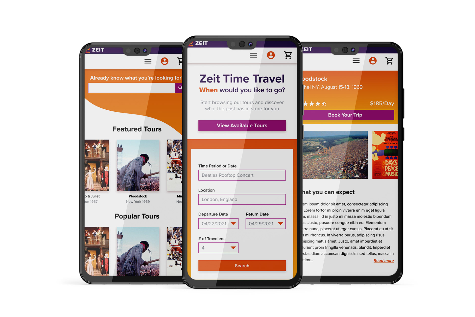
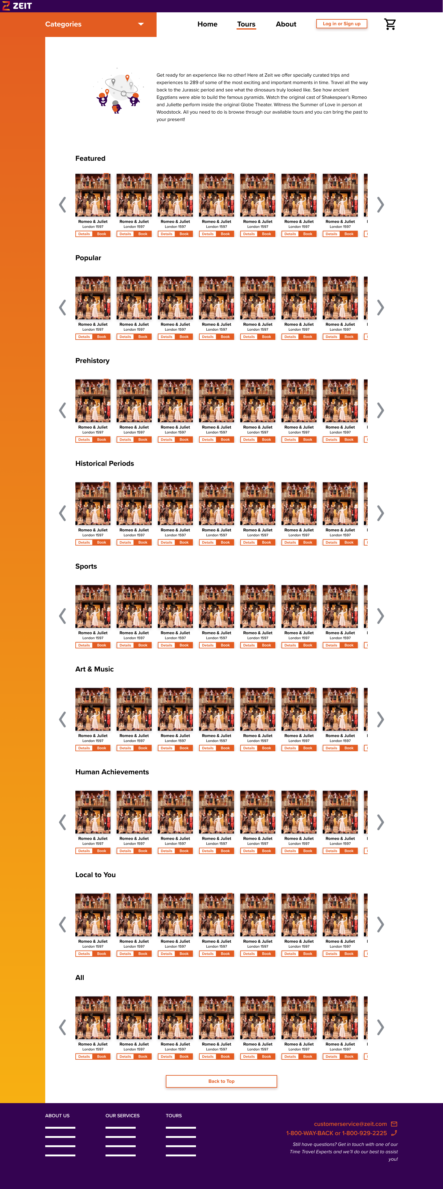
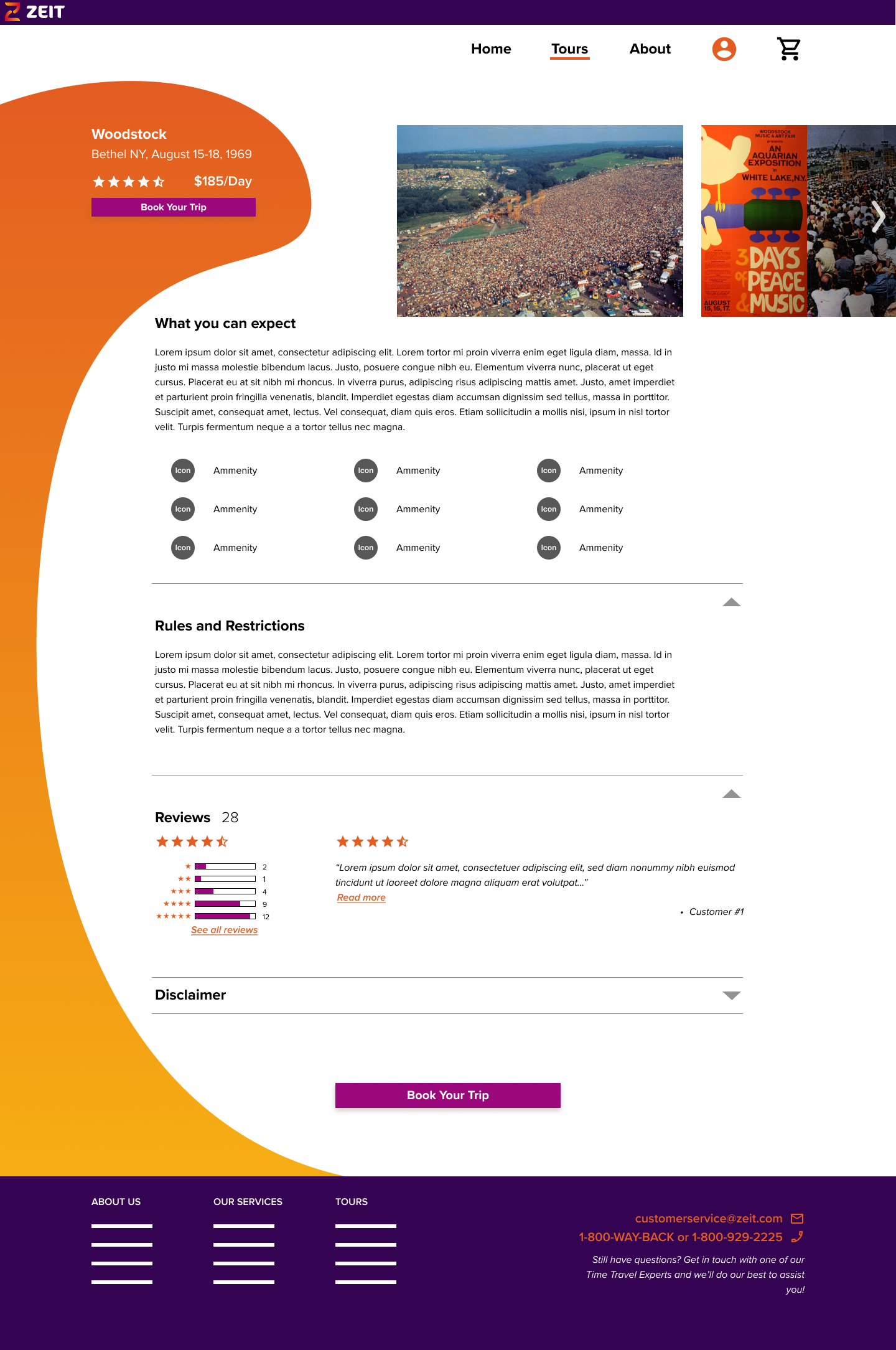
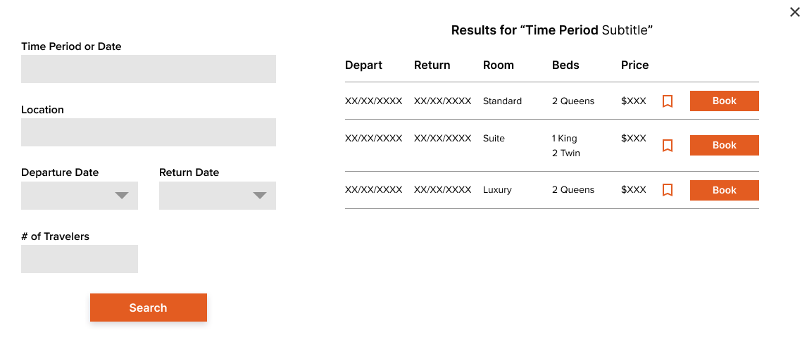
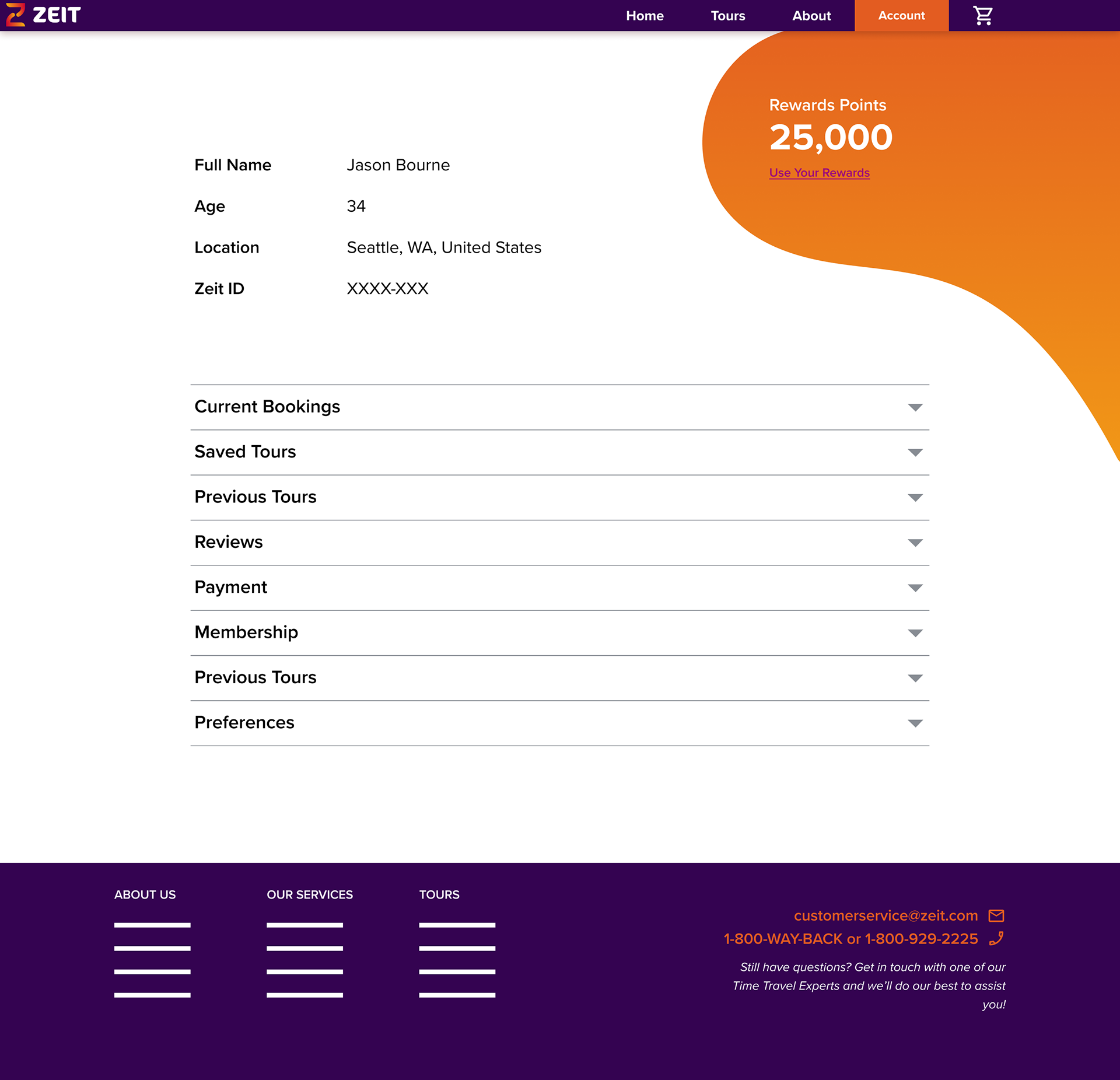
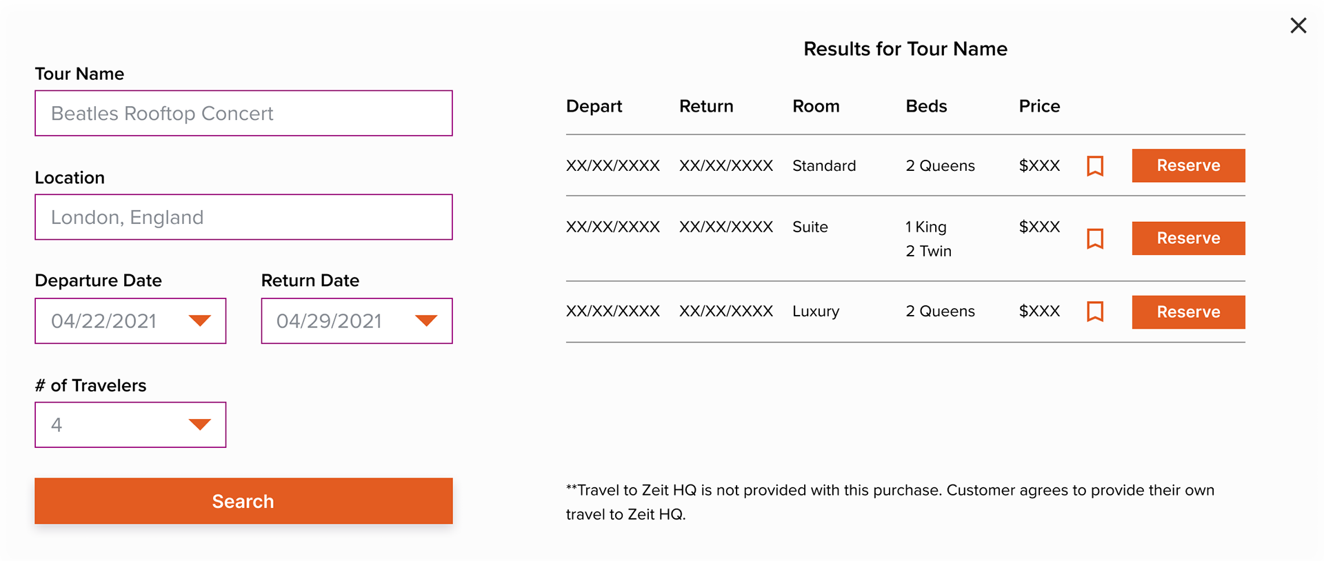
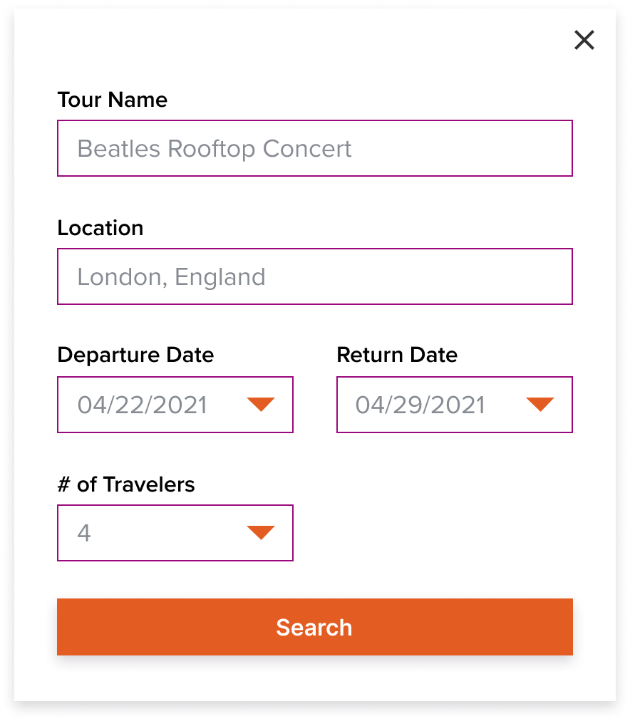
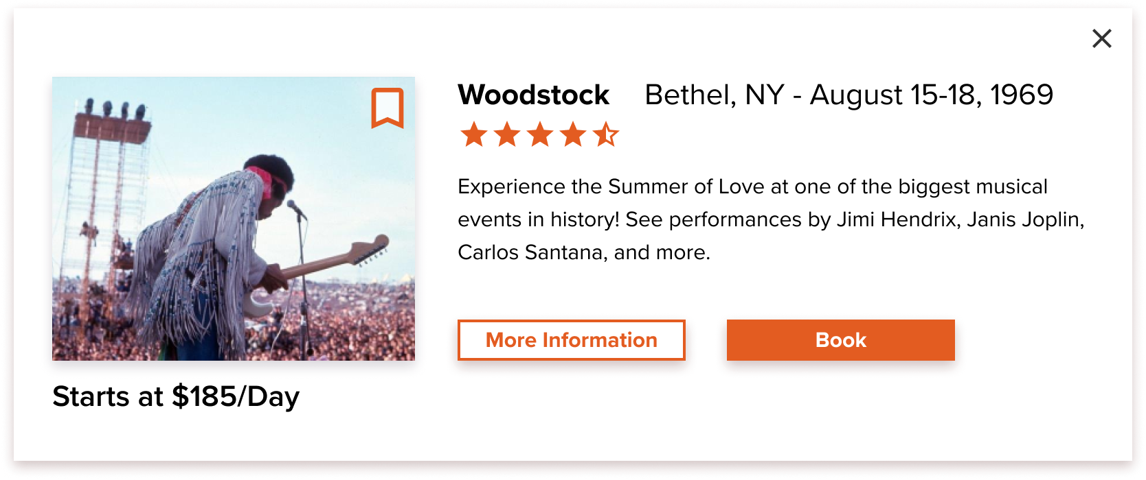
With the style tile in hand and wireframes in place it was time to build out the higher fidelity mockups. Below you can see the first round of mockups. These include pages for the homepage, tours, tour details, about, and account. Also included are the pop-ups for the booking module, search results, as well as the categories dropdown bar.
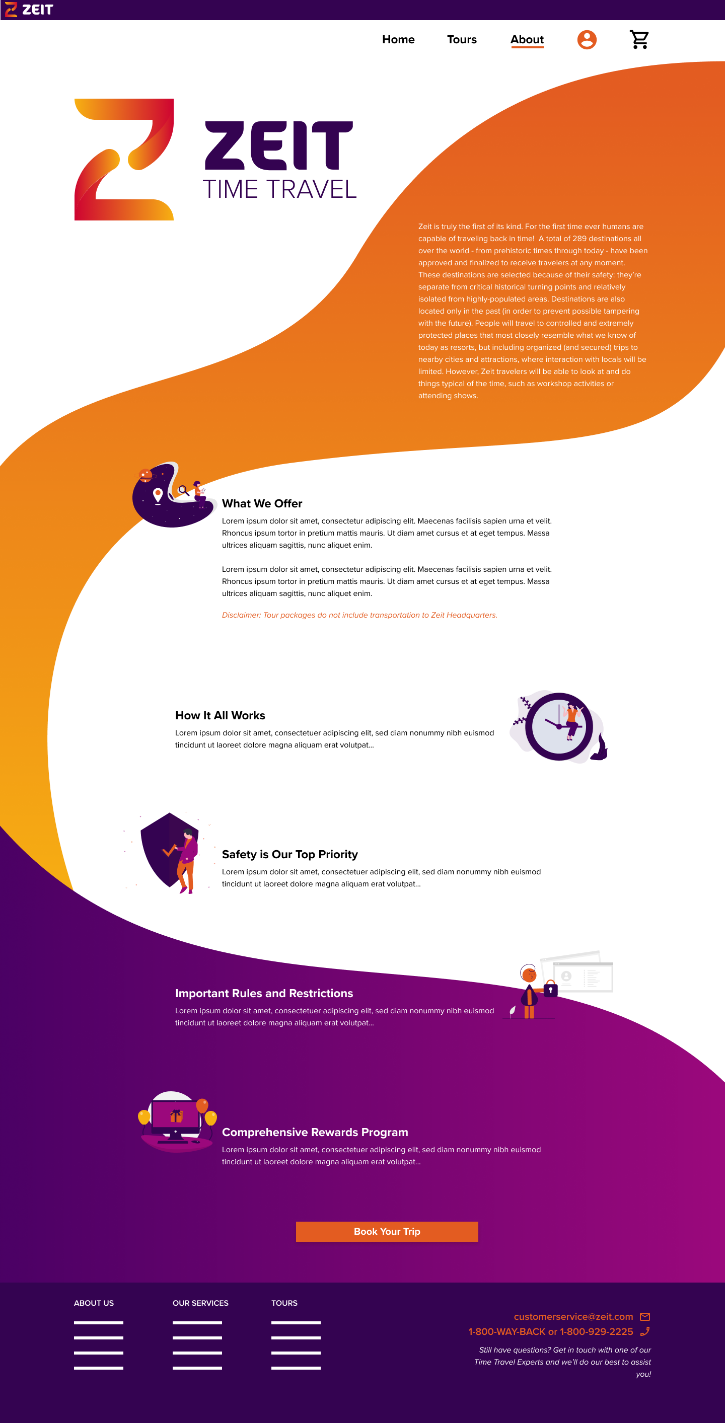
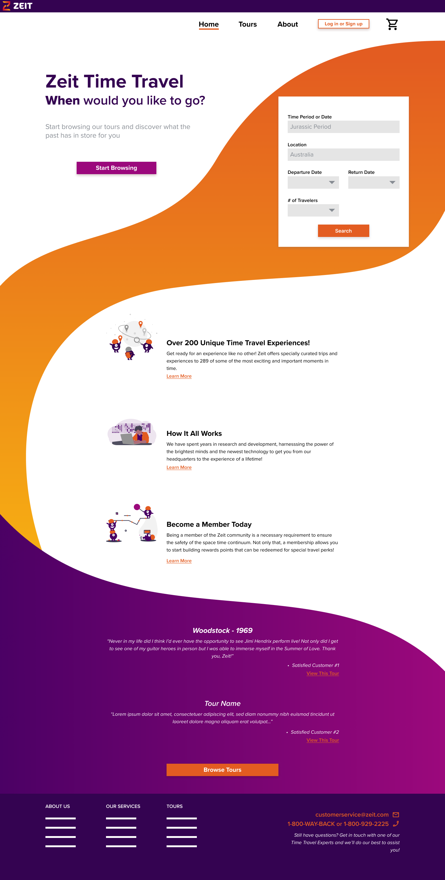
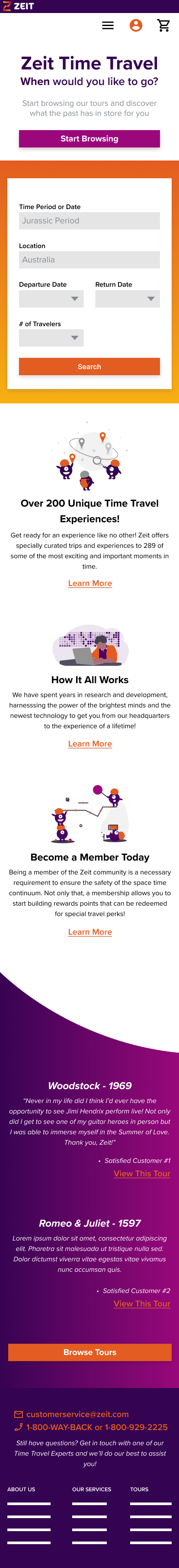
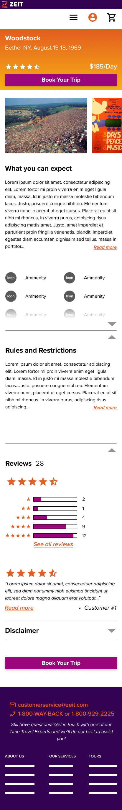
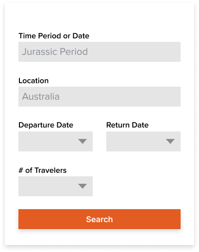
The primary goal for the site is to allow users to easily find, browse, and eventually book their vacations. The homepage focuses on a CTA to get users to the tours page but also has a booking module for returning users who know what they want. More information is contained below to give a brief overview on the company and what it offers with links to other pages for more detail. The bottom of the page is used to highlight positive reviews of some featured tours with links that connect directly to those pages.
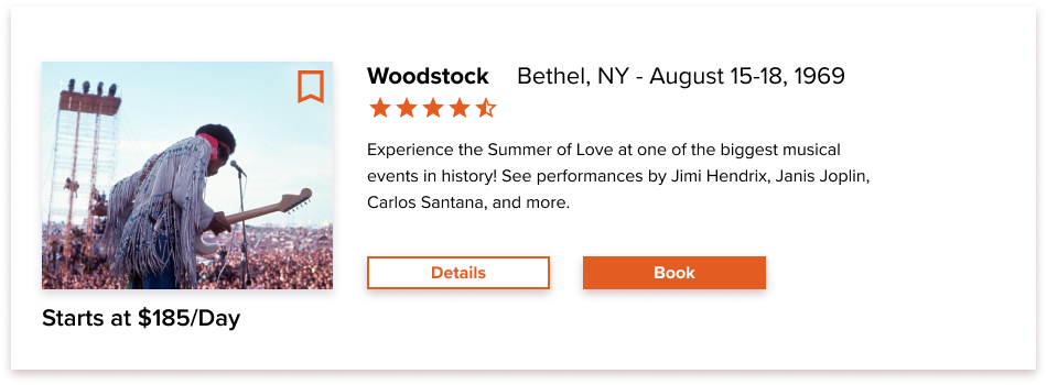
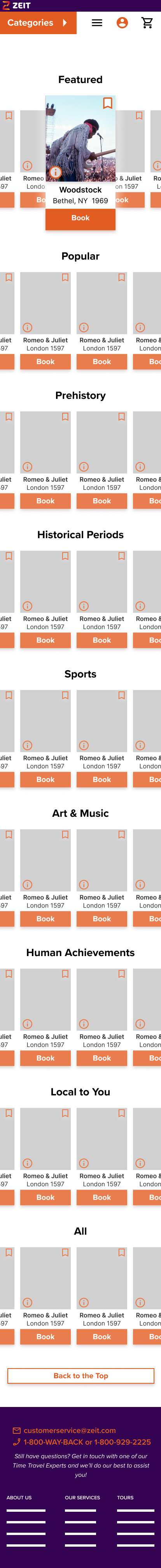
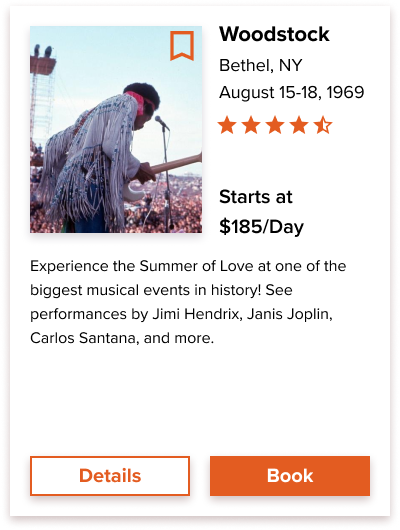
The Tours page is the biggest focal point of the work. This is where Zeit contains all of their available offerings. Users are able to scroll down to the category of their choice (or go directly to it via the dropdown menu) and then scroll horizontally through whichever category they find interesting. Clicking on an image creates a pop-up with slightly more detail that allows users to either book from there or head to the full page of information about the trip. Pop-ups are used as a way to offer users the chance to learn more or book a trip without losing their place on the page.
Usability Testing
After developing a functional prototype I entered into usability testing. I scheduled 4 tests with people who shared similarities to our user persona. Participants were asked to navigate the site beginning from the homepage. The goal was to learn about Zeit, find a tour they were interested in (in this case Woodstock was the only one with full functionality), find trip details, and try to book a trip. Afterwards we went page by page and discussed finer details about their first impressions, how they expected everything to function, what their overall feelings were, and any other observations made throughout the test.
Interviews were done remotely over Zoom and users shared their screens so that I could view how they operated the site and record their behavior and the conversation. Using notes taken during the testing and the recordings built an affinity map. This highlighted things that went well, went poorly, users suggestions, common behavior, and areas of improvement.
Interviews were done remotely over Zoom and users shared their screens so that I could view how they operated the site and record their behavior and the conversation. Using notes taken during the testing and the recordings built an affinity map. This highlighted things that went well, went poorly, users suggestions, common behavior, and areas of improvement.
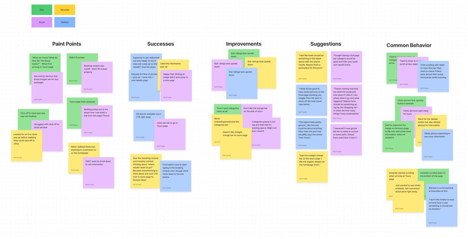
Conclusions drawn from testing are as follows:
Homepage
• Rename boxes within the booking module to better explain what they’re for
• Make it more obvious that there is more information to scroll down to if users are interested
• Change “Learn More” links to something more descriptive
• Consider adding content to highlight time travel
Tours Page
• Shorten copy on top
• Eliminate Categories dropdown (find a new way to filter options)
• Orange bar on the side is distracting and not helpful - Use organic shapes like the homepage
• Eliminate scroll bar and replace with hover over arrows for horizontal scrolling
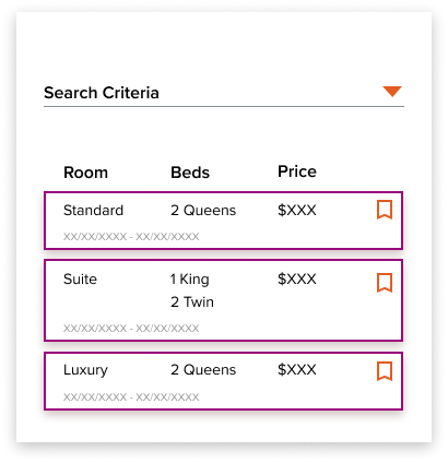
• Enlarge pictures, find new solution for ‘details and book’ buttons. Possibly eliminate and view in pop up. Could be a good space to display starting price
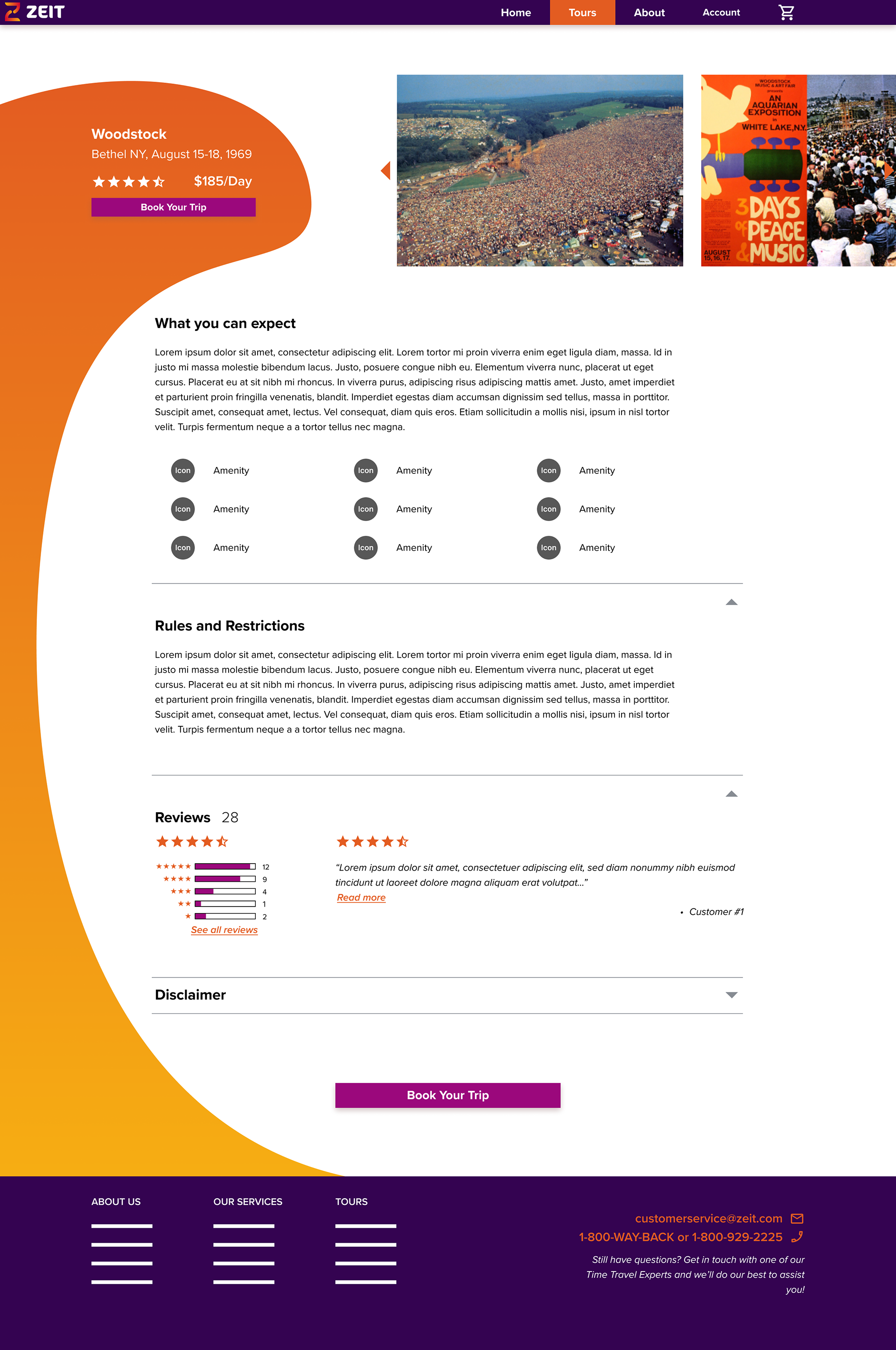
Tour Details Page
• Use image scrolling solution to match the Tours page
• Flip order of reviews to have 5 stars on top
Overall
• Consider changing booking module to horizontal option on top
• Nav bar can be made smaller
• Include rules/disclaimer within the booking results pop up
Homepage
• Rename boxes within the booking module to better explain what they’re for
• Make it more obvious that there is more information to scroll down to if users are interested
• Change “Learn More” links to something more descriptive
• Consider adding content to highlight time travel
Tours Page
• Shorten copy on top
• Eliminate Categories dropdown (find a new way to filter options)
• Orange bar on the side is distracting and not helpful - Use organic shapes like the homepage
• Eliminate scroll bar and replace with hover over arrows for horizontal scrolling
• Enlarge pictures, find new solution for ‘details and book’ buttons. Possibly eliminate and view in pop up. Could be a good space to display starting price
Tour Details Page
• Use image scrolling solution to match the Tours page
• Flip order of reviews to have 5 stars on top
Overall
• Consider changing booking module to horizontal option on top
• Nav bar can be made smaller
• Include rules/disclaimer within the booking results pop up

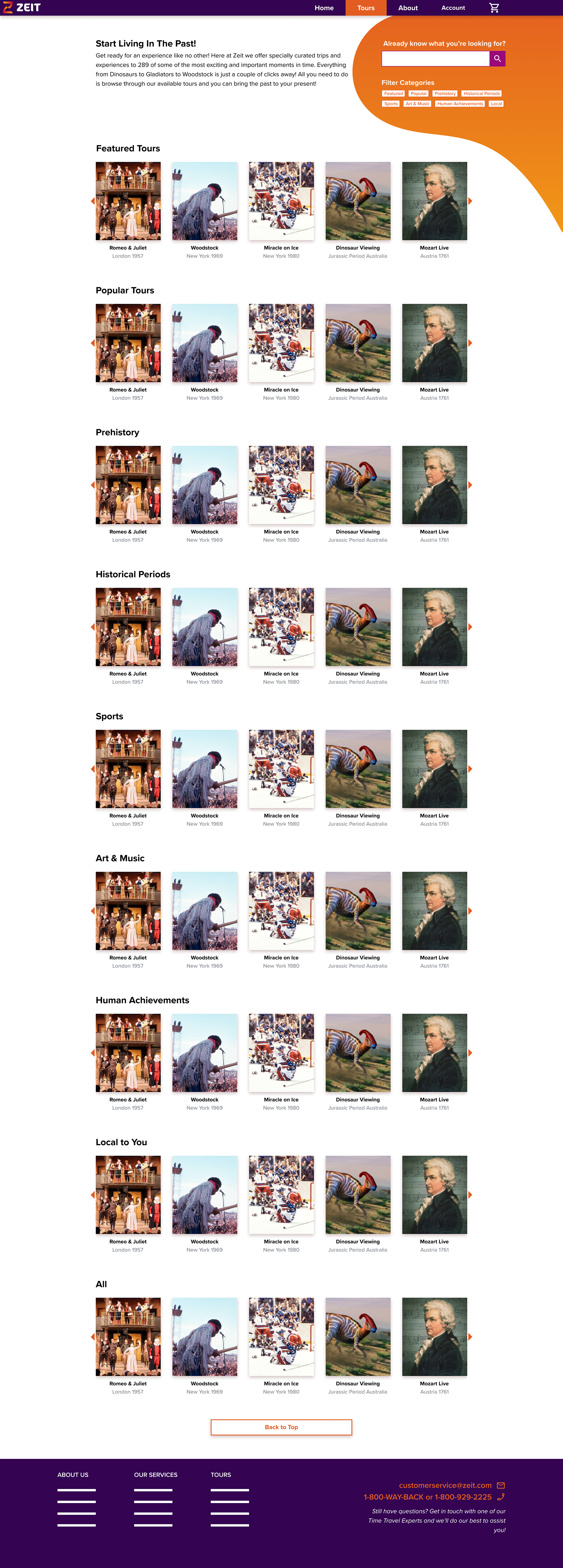

Most of the work was done to the Tours page as the rest were well received. The biggest changes come in the form of losing the dropdown categories bar and replacing it with a search bar and category filters. Since Zeit has a limited number of tours available (289) it shouldn’t be too large of an ask to create a functional search built off keywords contained in the trip description and title. Every user tried to scroll by hovering over the edge of the category to reveal a scroll arrow. The previous scroll options were altered to match users’ instincts and images were enlarged to make it easier to see what is being offered.
Conclusions
I believe this version of the site is enough to give Zeit a successful launch and immediately start gaining users and selling trips. While there is many an opportunity to continue iterating and improving the user experience this version will be able to satisfy both business and user goals.
The big takeaway on this project was the importance of research and iterating on feedback. You can spend hours and hours sketching and planning but the moment you put it into a users’ hands all that planning has the potential to go out the window. As designers we run the risk of not seeing the forest for the trees. User feedback is an incredibly valuable tool and should be taken advantage of as much as possible.
The big takeaway on this project was the importance of research and iterating on feedback. You can spend hours and hours sketching and planning but the moment you put it into a users’ hands all that planning has the potential to go out the window. As designers we run the risk of not seeing the forest for the trees. User feedback is an incredibly valuable tool and should be taken advantage of as much as possible.
Given more time and resources there is still lots more work to do. Full functionality needs to be built into the tours page with all of the available tours. Attention needs to be given to the user account page and how it works. Users will be required to have an account for tracking and safety purposes so that is the next priority. After that it would be wise to create the checkout process. When all is done and a successful prototype is ready then it’s time for more testing and finding areas of improvement as we can always strive to do better.